Friday, January 28, 2011

Business Cards: Page I

For many years I collected business cards. After trips near and far, close friends*, family, and dysfunctional relatives would pass them along to me. I collected the ones that struck my fancy in a binder with sleeves that were designed for trading cards.

What strikes my fancy? Font use, color choice, kitschy clip art, poor design, etc. I do not think business cards will ever go away from the landscape of America, but it certainly is a dying breed of communication.

My partner in life scanned these in for me a while back, and I’m glad they were not lost in RGBisMe’s Great Self-Created Blog Disaster.

Of note, middle card, third column: Rick Williams was the District Justice that married us in December 1984. The magenta cow above it just makes me smile. Click on the image for a larger view of the cards.

*P.S. I try not to use the “F” word nowadays, it leads to far too many tangled issues with complications beyond belief.

The Adventures of the Muddle-headed Wombat


via BibliOdyssey

“[S]ome delightful scratchy illustrations from the 1962 book by Ruth Park, The Adventures of the Muddle-headed Wombat. The illustrator for this book was Noela Young.”

See more of illustrations from the book here. Nothing beats wombat illustrations from 1962. Nothing.

All The World’s A Page


via ministry of type

“Once upon a time we asked ourselves a peculiar question: could you fit an entire literary work onto a single poster? Would it still be legible? What would it reveal about the hidden structures and rhythms of the text? . . .”

Visit the site, here, to see all four posters in the series so far. Image is Homer’s The Iliad two-color offset print (thunderous black / Aegean blue), printed on 120g Alster Werkdruck, typeset in 3.25pt Malaga.

Geometric Pattern


via the ephemera society item of the month

“Sheet of paper with hand-painted blue edge and crisp embossed border by Dobbs, London. Circa 1820s. This page shows how a complex shape can be created from simpler shapes working only with a compass. A companion piece on the same paper bears the watermark ‘J Budgen 1821.’ ”

Visit the site here to explore more ephemera.

100 Tips #46: Invert Your Mac’s Display Colors


via cult of mac

“Here’s a fun one. Whatever you’re doing on your Mac, from any application or any document, try hitting all these buttons together: Control+Option+Command+8. Bam! Your screen colors are inverted. Don’t worry, you haven’t broken anything, and this isn’t a bug. It’s a feature. To switch things back, hit the same key combination again: Control+Option+Command+8. The same command toggles this feature on and off. The inverted colors feature is one of the accessibility tools that are built into OS X (to see more of them, go to System Preferences and click on Universal Access).”

Read the rest here.

Word On The Street: Photos Of People With Words


via npr

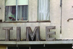
“Photographer Richard Nagler writes in his new book, Word On The Street, that in the late '70s, he was wandering the streets of Oakland, Calif., working on another project:

‘I came across an old building ... that had the single word TIME bolted to it in large letters. ... As I looked up, an elderly woman gazed out a window near TIME, but she quickly closed the curtain when, I thought, she saw me across the street with my camera. I was struck by the power of the scene I had just witnessed, and frustrated at not having been able to record it on film.’

Nagler went back to that very spot several times over the next few weeks trying to capture the moment. "The scene evoked in me thoughts of mortality and the relentless passages of time and life. The juxtaposition of the person and the word held a quiet poetic beauty in its pathos and sadness."

Read the rest here, see more on Nagler's website.

Thursday, January 27, 2011

Non Sequitur: Repent


See more comics by Wiley Miller here.

Savage Chickens: Neighbor Noise

Visit Doug Savage’s site here for more of his humor.

Xavier Antin’s Just in Time, or A Short History of Production


via printeresting

I’m pretty sure that this was one of the last posts in my previous blog, but I wanted to include it in the new version as well.

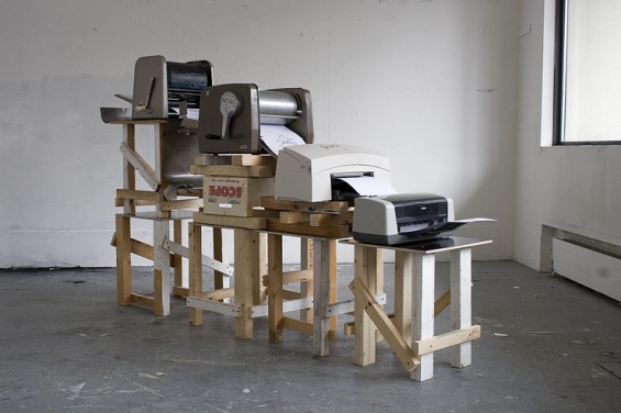
“Like a waterfall of printing technologies, Xavier Antin’s Just in Time, or a Short History of Production is an installation that was used to produce a book about production. Each of the four printers is from a different era and each is set to print one of the CMYK colors. The stencil duplicator does magenta, the spirit duplicator does cyan, the laser printer does black, and the inkjet does yellow. The resulting book is like a misprinted dream (or nightmare depending on how compulsive you are about registration).”

Find out more about it here.

George VI: The Reluctant King


via life.com

“The last king of England (so far), George VI was an unlikely monarch, ascending to the most high-profile throne in the world when his elder brother, Edward VIII, abdicated in December 1936. The tale of his kingship -- and of his struggle to overcome a lifelong stammer while inspiring Britons during the bleak early years of World War II -- is told in the Oscar-nominated 2010 film, The King’s Speech. . . ”

Visit Life here to read and see more about George VI. Official site of The King’s Speech, a movie I highly recommend.

Typefaces of the World


via swissmiss

“Typefaces of the World is a poster Shelby White created to show the typefaces that are most commonly used in a lot of today’s design. The poster includes information for each typefaces such as the year it was made, the location and the typographer. These 50 typefaces were chosen based on popularity and usefulness in present design.”

Read more here.

Sleeping Protects Memories From Corruption


via wired
“Replaying memories while people are awake leaves their memories subject to tinkering. But reactivating memories during sleep protects them from interference.”

Read the rest here.

Jake Shimabukuro: ‘Bohemian Rhapsody’ On The Ukulele


via npr

“Bohemian Rhapsody is high on the list of songs least likely to be covered by a solo ukuleleist. Yet when Jake Shimabukuro delicately yet assertively plucks out the opening notes of the quasi-operatic, hard-rocking power ballad, the 34-year-old Hawaiian is clearly out to show that there are no limits in the world of covers, and that even a seeming stunt can sound both musical and emotive.”

Read more about Shimabukuro, and listen to his version here.

Wednesday, January 26, 2011

Pantone Cookies

These were part of a birthday celebration; original link here.

And even more Pantone chip cookies can be found here. Designer Kim Neill took client gifts a step further this year after stumbling upon Pantone Chip Tins. In case you’re wondering which cookies went first (we know we were), Kim reports that PMS 485, PMS 183 and Silver 877 seemed to disappear first. Visit’s Kim’s blog to view the recipe.


Edgar Allen Pooh


I’m not sure it this got posted before I deleted my old blog or not . . . 


Visit Dan Piraro’s blog here to read more about the background of this cartoon.

The History of the Ampersand


spotted on we love typography, via webdesignerdepot

A nice simple intro on the history of the ampersand, and a gallery of ampersand designs from a variety of different typefaces.

Visit it here.

Monograms à la modern


via felt and wire

A nice piece on monograms, from modern cards by Lunalux filled with humor to stationery from the 20s.

Visit the site here.

Tuesday, January 25, 2011

Alison Bechdel & Jack LaLanne


via Alison Bechdel’s blog

Alison writes: “I just heard that Jack LaLanne died. He was my fitness idol as a young child. If I was home sick from school, this wild muscle man was on tv, showing housewives how to tone & trim. He had the most amazing arms, the most amazing polyester jumpsuit, and the most amazing white dog. I was spellbound. I wanted to be strong like him.”

I remember his TV show as well; I think it came on some crazy hour like 6:30 in the morning. Visit Alison’s blog here to see her sketch of Jack LaLanne and his dog, named Happy.

Quote of the Day: Lee Krasner


via bobulate

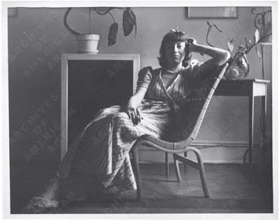
Lee Krasner: “I think for every level you go higher, you slip down one or two levels, and then come back up again. When I say slip back, I don’t mean that detrimentally. I think it is like the swing of a pendulum rather than better or back, assuming that back means going down. If you think of it in terms of time, in relation to past, present, and future, and think of them all as one an oneness, you will find that you swing the pendulum constantly to be with now. Part of it becomes past and the other is projection but it has got to become one to be now. I think there is an order but it isn’t good, better, best.” —Art Talk: Conversations with 15 Women Artists.

Visit the bobulate site here for links on Kranser and the book Art Talk.

The Knight Life: Drive a Zamboni


via The Knight Life
Go to Keith Knight’s site, here.