 |
| Some of the type related gifts I received this year included an ampersand "shadowbox" display, distressed letterpress magnets, cufflinks, a paintable ampersand, and the book "Just My Type;" such thoughtful gifts that I truly appreciate. |
Showing posts with label letterpress. Show all posts
Showing posts with label letterpress. Show all posts
Thursday, December 26, 2013
Type Holiday
Monday, November 4, 2013
Seal of the Commonwealth of Pennsylvania

This metal letterpress block was given to me by my father-in-law. A perfect gift!

For size comparison, I have it beside the wood block ampersand my son gave to me.
Thursday, October 20, 2011

Thursday, July 14, 2011
Images from Old Books
via Brain Pickings
The site ‘From Old Books’ features over 3,100 high-resolution free images scanned from more than 180 different old or rare books, with extracts, by Liam Quin.
Visit the site here.
 |
| Detail of the title page from De Studio Literarum (1536) |
Visit the site here.
Wednesday, July 13, 2011
Quoins
 |
| Image from Brad Cornelius’s photostream. |
via lawsonarchive
“In the past four centuries, very little tight logical change has been seen in the quoin, a simple item of composing room furniture used in preparing type for the press. The word itself, a variant of coin, has been used by printers since the 16th century. It is been discussed by the writers of printing manuals since Moxon’s treatise, Mechanick Exercises, first appeared in England in 1683….”
Read the rest here. Quoins are expandable metal or wooden wedges used by printers to lock up a form within a chase. More images of quoins can be found here and here.
Wednesday, July 6, 2011
Old English type body sizes

“Prior to 1737, little standardisation existed in the sizes of printing types and typefounders cast types to their own sizes and dimensions. In this year, the Parisian typefounder Pierre Simon Fournier introduced a new system that he derived from dividing two inches of the pre-metric French foot into one hundred and forty-four equal parts. Fournier gave the resulting unit a name – ‘points’ – and they measured 0.137 of the English inch, which is close to the present point system…”
Read the rest here. I love that the term Nonpareil is equivalent to 6 points.
Tuesday, July 5, 2011
Letterpress and Jack Daniels

via printeresting
Watch a video of Yee-Haw Industries making letterpress prints for their Tennessee pals Jack Daniels.
The video can be found here. I’m not a whiskey fan, but it is fascinating watching the carving of the plates, much like a stamp for a letterbox.
Wednesday, June 29, 2011


Wednesday, June 1, 2011

Saturday, May 28, 2011

Wednesday, May 25, 2011
TypeFacebook
 via creativepro and make
“TypeFacebook was a booth at the 2011 Bay Area Maker Faire that was organized by the People's Republic of Paper, a loose collective of designers, type casters, paper makers, printers, and book binders. The TypeFacebook concept was simple: Using moveable lead type, people were asked to respond to the prompt Facebook uses: "What's on your mind?" Each character of your answer was a piece of metal type, which you carefully picked from a job case. You set the characters in a job stick (also called a composing stick), making sure they faced the right way. The press owner and operator, Pam DeLuco, set three people's answers into one forme and mounted the forme on a small platen press. Each participant then laid paper that would become the book cover on the press, pulled and released the press's handle, and the printing process was done. If you made typos (as I did), you either had to live with them or go through the entire process again…”
Read the rest here, and see some wonderful photos there as well.
Friday, May 20, 2011
First Solar-Powered Engine

via retronaut
‘Eventually industry will no longer find in Europe the resources to satisfy its prodigious expansion. Coal will undoubtedly be used up. What will industry do then?’
— Augustin Bernard Mouchot (1825-1912), French inventor of the earliest solar-powered engine, converting solar energy into mechanical steam power
I love that the industry used in the image is a letterpress, which looks very much like the one we have at work.
Sunday, May 15, 2011
On Interrobang, Pilcrow, Capitulum, and Wayzgoose
Some small random bits . . .
 via Shady Characters The secret life of punctuation
 via worldwidewords

via Shady Characters The secret life of punctuationRead an addendum to the Interrobang, here.
via H&FJ
“ . . . In any case, Pilcrow & Capitulum would make a fine name for a pub, and a grand place to host a typographers’ wayzgoose.”
Read the entire post here.
 via worldwidewords
“The end of summer came early in old-time printing shops. By the third week in August candles were needed to light the final hours of the long working day. To mark this shift to winter working, it was usual for the master printer to give his journeymen a feast around St Bartholomew’s Day (24 August). This was the wayzgoose or way-goose…” Read more about this feast here and here.
 |
| Wayzgoose for Coventry printers at Stonebridge, c. 1907. |
Wednesday, May 11, 2011
Orphan Annie & Hot Metal Type
 via kickstarter
“Our Orphan Annie isn’t a cute redhead who sings. She’s a big, old cast-iron Monotype Sorts Caster who clicks more than sings, but isn’t doing either at the moment. We want to change that—and we need your help. Orphan Annie was part of the type foundry of the late C. Christopher Stern. Chris inspired many in the letterpress community with his brilliant printing, use of typography and enthusiasm for the craft of hot metal type casting. We’ve moved the foundry to Portland, Oregon and are now in the process of restoring it to working order. In early 2011, we’ll be opening the foundry as a working museum with public programs designed to preserve the craft of casting type, educate, and inspire creativity for a new generation of printers and thing-makers. The Orphan Annie is one of the foundry machines we want to revive.
Our Kickstarter project is to restore the Orphan Annie, record the process, and get her back in the business of casting metal type. We’ll use the money we raise to fund restoration materials and a public space for this industrial machine. We have volunteers to restore and make Orphan Annie sing again, but we also need to ensure she has a stable home and won’t be kicked out into the street. The typeface we’ll cast with her during the inaugural run will be Stern–the typeface created by the legendary typographer Jim Rimmer in honor of Chris Stern (and documented in the Kickstarter-funded film Making Faces). We'll be casting from Jim's original matrices, which he bequeathed to the Type Foundry in 2010. After that, we hope for many tomorrows filled with creative letterpress printing adventures with Orphan Annie and her metal type.”
Find out more here.
Tuesday, April 19, 2011

Wednesday, April 13, 2011
Image of the Day: Angry Bunny Ornament

Sunday, April 10, 2011
Inking Ampersands
 |
| For my birthday, my son and daughter-in-law gave me some metal and wood letterpress ampersands to add to my collection. A few weeks later the head pressman at work [Ron] was cleaning out the area where we store leftover ink used on past printings. I asked if I could have one of the containers in order to ink up my collection, and Ron’s eyes lit up when he saw the ampersands. |
 |
| A little ink goes a long way. You can see some of the test prints I made of each individual ampersand. |
 |
| I arranged the ampersands in a ‘cloud’ for printing, inked them up, then used a brayer to get smooth impression. |
 |
| Holding the group as I inked up. |
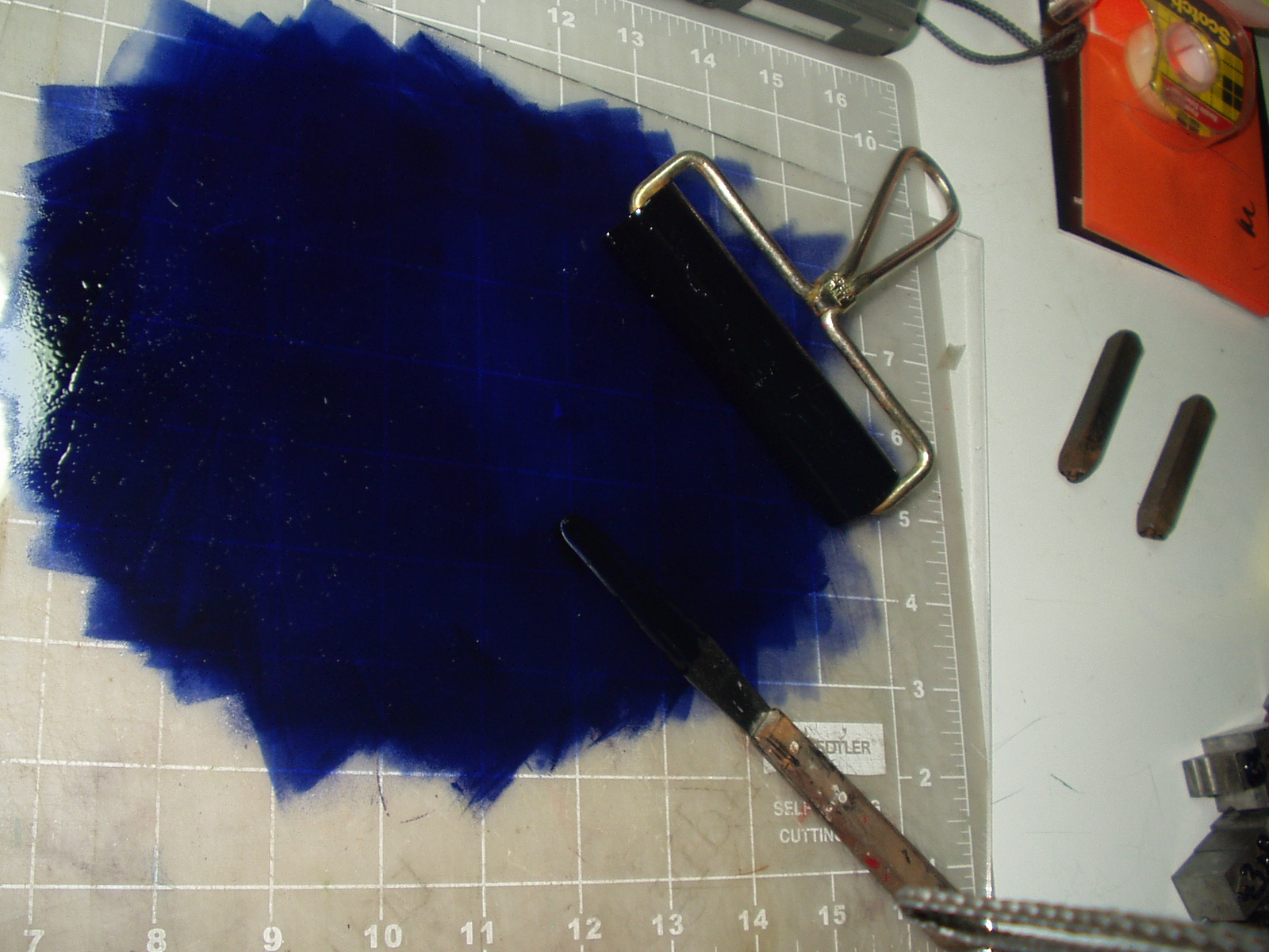 |
| Pantone 659; a pretty sweet color. |

Saturday, March 12, 2011

Friday, March 4, 2011

Subscribe to:
Posts (Atom)