Tuesday, March 15, 2011

Christopher Payne’s Asylum


via utne reader

“The state mental hospitals of the 19th and early 20th centuries—originally known as ‘lunatic asylums’—often operated within massive, majestic buildings, most of which are now abandoned or operating at a fraction of their former capacity. Christopher Payne spent several years meticulously photographing 70 of these architectural marvels, and his haunting images are collected in the beautiful new book Asylum: Inside the Closed World of State Mental Hospitals, just out on MIT Press. Neurologist-writer Oliver Sacks, who worked for 25 years at Bronx State Hospital (now Bronx Psychiatric Center), pens the book’s introduction, a lively tour through the history of these asylums’ philosophies, inner workings, and patient populations as they shifted over the years.

Read the rest here. Visit Christopher Payne’s site here to see a slideshow of images, MIT Press page here.


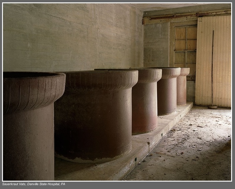
Sauerkraut Vats, Danville State Hospital, PA  As a child, I remember passing the Selinsgrove State Colony for Epileptics— a rambling state hospital on the way to visit my grandmothers. A few of the residents at that facility would stand or sit on benches by the road and wave to the passing cars traveling by on Route 522 . In later years I discovered that the daughter of one of my maternal grandmother’s sisters was a resident at one of Pennsylvania’s hospitals caring for the mentally retarded.

Wood Type of the Month: Goudy Bold


via International Printing Museum

Read this month’s wood-type column to learn about this popular typeface that was the darling of the liquor industry and was also used in the title of several movies.

Read more about Goudy Bold here.

1908: Many of These There


via shorpy

“November 1908. Lincolnton, North Carolina. Daniel Mfg. Co. Girl beginning to spin. Many of these there. Photograph by Lewis Wickes Hine.”

View full size here.

Business Cards: Page XV

[Top Row] The Nut Ranch — this looks like just the start of the design process; “Hmmm... what were all the elements that the client requested on their card? I’ll place the graphic and set the type they wrote down on this scrap of paper. I wonder how it would look all stacked flush left? Not quite right; the balance seems to be off, the house seems lost, and the point sizes aren’t quite right. Oh, and they are missing the city, state, and zip code. I’ll get to that later. Hmmm... Let’s see, if I make the... [phone rings]. Hello? Oh, funny coincidence, I was working on your card just now! Oh, you need it NOW? I wasn’t really finished, but... well sure it looks okay, but... if you are sure. I’d really rather you see a proof before we print it. You don’t have a fax machine? How many? WHEN? Okay, I’ll literally burn the plate as soon as I am off the phone. They’ll still be wet when you pick them up, just keep that in mind.” 


The middle card is Nittany Valley Offset’s. I always liked the full-color ribbon effect with the subtle n [in blue to green] and v [orange to red] on this fold-over card. For a while they were going by NVO, and I guess this ribbon effect didn’t include an o.They are still one of the better printers in the region, but their new logo has taken a dive. Far right card: The drop cap T just overwhelms this card, and the double rule lines are just unnecessary.

[Middle Row] Gold foil on transparent red plastic, now THAT says sandblasting to me! [ *s ] Again, low light and even color blind people will have a trip with this card. Far right card, one of the many in my collection of my father-in-law’s. This was printed at Penn State Printing Services before I started there in ’93. The Lion on the shield is referred to the ‘buggy eyed lion’ — used when the logo is relatively small. Jim’s personal card is below this one, probably done at either Kish Printing or Lewistown Printing, but my bet is the latter. Hot type, multiple font faces, centered. Classic Lewistown Printing style. I loved taking projects to them while I worked across the street at Danks Department store as the graphic designer and later as art director. Seeing a Linotype in action while you wait for a proof to be pulled was stepping back into another era.

[Bottom Row] WC Fritos card from my joining the WC Fritos club. Next, I always liked this card from State College the magazine, most likely designed at Snavely, Vidar, and Associates. Good use of having items “on a grid” and sticking to it, as well as color choices and complementing fonts.


Image of the Day: Desiccant Beads

I just liked the random pattern created by these desiccant beads.