Thursday, June 30, 2011

Color Communication: When You Say X, Your Designer Hears This


via colourlovers
Image from
Hearing Color: Neil Harbisson, Cyborg
“Let me paint a picture for you. You’ve just started working with a new designer. You sat down with that person, explained all of your dreams for the design, and left the meeting feeling like you were really on the same page. Then the next time you meet with them, they present a design that is completely different than what you expected. It’s not necessarily a bad design, but it is definitely different than what you described. Sound familiar? This is what I like to call a “lost in translation” moment. And it’s exactly what inspired me to create this guide on translating “design talk.” Why is there a disconnect?…”
Read the rest here.

Odd Color Names Offer a Primer in Marketing


via nytimes
“If you heard the words “Tempest,’ ‘Turbulence’ and ‘Tornado Watch,’ you might head for the basement — fast. Paint manufacturers want you to head for the living room. In a redoubled effort to capture consumers’ attention in this sputtering economic recovery, some paint companies are hoping to distinguish their brands with names that tell a story, summon a memory or evoke an emotion — even a dark one — as long as they result in a sale. What they do not do is reveal the color…”
Read the rest here.

Alessandro Novelli’s The Alphabet


via felt and wire
“In just over a minute, Alessandro Novelli captures his (and our) love for typography and animation in The Alphabet, a spelling video inspired by children’s hornbooks..”
Read the rest, and watch the video, here. P.S. Can you spot the typo?

Image of the Day: Bad Plate


I love the texture left by the wash-up of the plate.

Business Cards of the Day

Four cards I discovered on a recent trip. Freeze Frame Reality has used a nice spot gloss varnish. The Art Out of the Box card reminded me so much of the local equivalent to it [Artbox Studios] and I just had to laugh at the similarity. The next card, well, is self-explanitory: I buy. ’nuff said. Dog Gone Walking is my favorite in this series of finds [both sides of this card are shown, along with a close-up]. Clean design, nice muted color choices, sophisticated typography along with a touch of humor on a topic that can make me go on a rant.
Click on the images for a larger view.

The Radioactive Orchestra


via designboom
“The radioactive orchestra uses data from the gamma decay of atoms as the foundation for electronic music composition…”
Read the rest here. Create your own composition on the radioactive orchestra website here.


Heavenly Typography


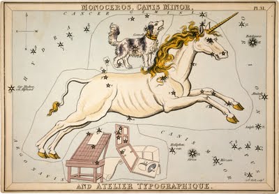
From Urania’s Mirror: Monoceros,
Canis Minor and Atelier Typographique
, 1825
via letterology
“Some people see faint outlines of unicorns in the heavenly constellations and others see dogs, or the canis minor. Yet Mr. Jehoshaphat Aspin looked up and saw a celestial type studio in the stars with a unicorn (monoceros) jumping over it…”
Read the rest here.