Thursday, March 31, 2011

Cryptanalysis: Help Solve an Open Murder Case


via Federal Bureau of Investigation

“On June 30, 1999, sheriff’s officers in St. Louis, Missouri discovered the body of 41-year-old Ricky McCormick. He had been murdered and dumped in a field. The only clues regarding the homicide were two encrypted notes found in the victim’s pants pockets.  Despite extensive work by our Cryptanalysis and Racketeering Records Unit (CRRU), as well as help from the American Cryptogram Association, the meanings of those two coded notes remain a mystery to this day, and Ricky McCormick’s murderer has yet to face justice. “We are really good at what we do,” said CRRU chief Dan Olson, “but we could use some help with this one.” In fact, Ricky McCormick’s encrypted notes are one of CRRU’s top unsolved cases. “Breaking the code,” said Olson, “could reveal the victim’s whereabouts before his death and could lead to the solution of a homicide. Not every cipher we get arrives at our door under those circumstances.”

Read the rest, and see the other note here. More on the story from the NYTimes here, and a follow-up on potential leads here.

Happy Holi!


Holi Fingers by Shiva’s Smile

via imprint: Wunderkammer of Color: April 2011 Edition

“Happy Holi! Imprint blows you a floating dust-choked kiss as the Hindu Festival of Colors draws to a close. . . ”


Read the rest here.

Make a Custom Brush for your Watermark


via thephotoletariat
“Like many necessary tasks, uploading your photos to your blog can be tedious: after a while, all that resizing, tagging, and watermarking gets old. But there are lots of ways to make this process more efficient, and one of my favorites involves making your watermark a custom brush. Custom brushes give you more flexibility (color, size, placement, etc.), and you can watermark your images in a fraction of a second.”

Read the rest here.

Raw Color: Printing with Vegetable Ink


Inkjet print made with (C) Red Cabbage,
(M) Beetroot and (Y) Pumpkin.

via colourlovers
“The work of Daniera ter Haar & Christoph Brach, who have become better known by the name of one of their projects, Raw Color, is highly prismatic, covering the spectrum between art, design, photography and color research by mixing the powerful colors of vegetables, innovative color harvesting processes, with unique applications for print and textiles. The Eindhoven, Netherlands based team uses color as the connection between their different practices posing questions like ‘what is the nature of a color and what is the connection to its physical state.’”
Read and see more of this work here.

“If you want to go quickly go alone, if you want to go far...


via quotevadis

“If you want to go quickly go alone, if you want to go far go together.”

— African proverb

Wednesday, March 30, 2011

Gas Ghosting

via  thegraphicgroup

“Gas ghosting, also known as gloss ghosting, is the transfer of a printed image from the front of one sheet to the back of another. The transfer is caused by a chemical reaction when vapors from ink drying on one side of the press sheet interacts chemically with dry ink or paper coating on the other side of the sheet. Gas ghosting can also result when the ink drying on the second side is accelerated or retarded by fumes given off by ink on the first side. The problem is typically solved by changing the chemical properties of one of the variables in the process.”

I recently experienced this ghosting at work. Here are the specs:
Final size 8"x8" booklet cover
Printed two out
Sheet size 20"x28"
100# Productolith Dull Cover
Work and Turn
PMS 877 [Silver], PMS 295 [Dark Blue], flood dull varnish
Printed on Heidelberg SORZ
Wet trapped

The photo shows the gas ghosting of the lion shrine statue [it appears almost like a negative on the solid dark blue area]. It showed up predominantly only one side of the printed sheet. Next year, we plan on printing PMS 877 silver first, let it dry a few days, then come back with PMS 295 [dry trapping]; after that dries, run the varnish. This would be a very cool technique to do on purpose; I wonder if anyone has created a gas ghost intentionally on a printed piece?

More on ghosting can be found on Gordon Pritchard’s blog, “Quality in Print,” here and here.

A+B=C [Atoms+Bits=the neue Craft]


via Adobe Museum of Digital Media

“John Maeda, one of Esquire’s 75 Most Influential People of the 21st Century, examines some of the history that connects the worlds of analog creativity and digital creativity. Set in the museum’s freshly constructed auditorium, the lecture is brought to life with interactive projections, animated infographics, video clips, and mini documentaries of various hands-based Rhode Island School of Design workshops, such as glassblowing and letterpress.”

Watch his talk, here.

Obsolete Occupations: 7 Short Films


spotted by a friend in NYC

“Buckminster Fuller famously said, ‘You never change things by fighting the existing reality. To change something, build a new model that makes the existing model obsolete.’ And the new models of the digital age have been making increasingly more old-timey crafts obsolete. But there seems to be something remarkably poetic about these dying professions. Over the past few months, we been noticing– and noting — a number of beautifully shot microdocumentaries romanticizing this impending obsolescence. Today, we’ve curated seven of our favorites. . . ”

Read about and watch the seven short films, here.

Design Council UK Explains What Graphic Designers Do


via @Issue Journal of Business & Design

“Probably more people know what a microbiologist does than what graphic designers do. Undoubtedly your aunt and grandma – and possibly even your mother – don’t have a clue. They’ll look at a printed piece and praise the photography, the illustrations, the writing and sometimes even the feel of the paper, but they aren’t quite sure what role the designer played in this. That’s why we are grateful to the Design Council UK for producing a video that succinctly explains what graphic design is and what graphic designers do. We recommend that you forward it to every member of your family especially just before a holiday gathering, and perhaps selectively to a few clients.”

Watch it here.

Monday, March 28, 2011

Little Giants


via the daily heller

Miniature famous people made of vinyl in the Little Giants collection by Alphine Northcote are produced by the Jailbreak Collective.

See them all here

Sunday, March 27, 2011

Weingut Ampersand


via creativepro

“While the word ’Weingut’ may not sound particularly lyrical to the ears of English speakers, the Weingut font family is certainly pleasing to the eyes. This decorative display typeface, created by Georg Herold-Wildfellner, blooms with delicate buds, leaves, and tendrils.”

“Weingut Script Flourish is a decorative display font with high contrasts, perfectly drawn to the tiniest details. The font is trimmed to fairly large font sizes and is highly suitable for chapter titles or book jackets as well as Headlines, Invitations and wine labels :), although also impressing with an astounding legibility in small typesettings. Inspired by the hand drawn Blätterschrift from the 19th century Mettenleiter’s Schriftenmagazin, its basic structure is related to the English Script. The creative process started in summer 2009 and after 600 hours of work, over a 2 year period, Weingut now unfolds to reveal all its charms.”

Read more about it here.

Saturday, March 26, 2011

Vote for My Wife's Video . . .


My wife writes, “A couple weeks ago, the authors of the book Run Like a Mother boldly asked for short videos about how we run like mothers. A handful of us rallied: big thanks to all you cinematographers out there. There are eight videos on their site — each less than two minutes each. Check them out, then vote on your favorite at the bottom. The top three vote receivers win either a new badass mother runner hats or visor.” She’d really like to win a hat or a visor to keep her hair out of her face while running!

Her’s is #3
“Now I'm a Diva!”

Vote early, vote often!

Thursday, March 24, 2011

Sunday, March 20, 2011

Business Cards: Page XVIII

[Top Row] I love how the spot yellow gold ink just ‘pops’ on this two color card. FontShop is a great online resource for fonts and all things related.

[Middle Row] Wood•Mode: a safe but effective type treatmet.

[Bottom Row] SASCO card; Jerry Gay is my mother-in-law’s brother, who I met on one of his visits ‘up North’.

Linoskala


via Blue Pencil

“…Linoskala from Linotype GmbH, a two-sided volvelle (wheel chart) used to find out characters per cicero for 25 Linotype typefaces (presumably hot metal rather than Linofilm) at a series of [Didot] point sizes. The sizes vary from typeface to typeface with most being available in 6 pt, 7 pt, 8 pt, 9 pt, 10 pt and 12 pt while a few stop at 10 pt and Excelsior additionally offers 7.5 pt and 8.5 pt. Oddly there is no 11 pt.

There are two parts to the volvelle. One is a bright orange wheel with a handle and a viewing slot that has the list of typefaces and the cicero increments (in black) as well as Linotype’s logo. The other is a larger light gray wheel with the typeface names and point sizes in black arranged around its edge.

The volvelle is not dated but it is most likely from the early 1960s since Optima (1958) is among the typefaces.”

Read the entire post here.

Saturday, March 19, 2011

Billboards Converted To Swingsets


spotted on make, via thisiscolossal
“Paris Architect Didier Faustino created this epic swing set out of a converted advertising billboard for the Shenzhen-Hong Kong Bi-City Biennial of Urbanism and Architecture. ‘Double Happiness responds to the society of materialism where individual desires seem to be prevailing over all. This nomad piece of urban furniture allows the reactivation of different public spaces and enables inhabitants to reappropriate fragments of their city. They will both escape and dominate public space through a game of equilibrium and desequilibrium. By playing this “risky” game, and testing their own limits, two persons can experience together a new perception of space and recover an awareness of the physical world.’ ”


Business Cards: Page XVII

[Top Row] Eikon: This company bought the one I was employed by for $1, let all of the employees go, then sold it back to the original owners so that they could have a fresh start. Seitz and Seitz was one of the first stock photo groups that we used at the agency I worked for. You’d request certain type of image for use [like in a brochure], and they’d send sheets of slides for you to choose from that met your criteria. If you liked one, you’d pay for the use of the image, and return the slides -- this was long before the age of internet.

[Middle Row] Middle card of Richard Waters. You have to hear this instrument to truly appreciate it, and we are lucky enough to have one.

Friday, March 18, 2011

Super Moons and Perigean Tides


pointed out by my father-in-law, via nasa

“On March 19th, a full Moon of rare size and beauty will rise in the east at sunset. It’s a super ‘perigee moon’—the biggest in almost 20 years. ‘The last full Moon so big and close to Earth occurred in March of 1993,’ says Geoff Chester of the US Naval Observatory in Washington DC. ‘I’d say it’s worth a look.’

Full Moons vary in size because of the oval shape of the Moon’s orbit. It is an ellipse with one side (perigee) about 50,000 km closer to Earth than the other (apogee): diagram. Nearby perigee moons are about 14% bigger and 30% brighter than lesser moons that occur on the apogee side of the Moon’s orbit.

‘The full Moon of March 19th occurs less than one hour away from perigee—a near-perfect coincidence that happens only 18 years or so,’ adds Chester. A perigee full Moon brings with it extra-high ‘perigean tides,’ but this is nothing to worry about, according to NOAA. In most places, lunar gravity at perigee pulls tide waters only a few centimeters (an inch or so) higher than usual. Local geography can amplify the effect to about 15 centimeters (six inches)—not exactly a great flood.

Indeed, contrary to some reports circulating the Internet, perigee Moons do not trigger natural disasters. The ‘super moon’ of March 1983, for instance, passed without incident. And an almost-super Moon in Dec. 2008 also proved harmless.”

Read the rest here. Watch a ScienceCast on super moons here.  The exact time of the next full moon is: NEW YORK = Saturday * 19th March 2011 * 02:10:06 pm (EST).   I just love the sound of the phrase ‘perigean tides.’ 

Collection of Pop-ups


via Paper Forest

“The Allegro Movable Book Collection is Australia’s largest and most comprehensive collection of movable and pop-up books covering over 300 years of published history. Corrie Allegro is releasing books from this collection to the public, collectors and institutions. This book site contains articles, news and related links to the genre of ‘movable’ books.”

Six Degrees of Moby and Oliver Sacks


via wired

“On his upcoming effort Destroyed, Moby constructs synthetic symphonies out of sounds coaxed from broken-down gear during dead-of-night sessions in hotel rooms. It’s an insomniac artist’s way of making sense of the world during a time when the music industry, and everything else, seems to be falling into chaos. . . .

Wired.com: You serve on the board of directors of the Institute for Music and Neurologic Function, which works with Musicophilia: Tales of Music and the Brain author, neurologist Oliver Sacks. What would Sacks think if he heard Destroyed?

Moby: Oliver is an interesting guy, who I hold in the highest regard. But he can be a little cranky. He mainly likes classical music, so my honest answer is I think it depends on if you caught him on a good or bad day or time. If you caught him at a time where he was really relaxed and open-minded, he might take the time to listen to Destroyed’s classical and melodic influences. But I have a feeling Concetta Tomaino, the IMNF’s executive director, might be favorably disposed to it. . . .”

Read the entire article here.

Business Cards: Page XVI

[Middle Row] Anthros Medical Group card. The type treatment for the logo that has been stretched, spaced, and squished, just makes me cringe. Joe Jackson used to come into to do desktop publishing on one of the Mac Pluses that could be rented by the hour at Graphics 101. He had a gentle positive personality and wore loud colorful jam pants -- the style my son wore in elementary school.

[Bottom Row] Hotel State College; still quite a presence in State College. The Pitman-Moore card—Ethical Sales Representative II? What a job title! A seach online shows that the company ‘produces pharmaceutical and biological products for animals.”

Thursday, March 17, 2011

200-year-old love letter found in chair


via retronaut

“A 200-year-old love letter has been found in the arm of a chair at a furniture upholsterers in Tewkesbury, Gloucestershire, England. The note, written in French, was in the chair bought in a house clearance in France. ‘When I started to work on the arm’, said Graham Simpson of Theocus Furniture, ‘I could see a small note, tightly folded up, about the size of a penny. When I opened it, to my amazement it was a note written in pencil, in old French.’

The style of language suggests the letter was composed about 200 years ago. It was written from a man to a woman and sent from the town of Mercurol in the Alps. The translated letter:

“My dear small love, do not be worried, do you seriously believe I would tell anything to these people, who don’t understand anything about love?


If someone insists that I say something, it will be anything but the dear love acquired by you, which is the great treasure hidden in my heart.


I didn’t tell you to come yesterday because I didn’t have the opportunity, but do come every Tuesday around 5:30, and Fridays as well; I count/hope on you tomorrow.


At the moment I write this letter, I can hear my aunt yelling, who else annoys us all day long, today and tomorrow.


My dear, I cover you with kisses and caresses until… I need you in this moment of desire. I love you.”

Hecht Sewing Machine & Motor Co.


via imprint

“The other day [Steven Heller] was taken by Times Design Director Tom Bodkin to an unassuming, narrow storefront on West 38th street in the bustling Garment Center / Port Authority / New York Times area around 8th Avenue. Hecht is the name and once inside this Sewing Machine & Motor Co., Inc. comes alive with the past. The proprietor Steven Hecht is the proud collector of all things mechanical (his 94 year old father is the skilled repairer of all things machine) and the shop, the high walls and narrow 1920s-era space is filled with everything from mannequins to vintage sewing apparatus, with lights, lamps, buffers and stainless Mack Truck dogs sprinkled all around (and on two floors too). . . ”


Read the rest here. A bit of online searching turned up a great ampersand on their signage; I hope to get a photo of it in person someday. Read more about Hecht’s here.

Aled Lewis’ Toy Stories


via how

“London-based designer and illustrator Aled Lewis decided to challenge himself to make a new image every day in 2011. Part of that project is a series of photo illustrations called Toy Stories where Aled photographs actual toys and adds clever/silly text with hilarious results…”

Read the rest here, visit the Toy Stories gallery here.

Wednesday, March 16, 2011

Image of the Day: Button

Found on a walk near Katz Building; made me smile.

The Visual Topography of a Generation Gap


via Things Neatly Organized

Dan Bejar writes, “A copy was made from my original apartment key, then a copy was made from that copy. This process was repeated until the original keys information was destroyed, resulting in the topography of a generation.”6

Tuesday, March 15, 2011

Christopher Payne’s Asylum


via utne reader

“The state mental hospitals of the 19th and early 20th centuries—originally known as ‘lunatic asylums’—often operated within massive, majestic buildings, most of which are now abandoned or operating at a fraction of their former capacity. Christopher Payne spent several years meticulously photographing 70 of these architectural marvels, and his haunting images are collected in the beautiful new book Asylum: Inside the Closed World of State Mental Hospitals, just out on MIT Press. Neurologist-writer Oliver Sacks, who worked for 25 years at Bronx State Hospital (now Bronx Psychiatric Center), pens the book’s introduction, a lively tour through the history of these asylums’ philosophies, inner workings, and patient populations as they shifted over the years.

Read the rest here. Visit Christopher Payne’s site here to see a slideshow of images, MIT Press page here.


Sauerkraut Vats, Danville State Hospital, PA  As a child, I remember passing the Selinsgrove State Colony for Epileptics— a rambling state hospital on the way to visit my grandmothers. A few of the residents at that facility would stand or sit on benches by the road and wave to the passing cars traveling by on Route 522 . In later years I discovered that the daughter of one of my maternal grandmother’s sisters was a resident at one of Pennsylvania’s hospitals caring for the mentally retarded.

Wood Type of the Month: Goudy Bold


via International Printing Museum

Read this month’s wood-type column to learn about this popular typeface that was the darling of the liquor industry and was also used in the title of several movies.

Read more about Goudy Bold here.

1908: Many of These There


via shorpy

“November 1908. Lincolnton, North Carolina. Daniel Mfg. Co. Girl beginning to spin. Many of these there. Photograph by Lewis Wickes Hine.”

View full size here.

Business Cards: Page XV

[Top Row] The Nut Ranch — this looks like just the start of the design process; “Hmmm... what were all the elements that the client requested on their card? I’ll place the graphic and set the type they wrote down on this scrap of paper. I wonder how it would look all stacked flush left? Not quite right; the balance seems to be off, the house seems lost, and the point sizes aren’t quite right. Oh, and they are missing the city, state, and zip code. I’ll get to that later. Hmmm... Let’s see, if I make the... [phone rings]. Hello? Oh, funny coincidence, I was working on your card just now! Oh, you need it NOW? I wasn’t really finished, but... well sure it looks okay, but... if you are sure. I’d really rather you see a proof before we print it. You don’t have a fax machine? How many? WHEN? Okay, I’ll literally burn the plate as soon as I am off the phone. They’ll still be wet when you pick them up, just keep that in mind.” 


The middle card is Nittany Valley Offset’s. I always liked the full-color ribbon effect with the subtle n [in blue to green] and v [orange to red] on this fold-over card. For a while they were going by NVO, and I guess this ribbon effect didn’t include an o.They are still one of the better printers in the region, but their new logo has taken a dive. Far right card: The drop cap T just overwhelms this card, and the double rule lines are just unnecessary.

[Middle Row] Gold foil on transparent red plastic, now THAT says sandblasting to me! [ *s ] Again, low light and even color blind people will have a trip with this card. Far right card, one of the many in my collection of my father-in-law’s. This was printed at Penn State Printing Services before I started there in ’93. The Lion on the shield is referred to the ‘buggy eyed lion’ — used when the logo is relatively small. Jim’s personal card is below this one, probably done at either Kish Printing or Lewistown Printing, but my bet is the latter. Hot type, multiple font faces, centered. Classic Lewistown Printing style. I loved taking projects to them while I worked across the street at Danks Department store as the graphic designer and later as art director. Seeing a Linotype in action while you wait for a proof to be pulled was stepping back into another era.

[Bottom Row] WC Fritos card from my joining the WC Fritos club. Next, I always liked this card from State College the magazine, most likely designed at Snavely, Vidar, and Associates. Good use of having items “on a grid” and sticking to it, as well as color choices and complementing fonts.


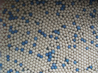
Image of the Day: Desiccant Beads

I just liked the random pattern created by these desiccant beads.

Monday, March 14, 2011

Image of the Night: Pie on Pi Day

Nothing beats sharing a slice of Mrs. Smith’s Cherry Pie served on Pi Day!

Savage Chickens: Pie Chart

Visit Doug Savage’s site here. Makes me smile, especially on Pi Day. 

Pi Day


A Brief History of pi
“Pi has been known for almost 4000 years—but even if we calculated the number of seconds in those 4000 years and calculated pi to that number of places, we would still only be approximating its actual value.”

Here’s a brief history of finding pi on the Exploratorium’s site, more on the pi Day site. and a Facebook page.

Sunday, March 13, 2011

Spirit Photography

Houdini and ghost of Abraham Lincoln
via accidental mysteries

“The late 19th century saw a rise in spiritualism in the United States and the world. Indeed, even Mrs. Abraham Lincoln was convinced that ghosts and spirits existed and this, in part, fueled others in similar beliefs. Photography at the time was still rather unaccessible and misunderstood by the ordinary citizen, their images usually taken by photographers in studios. Enter the dishonest photographer to the popular spiritual seance scene, and an opportunity for a past buck appeared. These unscrupulous photographers would bring a person into their ‘spiritual studio’ and a ‘mock’ seance was performed. Of course, when the photo was taken, the victim paid the money and instructed to come back the next day to see ‘what may have materialized.’”

Read the rest here, see more images here.

Creative Roles: The Slow Cooker


Via design feast

A series focused on the lively cast of characters whose roles make the play of Creativity were recently posted. Meet:

The Slow Cooker: “There is always a rush to make things—a desire for the instant gratification that creating can bring. This will likely always be the case, as our world dialogue spins around ‘attention spans shrinking’ and the ‘cost of entry lessening.’ But what if the fast and furious way of making was coupled with a slow and gradual path?”

Read the rest of The Slow Cooker here, and others in the series here.


Saturday, March 12, 2011

Oldest wild bird in US is new mother


via wral

“The oldest known wild bird in the U.S. is a new mother. A U.S. Fish and Wildlife Service biologist spotted the Laysan albatross that’s at least 60 years old a few weeks ago. It was with a chick at Midway Atoll, a remote wildlife refuge 1,300 miles northwest of Honolulu. A U.S. Geological Survey scientist first banded the seabird as she incubated an egg in 1956. She was estimated to be at least 5 years old at the time. The albatross has since worn out five bird bands.”

Read the rest here.

Gothic Tuscan Condensed Ampersand


via letterpress daily
Gothic Tuscan Condensed Ampersand

Vegetarian Food & Nut Co. 1926


via shorpy

Note the different varieties of "Wantmor" peanut butter sandwiches! Read more about the image here; be sure to scroll down this page to the Comments section. Read the post “Nut’s to you!” about Ardil - The Forgotten Peanut Fibre.


Friday, March 11, 2011

Van Lanen, Matthew Carter, and Ampersands


Van Lanen deliberately printed off-register in two colors .

via imprint

An Interview With Matthew Carter:

“. . . The Hamilton Wood Type Museum in Two Rivers, Wisconsin released Carter Latin (now called Van Lanen), your first-ever wood type. Can you explain who initiated the design?

MATTHEW: This project began in 2002 thanks to Richard Zauft who was teaching in Milwaukee at the time and advising the Hamilton Museum. He suggested to Hamilton that they should revive a few of their old wood types and commission a new one as a way of earning revenue. On a visit to Boston he invited me to take on the new design and I jumped at the opportunity, mainly out of curiosity about a kind of type that I had never dealt with before.”

Read An Interview With Matthew Carter — here. The Van Lanen’s ampersand makes me stop, look, and smile.

Thursday, March 10, 2011

Black Raven Brewing Company


spotted on the edible raven blog

Gray crest logo style t-shirt
“Ravens have long been held in high esteem by brewers, particularly in the British Isles. A famous London brewery once had a tame ‘mascot’ raven named ‘Joey’ that was thought to bring the brewery good luck. Many years ago while home brewing, our brewer/owner came across an old photo in an online stock photo database entitled ‘Brewer with tame raven.’ That photo was the inspiration for continuing the mystical brewery–raven connection, hence the Black Raven Brewing Company.”

More about their story here.


Keep Calm and Carry On

In light of the recent announcement by Pennsylvania Gov. Tom Corbett’s proposed budget for 2011-2012 that would cut annual state funding for Penn State roughly in half, and President Graham Spanier’s response, I was inspired to update the classic British poster from WWII.

Desktop image in red, that I am using at work.


. . . and a version in blue.

In my opinion, the best thing I can do is ignore the swirling and escalating rumors, do my job, step up to the plate when necessary, and just keep focused on the task at hand. I do not get a lot of foot traffic in my office, but perhaps anyone who sees my desktop [for now] will be influenced.

. . .


From wikipedia: “Keep Calm and Carry On was a poster produced by the British government in 1939 during the beginning of World War II, intended to raise the morale of the British public under the threat of impending invasion. It was little known and never used. The poster was rediscovered in 2000 and has been re-issued by a number of private sector companies, and used as the decorative theme for a range of other products. There are only two known surviving examples of the poster outside of government archives.

The original 1939 poster
The poster was initially produced by the Ministry of Information in 1939 during the beginning of World War II. It was intended to be distributed in order to strengthen morale in the event of a wartime disaster. Two-and-a-half million copies were printed, although the poster was distributed only in limited numbers. The designer of the poster is not known.”

Read the rest here. More about the original 1939 poster here and here, and also here from the BBCParodies of this poster design can be found here, here, and here. The original wallpaper design that I modified for the top two wallpapers can be found here.

CMYK Highway


via printeresting

“Approximately 16,000 pounds of ink cartridges from the Flint Group, an Indianapolis-based company selling printing and packaging products, was bound for a newspaper company in Portland, Maine. Red, blue, and yellow ink cartridges were inside the truck, but Ferson said there is no evidence the yellow ink was released.

Go to the story here.