Wednesday, June 26, 2013

SORM

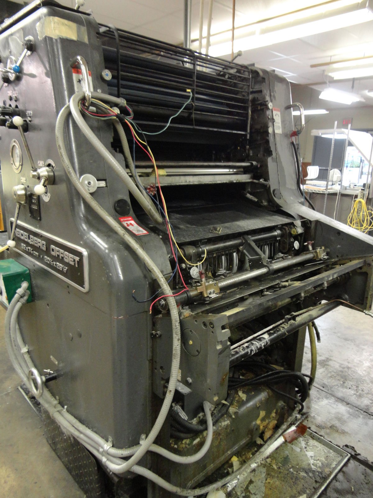
After 34 years, the offset press Heidelberg SORM at Penn State Multimedia & Print Center was retired. Acquired on May 14, 1979, she was a single color press, and had made 83,755,238 impressions by June 19th, 2013. The last job run was a publication for the Pennsylvania Junior Academy of Science (PJAS) held at Penn State. If you look closely on some of the photos, you can see one of the plates for that job was still hung on the press.
We salvaged some parts to use on our Heidelberg Z-press, and what remained was taken to Lion Surplus, Penn State’s surplus and salvage, to be sold.

Below are some photos I took while she was waiting quietly amid the busy sounds of the other presses and bindery equipment.




Thursday, December 20, 2012

Monday, November 19, 2012

I am 1 in 6


The mission of 1in6 is to help men who have had unwanted or abusive sexual experiences in childhood live healthier, happier lives. Their mission also includes serving family members, friends, and partners by providing information and support resources on the web and in the community.

Researchers estimate that 1 in 6 men have experienced unwanted or abusive sexual experiences before age 16. This is likely a low estimate, since it doesn’t include noncontact experiences, which can also have lasting negative effects.

If you’ve had such an experience, or think you might have, you are not alone. If you wonder whether such an experience may be connected to some difficulties or challenges in your life now, you are not alone.

Thursday, October 18, 2012

Boy Scout Files Detail Decades of Alleged Sex Abuse


I read in the NYTimes and CNN that the Boy Scouts released more than 20,000 documents identifying more than 1,000 leaders and volunteers banned from the group after being accused of sexual or inappropriate conduct with boys. Going out to the site, searching by state, then by town, I was not surprised to see the name that came up for my home town, yet it shook me. I downloaded the PDF and recognized the pastor of the church I attended that was given as a reference for the former scout leader. It confirmed the leader’s identity to me.

I can see his face. I can hear his voice. Smells and sounds of the era resonate in my mind. I know who he is. And I do not think I will sleep well for quite some time . . .


Update: NPR's story on this has a great link from The Los Angeles Times that has a built a searchable database that includes the vast number of files, including some from more recent years that are not part of this release.


Friday, July 6, 2012

Image of the Day: Imaginary Arabic Font — Vinyl Tears

Walking across the parking lot on my way into work this morning, I spotted this:


It looked like words in a foreign language, almost arabic-looking in its flowing nature. 

I recalled a recent interview with font designer Nadine Chahine that was posted recently on I Love Typography showing some examples of her work. Chahine is listed in Fast Company’s 100 Most Creative People in Business.

Creativity and inspiration can be found in some unlikely places; I wonder if anyone was ever inspired by torn, weathered vinyl?

The vinyl car guard.

Thursday, May 3, 2012

The “Hello” Crow


My wife finally got a little movie of the “hello” crow back in March. She was inside our home shooting this video and the sound is really muffled. The video clip starts off with it just finishing a “hello” call as it sits perched above the suet block in our backyard. Soon you can hear some small birds that are really close on the feeder by the window (they chirp sharply 2 times at about 5 and 6 seconds into the video). Listen very closely after that and watch the crow do its “hello” call again 3 times (its beak is closed but its head bobs 7 - 10 seconds into the video). It then caws a normal 8 caws with its beak open and a starling flies up to it at the end of the video.

Thursday, April 26, 2012

Art, Mystery And Posh Pigments In “Sacre Bleu“


via npr
“...These days you can walk into any drugstore and buy a cheap pack of markers in all the colors of the rainbow. That makes it hard to appreciate just how rare and precious blue pigment was, not so long ago.

“The translation of sacre bleu is sacred blue,” says [Christopher] Moore. “In medieval times, the church said that if you are going to portray the Virgin Mary's cloak, it has to be in a certain shade of blue. And that blue must be ultramarine, because ultramarine blue is permanent. It doesn't go black or fade as organic colors do. And that is made essentially from crushed lapis lazuli, which is only available in Afghanistan. If you think about the 11th and 12th century, trying to get a stone from Afghanistan to Europe, for years and right up into the 19th century, was more valuable, weight for weight, than gold…”
Read more about Christopher Moore's novel here.

Friday, March 9, 2012

Emilie de Griottes’ Pantone Tarts


Pointed out via a raven
“French food designer Emilie de Griottes for a special feature in french culinary magazine Fricote developed dessert tarts that recreate Pantone color swatches. Berries, carrots, lemon, candies, and other foods are arranged upon a tart base, whose bottom is iced in white and marked with the Pantone color represented…’
See more of her Pantone Tart creations here.

Image of the Day: Yale Lock


Tuesday, February 21, 2012

Bird by Will Ryman


via designboom
From now until March 24th, the 515 W 27th Street space in NYC boasts Will Ryman’s monumental sculpture ‘Bird,’ inspired by Edgar Allen Poe's poem, ‘The Raven.’
See more images of it here.

Tuesday, February 7, 2012

Are Sea Monkeys Vegan?

Scan from the Hanna-Barbera comic book “The Hair Bear Bunch” No. 3 August 1972, published by Gold Key  

In case you missed it, read the “Wonder if it’s Vegan?” post at the Bacon is Not an Herb blog here. I ever so vaguely recall that my older brother had Sea Monkeys for a while in the mid-1960s. I was probably under 5 years old at the time and only remember that I wasn’t allowed to touch the bowl.

Saturday, February 4, 2012

Typo . . . or is it?

From the Bargain Sheet Personals Section

One of the perks of where I work is that on break I can read copies of one of the local free publications, The Ad Bargain. I particularly like scanning for typos that are not caught by any “Spell Check” function, and are obviously not proofread all that carefully for content. Other than adding the yellow highlight, the above example has not been manipulated in Photoshop.

Friday, February 3, 2012

White and Pink Pearls


I had an instructor at the Art Institute of Pittsburgh that despised the use of Pink Pearl erasers. If he caught anyone using one in his class, he would snatch it off of their desk and throw it across the classroom. He was an evangelist of kneaded erasers, and hated the dreaded “pink streak” that Pink Pearls are notorious for leaving behind in their wake of pink crumbles. But it wasn’t until recently that I discovered that there are White Pearl erasers — no more pink streaks [I think]! I wonder if a former student of his invented this version . . .

Sunday, January 29, 2012

Glasses Case Project

Personalized glasses case

My previous black glasses case hinge broke, and my wife picked up a free case at Target, in red. Our one friend suggested personalizing with with a Sharpie®, and that gave me an idea. Drawing upon some letterboxing knowledge, I knew I could transfer laser prints with heat and with 100% acetone [nail polish remover] onto different materials. Since heat wasn’t an option, I was pretty sure the acetone method would work. I took a scan of a photo of me from August 1965 and converted it to pure black and white with a cutline filter. Because the acetone fumes are pretty nasty, I waited for a day that was decent outside. Yesterday was my day. I wrapped the laser print paper around the case, held it in place, then dipped Q-tips into the acetone. I applied a little pressure when rubbing the Q-tips on the back of the laser print, and was careful not to get any acetone on me. It worked perfectly, and the toner is not sticky at all. The only thing I would do different would be to not go back over an area that was previously rubbed — parts of the images got just a little smeary looking.

Saturday, January 28, 2012

Ghost Signs: Coca-Cola and D. Bean

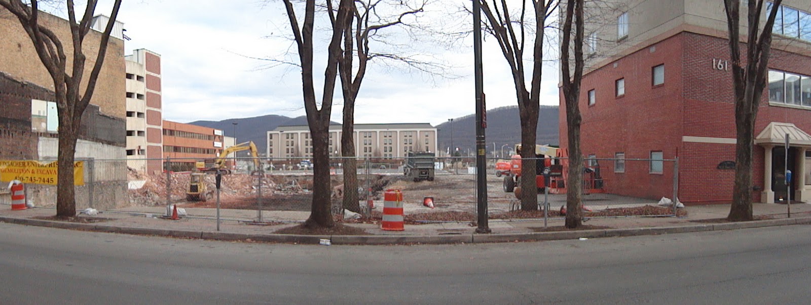
A few weeks ago, as we were traveling through Williamsport I thought I spotted a ghost sign. We were not able to stop at the time, but on a later date, made the time to explore the area.

Site of the demolition, which revealed the sign on the building to the far right.
Panorama shot by trueindigo.
Double ghost signs — top and bottom

Above the Coca-Cola sign
Coca-Cola

Click on the image to enlarge, and see the painted inscription
roughly in the center of the tarred area:
D BEAN
APR. 30  23


Friday, January 27, 2012

PSDSGNR Listserv Gathering

The first gathering of members of the PSDSGNR listserv met at Olde New York last evening. Twelve were able to make it to this informal way of putting faces to names, network, and talk about what we do outside of our work at Penn State. Lots a good ideas were shared, and plans are in the works for the next gathering.


Everyone got to choose from a selection from the
printers set of temporary tattoos from Tattly.

Monday, January 23, 2012

Saturday, January 21, 2012

You know you’ve raised a Font Snob when...

Today is the 12th anniversary of the listserv I host for the professional design community at Penn State. Below is a screen capture of a recent post by one of the 101 current members:


When asked in a later post, “How did the grub stack up to more sophisticated menu-ed establishments?”

The reply was: “Well, I wouldn’t rate it a Frutiger. But it was definitely up there with American Typewriter. (They were selling themselves short with Comic Sans.)”