Tuesday, July 12, 2011

1930s London Zoo Sign Writer

Looks like he painted a mean ampersand!

via buzzfeed
See more photos of Pauline Locke’s grandfather working at the London Zoo in the 1930s, here. He is using a Mahl stick!

AntiMosquito Fumigator App

via swissmiss
“The app claims to keep mosquitos away as long as you keep it running in the background. It emits a high-pitched sound that humans don’t hear but mosquitos do and not appreciate…”
I wonder if this app works!?!

The Johnson Box

Frank Johnson

I didn’t realize that this technique of marketing had a name until I was working on a PowerPoint slide last week.

via wikipedia
“A Johnson Box is a box commonly found at the top of direct mail letters, containing the key message of the letter. The purpose of it is to draw the reader’s attention to this key message first, and hopefully grab their attention, enticing them to read the rest of the letter. The Johnson Box is named after direct marketer Frank Johnson, who is credited as having first used the Johnson Box to improve response to his offers for American Heritage magazine. He does not claim credit for creating the device, claiming to have only popularized it.” Johnson died at the age of 88 on March 6, 2001.
See an example of a letter, believed to be from 1959, that contains a Johnson Box at the top, here. More on Johnson can be found here.

Sunday, July 10, 2011

People for Bikes

via freezethawcycles
“...We’re all united by a shared passion: bikes. Bikes keep us healthy, carry us from point A to point B, save us from high gas prices, and make our air cleaner and our roads less congested. Bikes fill our lives with adventure and excitement, relaxing our minds and energizing our souls. Peopleforbikes.org is dedicated to channeling that passion to improve the future of bicycling. Our goal is to gather a million names of support, to speak with one, powerful voice—to make bicycling safer, more convenient and appealing for everyone. Simply put, we believe that life is far more enjoyable when it’s experienced on two wheels. We believe that by coming together, we can make our world a better place to ride.”
Find out more here. 

Saturday, July 9, 2011

2-Foot Hand-Cut Playing Cards

via cmybacon
“Paper artist Emmanuel Jose is working on a year-long project hand-cutting a 2 foot tall deck of transformation playing cards out of paper, 1 card each week for 52 weeks. When his deck is completed, Emmanuel hopes to get it printed as a regular deck of cards and have a show to display his papercut designs...”
Follow his progress on his Tumblr blog, Ncyclopedia.

Friday, July 8, 2011

Loving Day: Anniversary of Loving vs. Virginia

Mildred and Richard Loving

via the daily heller
“Loving Day is a global movement to create a holiday that celebrates the anniversary of Loving v. Virginia, the Supreme Court decision that legalized interracial marriage in the United States. Mr. and Mrs. Loving were a young couple who were arrested for their interracial marriage, which was illegal in Virginia (as well as in most states at some point). The celebration was founded by Ken Tanabe, a designer, animator, and art director that works in motion, identity, print, experience design, and interactive media...”

Read the rest here. Visit the Loving Day site here.

Thursday, July 7, 2011

Christopher Jonassen: Worn-out Fryingpans


via tasteologies
Christopher Jonassen’s investigation of worn-out fryingpans reminds me of looking at images of distant planets and other celestial bodies.
See the images here.

Wednesday, July 6, 2011

1910: Moisant and Mademoiselle Fifi

Another image of John B. Moisant and Mademoiselle Fifi, aviators, ca. 1910

Old English type body sizes


via typoretum
“Prior to 1737, little standardisation existed in the sizes of printing types and typefounders cast types to their own sizes and dimensions. In this year, the Parisian typefounder Pierre Simon Fournier introduced a new system that he derived from dividing two inches of the pre-metric French foot into one hundred and forty-four equal parts. Fournier gave the resulting unit a name – ‘points’ – and they measured 0.137 of the English inch, which is close to the present point system…”
Read the rest here. I love that the term Nonpareil is equivalent to 6 points.

Chop vs. Rubber Stamp


via printeresting
“Near the beautiful Temple of Heaven Park in Beijing, one might wander past this public sculpture resembling a enormous traditional Chinese chop. It looks as if a giant person just stamped her seal onto the sidewalk.

Not to be outdone by anyone, Cleveland, OH, is quick to point out that they own the largest rubber stamp. Although to my knowledge it has never used on a sidewalk or paper, this Claes Oldenburg sculpture does appear to be bigger…”
Original post here.
http://www.printeresting.org/2011/07/05/dispatches-from-china-really-big-chop

Linotype: The Film Interview Excerpts


via letterology
In honor of the 125th anniversary of the Linotype (July 3rd, 1886) the producers of Linotype: The Film have released a few teaser excerpts of interview footage.
Read the rest and watch a teaser here, and find more videos here.

Chili Peppers and Scoville Units


Trinidad Scorpion Butch T
via make
“…The Ghost pepper Bhut Jolokia (“bhut” means ghost in Hindi) has fallen from the top. Earlier this year, Australian pepper grower Marcel de Wit unveiled a super pepper, called the Trinidad Scorpion Butch T, which tested hotter. Just two weeks ago came news reports that a Taiwanese farmer, Yeh Wu Shun, claimed his new cultivar is even hotter, scoring 1.5 million units on the Scoville scale of pepper hotness. (By comparison, a really hot jalapeno scores around 8,000 units.)”
Read the entire post here.

Tuesday, July 5, 2011

The Alamo was about Slavery


via delanceyplace
“In today’s excerpt from Delancey Place — as David Crockett entered into sparsely-populated Texas from Tennessee in 1836 hoping for riches from new land grants but unwittingly headed for martyrdom at the Alamo, white settlers there were chafing at the Mexican laws that prohibited slavery. While the causes of the Texas War for Independence were many, the principal cause was this prohibition of slavery. And of the ‘holy trinity’ of heroes at the Alamo — William Barrett Travis, James Bowie, and ‘Davy’ Crockett — both Travis and Bowie were land speculators and slave traders:

“Like many others making the same journey at the time, Crockett understood what he faced once he crossed the Red River into Texas and left the United States. He had to have been aware that, in the weeks before he departed, the animosity had increased between the government of Mexico and the American settlers, called Texians, in the Mexican state of Coahuila y Tejas, The white colonists were becoming increasingly tired of living under Mexican rule, and they headed for war with hopes of forming their own separate republic. Many of these Anglos were illegal immigrants and did not abide by Mexican law. All citizens were required to join the Catholic Church, accept the language and laws of the governing country, and, by the late 1820s, observe the ban on the enslavement of human beings…”
Read the rest here.

Suffragette Surveillance, 1912


via retronaut
“In 1912, Scotland Yard detectives bought their first camera, to covertly photograph suffragettes. The pictures were compiled into ID sheets for officers on the ground.

When Evelyn Manesta, one of the Manchester suffragettes, refused to pose for a picture, a guard was brought in to restrain her in front of the camera. But when the photograph of Evelyn Manesta appeared, the arm had been removed. The photographer had acted on official instructions to doctor the photograph so that it would be less controversial...”

Images © National Portrait Gallery, London. Read the BBC article here. More images from the BBC can be found here.

1910: Mademoiselle Fifi Crosses the English Channel


via BlackandWTF
“In 1910, on the first airplane flight across the English Channel to carry a passenger, American aviator John Moisant flew from Paris to London accompanied by both his mechanic and his cat, named either Mademoiselle Fifi or Paree, depending on which newspaper you believe…”
Visit the link here.

Letterpress and Jack Daniels


via printeresting
Watch a video of Yee-Haw Industries making letterpress prints for their Tennessee pals Jack Daniels.
The video can be found here. I’m not a whiskey fan, but it is fascinating watching the carving of the plates, much like a stamp for a letterbox.

Monday, July 4, 2011

Firecracker Labels


via letterology
See more examples of early firecracker labels here, with links to even more.

Earworm of the Day: Sinnerman by Nina Simone


Nina Simone

I first heard this song in The Thomas Crowne Affair; you can watch the clip from the movie that used the song here. A search turned up this link on Nina Simone’s life — she was was an American singer, songwriter, pianist, arranger, and civil rights activist widely associated with jazz music. Here is a link to her official website.

Sinnerman (spelled as one word) is one of Nina Simone’s most famous songs and she recorded her definitive 10-minute-plus version on her 1965 album Pastel Blues. Simone learned the lyrics of this song in her childhood when it was used at revival meetings by her mother, a Methodist minister, to help people confess their sins. In the early days of her career during the early sixties, when she was heavily involved in the Greenwich Village scene, Simone often used the long piece to end her live performances.  Listen to her 10-minute version here.

Find the lyrics to Sinnerman here, and more about the song’s history here.

Ditto


via mehallo blog
“Before there were photocopiers, scanners and printers, there was the Ditto Machine (a.k.a. spirit duplicator), produced by the Illinois-based Ditto Corporation; originally introduced in 1923…”
Read the rest here. A link for a pretty cool t-shirt can be found there as well.

The Ampersand, part 2½ of 2


via shady characters
“Although the ampersand’s creator (if it can be said to have one at all) is not recorded, there exists a popular misconception that the symbol’s name is taken from ‘Amper’s and’, after a supposed originator. Mentions of this derivation come from sources as diverse as an 1883 book on Personal and Family Names written by one H. A. Long, and more recently the collaborative, internet-based Urban Dictionary which suggests that the symbol was both invented by and named for a 17th century typesetter called Manfred Johann Amper. Unfortunately, both claims are undermined by a lack of corroborating evidence, and even more telling, ‘Manfred Johann Amper’ appears to never have existed.

The real origin of the word ‘ampersand’ likely owes more to Latin than to French, although it is a far more recent creation than the character which bears its name. During the 19th century, the ampersand was routinely taught as the twenty-seventh letter of the alphabet, and in common with those other letters which formed words by themselves — ‘A’ and ‘I’, for example — it was prefixed by the Latin per se, or ‘by itself’. Schoolchildren would recite “X, Y, Z, and per se and”, while particularly bored pupils would not so much recite as slur the final syllables to yield any one of a dazzling variety of words. This entry from Farmer & Henley’s 1905 Dictionary of Slang and Colloquial Engish recorded some of them for posterity:

Ampersand. 1. The posteriors. 2. The sign &; ampersand. Variants: And-pussy-and; Ann Passy Ann; anpasty; andpassy; anparse; apersie (a.v.); per-se; ampassy; am-passy-ana; ampene-and; ampus-and; am pussy and; ampazad; amsiam; ampus-end; apperse-and; empersiand; amperzed; and zumzy-zan...”
Read the rest here.

Image of the Day: Life is a Bowl of Perry's

It’s always fun when we drive into the regions that serve Perry’s ice cream!
More on the company can be found here.

Sunday, July 3, 2011

Klotz Type Experiment


spotted by my son
Combine wooden blocks and perspective and what you’ll get is a fascinating Block Type Experiment by Marc Bottler.
See it here.

Linotype Machines


spotted vis a friend on TunnelBug's photostream 
“These ghostly linotype machines stand guard on the 7th floor of this early 20th century gothic masterpiece in St Louis, MO. Linotypes made the plate for printing presses by embossing red hot plates of iron. I couldn't help but imagine red hot plates of iron passing the halls of this grand skyscraper…”
Visit TunnelBug's photostream here.

Restoring an 1870s Tintype


via topdog imaging and boingboing
“Bob Rosinsky from Top Dog Imaging walks through the extraordinary process of restoring a badly damaged 1870s tintype using modern, high-tech techniques, such as a polarized strobe and ultra-high-rez camera. He hints at even more advanced techniques employing X-rays, UV and infra-red light…”
Read the rest here.

Saturday, July 2, 2011

Hamilton Wood Type and Target announce a new Hamilton inspired Fall clothing line


via kartemquinfilms
Target has just announced their Fall line inspired by designs and prints from Hamilton Wood Type and Printing Museum. Visit the link below to watch a video from Target that features a behind-the-scenes look at the design, and a quick glimpse of the clothing. Also, you can find a link to an article in The Atlantic, where you can find a bit more about how this all came to be. And finally, watch a video interview from earlier this year with the Moran Brothers on how Typeface has made a positive impact on Hamilton.
All the links and more can be found here.

Image of the Day: 8783 C


Friday, July 1, 2011

Image of the Day: Time Among the Ampersands

For some reason, this clock makes me think of the Wizard of Oz.
Perhaps it is the shape of Tik-Tok...

Phipps Conservatory 1910


via shorpy
Pittsburgh circa 1910. Phipps Conservatory, Schenley Park. Detroit Publishing glass negative.
View full size here. I have loved going to Phipps Conservatory since my college days in the early 80s.

Thursday, June 30, 2011

Color Communication: When You Say X, Your Designer Hears This


via colourlovers
Image from
Hearing Color: Neil Harbisson, Cyborg
“Let me paint a picture for you. You’ve just started working with a new designer. You sat down with that person, explained all of your dreams for the design, and left the meeting feeling like you were really on the same page. Then the next time you meet with them, they present a design that is completely different than what you expected. It’s not necessarily a bad design, but it is definitely different than what you described. Sound familiar? This is what I like to call a “lost in translation” moment. And it’s exactly what inspired me to create this guide on translating “design talk.” Why is there a disconnect?…”
Read the rest here.

Odd Color Names Offer a Primer in Marketing


via nytimes
“If you heard the words “Tempest,’ ‘Turbulence’ and ‘Tornado Watch,’ you might head for the basement — fast. Paint manufacturers want you to head for the living room. In a redoubled effort to capture consumers’ attention in this sputtering economic recovery, some paint companies are hoping to distinguish their brands with names that tell a story, summon a memory or evoke an emotion — even a dark one — as long as they result in a sale. What they do not do is reveal the color…”
Read the rest here.

Alessandro Novelli’s The Alphabet


via felt and wire
“In just over a minute, Alessandro Novelli captures his (and our) love for typography and animation in The Alphabet, a spelling video inspired by children’s hornbooks..”
Read the rest, and watch the video, here. P.S. Can you spot the typo?

Image of the Day: Bad Plate


I love the texture left by the wash-up of the plate.

Business Cards of the Day

Four cards I discovered on a recent trip. Freeze Frame Reality has used a nice spot gloss varnish. The Art Out of the Box card reminded me so much of the local equivalent to it [Artbox Studios] and I just had to laugh at the similarity. The next card, well, is self-explanitory: I buy. ’nuff said. Dog Gone Walking is my favorite in this series of finds [both sides of this card are shown, along with a close-up]. Clean design, nice muted color choices, sophisticated typography along with a touch of humor on a topic that can make me go on a rant.
Click on the images for a larger view.

The Radioactive Orchestra


via designboom
“The radioactive orchestra uses data from the gamma decay of atoms as the foundation for electronic music composition…”
Read the rest here. Create your own composition on the radioactive orchestra website here.


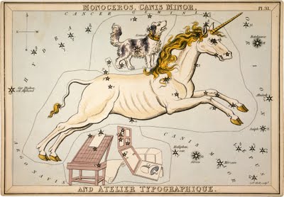
Heavenly Typography


From Urania’s Mirror: Monoceros,
Canis Minor and Atelier Typographique
, 1825
via letterology
“Some people see faint outlines of unicorns in the heavenly constellations and others see dogs, or the canis minor. Yet Mr. Jehoshaphat Aspin looked up and saw a celestial type studio in the stars with a unicorn (monoceros) jumping over it…”
Read the rest here.

Wednesday, June 29, 2011

The Art of Sleeping in a Box


pointed out by a fairy
“Start from simple sleeping on your back…or on your side…”
Read the rest here. Makes me smile.

Image of the Day: On The Shop Floor


8 line No. 35


via letterpress daily. The rich color and texture of this makes me smile.

Stoyn Ice Cream: Ché


via notcot
Not entirely sure if this is real or not, but you can visit the site here.

Paige Bradley’s Expansion


via notcot
Paige Bradley’s artist statement on her sculpture Expansion, “From the moment we are born, the world tends to have a container already built for us to fit inside: A social security number, a gender, a race, a profession or an I.Q. I ponder if we are more defined by the container we are in, rather than what we are inside. Would we recognize ourselves if we could expand beyond our bodies?  Would we still be able to exist if we were authentically ‘un-contained’?”
More images of Expansion can be found here.

Don’t Fear the Internet


via imprint
“…Jessica Hische and Russ Maschmeyer have started a wonderful little site explaining to beginners what production for the web is all about. Young designers, take heed: this is not optional information. It’s rare that a web shop would be willing to hire a designer who has no idea how HTML/CSS and JavaScript work together. Friendly and easy to understand, these guides are a good place to start.”
Be sure to visit here.

Tuesday, June 28, 2011

Image of the Night: Simply Waiting

Patience defined.

Typeface Software

This is my face as interpreted by the software.
via typeface project
“The design of typefaces is founded upon principles from the days of metal type, when creating individual fonts was a laborious process and constrained by physical requirements. Most digital type design follows those same conventions, but technology gives us opportunities to make type design more spontaneous and personal. The Typeface software translates facial dimensions into generative type design.”
Learn more about it here, and download the software to generate your own typeface.

Bizarro: The Power of Positive Thinking


via bizarro blog, this makes me smile