Friday, March 18, 2011

Six Degrees of Moby and Oliver Sacks


via wired

“On his upcoming effort Destroyed, Moby constructs synthetic symphonies out of sounds coaxed from broken-down gear during dead-of-night sessions in hotel rooms. It’s an insomniac artist’s way of making sense of the world during a time when the music industry, and everything else, seems to be falling into chaos. . . .

Wired.com: You serve on the board of directors of the Institute for Music and Neurologic Function, which works with Musicophilia: Tales of Music and the Brain author, neurologist Oliver Sacks. What would Sacks think if he heard Destroyed?

Moby: Oliver is an interesting guy, who I hold in the highest regard. But he can be a little cranky. He mainly likes classical music, so my honest answer is I think it depends on if you caught him on a good or bad day or time. If you caught him at a time where he was really relaxed and open-minded, he might take the time to listen to Destroyed’s classical and melodic influences. But I have a feeling Concetta Tomaino, the IMNF’s executive director, might be favorably disposed to it. . . .”

Read the entire article here.

Business Cards: Page XVI

[Middle Row] Anthros Medical Group card. The type treatment for the logo that has been stretched, spaced, and squished, just makes me cringe. Joe Jackson used to come into to do desktop publishing on one of the Mac Pluses that could be rented by the hour at Graphics 101. He had a gentle positive personality and wore loud colorful jam pants -- the style my son wore in elementary school.

[Bottom Row] Hotel State College; still quite a presence in State College. The Pitman-Moore card—Ethical Sales Representative II? What a job title! A seach online shows that the company ‘produces pharmaceutical and biological products for animals.”

Thursday, March 17, 2011

200-year-old love letter found in chair


via retronaut

“A 200-year-old love letter has been found in the arm of a chair at a furniture upholsterers in Tewkesbury, Gloucestershire, England. The note, written in French, was in the chair bought in a house clearance in France. ‘When I started to work on the arm’, said Graham Simpson of Theocus Furniture, ‘I could see a small note, tightly folded up, about the size of a penny. When I opened it, to my amazement it was a note written in pencil, in old French.’

The style of language suggests the letter was composed about 200 years ago. It was written from a man to a woman and sent from the town of Mercurol in the Alps. The translated letter:

“My dear small love, do not be worried, do you seriously believe I would tell anything to these people, who don’t understand anything about love?


If someone insists that I say something, it will be anything but the dear love acquired by you, which is the great treasure hidden in my heart.


I didn’t tell you to come yesterday because I didn’t have the opportunity, but do come every Tuesday around 5:30, and Fridays as well; I count/hope on you tomorrow.


At the moment I write this letter, I can hear my aunt yelling, who else annoys us all day long, today and tomorrow.


My dear, I cover you with kisses and caresses until… I need you in this moment of desire. I love you.”

Hecht Sewing Machine & Motor Co.


via imprint

“The other day [Steven Heller] was taken by Times Design Director Tom Bodkin to an unassuming, narrow storefront on West 38th street in the bustling Garment Center / Port Authority / New York Times area around 8th Avenue. Hecht is the name and once inside this Sewing Machine & Motor Co., Inc. comes alive with the past. The proprietor Steven Hecht is the proud collector of all things mechanical (his 94 year old father is the skilled repairer of all things machine) and the shop, the high walls and narrow 1920s-era space is filled with everything from mannequins to vintage sewing apparatus, with lights, lamps, buffers and stainless Mack Truck dogs sprinkled all around (and on two floors too). . . ”


Read the rest here. A bit of online searching turned up a great ampersand on their signage; I hope to get a photo of it in person someday. Read more about Hecht’s here.

Aled Lewis’ Toy Stories


via how

“London-based designer and illustrator Aled Lewis decided to challenge himself to make a new image every day in 2011. Part of that project is a series of photo illustrations called Toy Stories where Aled photographs actual toys and adds clever/silly text with hilarious results…”

Read the rest here, visit the Toy Stories gallery here.

Wednesday, March 16, 2011

Image of the Day: Button

Found on a walk near Katz Building; made me smile.

The Visual Topography of a Generation Gap


via Things Neatly Organized

Dan Bejar writes, “A copy was made from my original apartment key, then a copy was made from that copy. This process was repeated until the original keys information was destroyed, resulting in the topography of a generation.”6

Tuesday, March 15, 2011

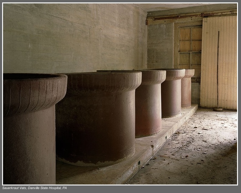
Christopher Payne’s Asylum


via utne reader

“The state mental hospitals of the 19th and early 20th centuries—originally known as ‘lunatic asylums’—often operated within massive, majestic buildings, most of which are now abandoned or operating at a fraction of their former capacity. Christopher Payne spent several years meticulously photographing 70 of these architectural marvels, and his haunting images are collected in the beautiful new book Asylum: Inside the Closed World of State Mental Hospitals, just out on MIT Press. Neurologist-writer Oliver Sacks, who worked for 25 years at Bronx State Hospital (now Bronx Psychiatric Center), pens the book’s introduction, a lively tour through the history of these asylums’ philosophies, inner workings, and patient populations as they shifted over the years.

Read the rest here. Visit Christopher Payne’s site here to see a slideshow of images, MIT Press page here.


Sauerkraut Vats, Danville State Hospital, PA  As a child, I remember passing the Selinsgrove State Colony for Epileptics— a rambling state hospital on the way to visit my grandmothers. A few of the residents at that facility would stand or sit on benches by the road and wave to the passing cars traveling by on Route 522 . In later years I discovered that the daughter of one of my maternal grandmother’s sisters was a resident at one of Pennsylvania’s hospitals caring for the mentally retarded.

Wood Type of the Month: Goudy Bold


via International Printing Museum

Read this month’s wood-type column to learn about this popular typeface that was the darling of the liquor industry and was also used in the title of several movies.

Read more about Goudy Bold here.

1908: Many of These There


via shorpy

“November 1908. Lincolnton, North Carolina. Daniel Mfg. Co. Girl beginning to spin. Many of these there. Photograph by Lewis Wickes Hine.”

View full size here.

Business Cards: Page XV

[Top Row] The Nut Ranch — this looks like just the start of the design process; “Hmmm... what were all the elements that the client requested on their card? I’ll place the graphic and set the type they wrote down on this scrap of paper. I wonder how it would look all stacked flush left? Not quite right; the balance seems to be off, the house seems lost, and the point sizes aren’t quite right. Oh, and they are missing the city, state, and zip code. I’ll get to that later. Hmmm... Let’s see, if I make the... [phone rings]. Hello? Oh, funny coincidence, I was working on your card just now! Oh, you need it NOW? I wasn’t really finished, but... well sure it looks okay, but... if you are sure. I’d really rather you see a proof before we print it. You don’t have a fax machine? How many? WHEN? Okay, I’ll literally burn the plate as soon as I am off the phone. They’ll still be wet when you pick them up, just keep that in mind.” 


The middle card is Nittany Valley Offset’s. I always liked the full-color ribbon effect with the subtle n [in blue to green] and v [orange to red] on this fold-over card. For a while they were going by NVO, and I guess this ribbon effect didn’t include an o.They are still one of the better printers in the region, but their new logo has taken a dive. Far right card: The drop cap T just overwhelms this card, and the double rule lines are just unnecessary.

[Middle Row] Gold foil on transparent red plastic, now THAT says sandblasting to me! [ *s ] Again, low light and even color blind people will have a trip with this card. Far right card, one of the many in my collection of my father-in-law’s. This was printed at Penn State Printing Services before I started there in ’93. The Lion on the shield is referred to the ‘buggy eyed lion’ — used when the logo is relatively small. Jim’s personal card is below this one, probably done at either Kish Printing or Lewistown Printing, but my bet is the latter. Hot type, multiple font faces, centered. Classic Lewistown Printing style. I loved taking projects to them while I worked across the street at Danks Department store as the graphic designer and later as art director. Seeing a Linotype in action while you wait for a proof to be pulled was stepping back into another era.

[Bottom Row] WC Fritos card from my joining the WC Fritos club. Next, I always liked this card from State College the magazine, most likely designed at Snavely, Vidar, and Associates. Good use of having items “on a grid” and sticking to it, as well as color choices and complementing fonts.


Image of the Day: Desiccant Beads

I just liked the random pattern created by these desiccant beads.

Monday, March 14, 2011

Image of the Night: Pie on Pi Day

Nothing beats sharing a slice of Mrs. Smith’s Cherry Pie served on Pi Day!

Savage Chickens: Pie Chart

Visit Doug Savage’s site here. Makes me smile, especially on Pi Day. 

Pi Day


A Brief History of pi
“Pi has been known for almost 4000 years—but even if we calculated the number of seconds in those 4000 years and calculated pi to that number of places, we would still only be approximating its actual value.”

Here’s a brief history of finding pi on the Exploratorium’s site, more on the pi Day site. and a Facebook page.

Sunday, March 13, 2011

Spirit Photography

Houdini and ghost of Abraham Lincoln
via accidental mysteries

“The late 19th century saw a rise in spiritualism in the United States and the world. Indeed, even Mrs. Abraham Lincoln was convinced that ghosts and spirits existed and this, in part, fueled others in similar beliefs. Photography at the time was still rather unaccessible and misunderstood by the ordinary citizen, their images usually taken by photographers in studios. Enter the dishonest photographer to the popular spiritual seance scene, and an opportunity for a past buck appeared. These unscrupulous photographers would bring a person into their ‘spiritual studio’ and a ‘mock’ seance was performed. Of course, when the photo was taken, the victim paid the money and instructed to come back the next day to see ‘what may have materialized.’”

Read the rest here, see more images here.

Creative Roles: The Slow Cooker


Via design feast

A series focused on the lively cast of characters whose roles make the play of Creativity were recently posted. Meet:

The Slow Cooker: “There is always a rush to make things—a desire for the instant gratification that creating can bring. This will likely always be the case, as our world dialogue spins around ‘attention spans shrinking’ and the ‘cost of entry lessening.’ But what if the fast and furious way of making was coupled with a slow and gradual path?”

Read the rest of The Slow Cooker here, and others in the series here.


Saturday, March 12, 2011

Oldest wild bird in US is new mother


via wral

“The oldest known wild bird in the U.S. is a new mother. A U.S. Fish and Wildlife Service biologist spotted the Laysan albatross that’s at least 60 years old a few weeks ago. It was with a chick at Midway Atoll, a remote wildlife refuge 1,300 miles northwest of Honolulu. A U.S. Geological Survey scientist first banded the seabird as she incubated an egg in 1956. She was estimated to be at least 5 years old at the time. The albatross has since worn out five bird bands.”

Read the rest here.

Gothic Tuscan Condensed Ampersand


via letterpress daily
Gothic Tuscan Condensed Ampersand

Vegetarian Food & Nut Co. 1926


via shorpy

Note the different varieties of "Wantmor" peanut butter sandwiches! Read more about the image here; be sure to scroll down this page to the Comments section. Read the post “Nut’s to you!” about Ardil - The Forgotten Peanut Fibre.


Friday, March 11, 2011

Van Lanen, Matthew Carter, and Ampersands


Van Lanen deliberately printed off-register in two colors .

via imprint

An Interview With Matthew Carter:

“. . . The Hamilton Wood Type Museum in Two Rivers, Wisconsin released Carter Latin (now called Van Lanen), your first-ever wood type. Can you explain who initiated the design?

MATTHEW: This project began in 2002 thanks to Richard Zauft who was teaching in Milwaukee at the time and advising the Hamilton Museum. He suggested to Hamilton that they should revive a few of their old wood types and commission a new one as a way of earning revenue. On a visit to Boston he invited me to take on the new design and I jumped at the opportunity, mainly out of curiosity about a kind of type that I had never dealt with before.”

Read An Interview With Matthew Carter — here. The Van Lanen’s ampersand makes me stop, look, and smile.

Thursday, March 10, 2011

Black Raven Brewing Company


spotted on the edible raven blog

Gray crest logo style t-shirt
“Ravens have long been held in high esteem by brewers, particularly in the British Isles. A famous London brewery once had a tame ‘mascot’ raven named ‘Joey’ that was thought to bring the brewery good luck. Many years ago while home brewing, our brewer/owner came across an old photo in an online stock photo database entitled ‘Brewer with tame raven.’ That photo was the inspiration for continuing the mystical brewery–raven connection, hence the Black Raven Brewing Company.”

More about their story here.


Keep Calm and Carry On

In light of the recent announcement by Pennsylvania Gov. Tom Corbett’s proposed budget for 2011-2012 that would cut annual state funding for Penn State roughly in half, and President Graham Spanier’s response, I was inspired to update the classic British poster from WWII.

Desktop image in red, that I am using at work.


. . . and a version in blue.

In my opinion, the best thing I can do is ignore the swirling and escalating rumors, do my job, step up to the plate when necessary, and just keep focused on the task at hand. I do not get a lot of foot traffic in my office, but perhaps anyone who sees my desktop [for now] will be influenced.

. . .


From wikipedia: “Keep Calm and Carry On was a poster produced by the British government in 1939 during the beginning of World War II, intended to raise the morale of the British public under the threat of impending invasion. It was little known and never used. The poster was rediscovered in 2000 and has been re-issued by a number of private sector companies, and used as the decorative theme for a range of other products. There are only two known surviving examples of the poster outside of government archives.

The original 1939 poster
The poster was initially produced by the Ministry of Information in 1939 during the beginning of World War II. It was intended to be distributed in order to strengthen morale in the event of a wartime disaster. Two-and-a-half million copies were printed, although the poster was distributed only in limited numbers. The designer of the poster is not known.”

Read the rest here. More about the original 1939 poster here and here, and also here from the BBCParodies of this poster design can be found here, here, and here. The original wallpaper design that I modified for the top two wallpapers can be found here.

CMYK Highway


via printeresting

“Approximately 16,000 pounds of ink cartridges from the Flint Group, an Indianapolis-based company selling printing and packaging products, was bound for a newspaper company in Portland, Maine. Red, blue, and yellow ink cartridges were inside the truck, but Ferson said there is no evidence the yellow ink was released.

Go to the story here.

Wednesday, March 9, 2011

K Chronicles: Socks and the Sleeping Mouse


Yet another reason I really enjoy Keith Knight’s strips.

Image of the Day: At 25 or 6 Before

Taken at 35 m.p.h. on my College Avenue commute this morning. I am amazed how well the shot turned out!
“Ooops, I forgot the word ‘of’ — I’ll just add it above!”

What is Your Favorite Color?


via Triiibes Press

“Once a child was asked, ‘what is your favourite colour?,’ a common enough question . . . yet a stunning reply . . . ‘today,’ she said softly, ‘it’s yellow.’ I have remembered that forever and it has released me from the pain of choosing just one colour to be my favourite when there are so many to enjoy every moment.”

— Sarah Farrugia, Strategist, Thinker, Writer, Progressive

Tuesday, March 8, 2011

The Brilliant Line


via communication arts

“This collaboration between the Rhode Island School of Design [RSID] Museum of Art and RISD’s Interactive Media Department serves two separate needs: to entice visitors to the exhibition and to display at the exhibition as a way for visitors to learn more about the art and printmaking.

A map interface offers a unique user interface that allows for all the artworks to be displayed at the same time it offers information about their origination. There are two modes for viewing the artworks—one enables viewers to enlarge the art and the other allows them to analyze it by layering the etching lines to see how the artist built up the form within each piece. ”

Read the rest of the post here. Explore The Brilliant Line here, enjoy the “Analyze Lines” option, and watch the video of the engraving process.

Monday, March 7, 2011

Image of the Day: Electro • Touch

Rufous rust, yellow peeling paint, and a cool name —Electro • Touch — all topped off with a lightning bolt with indigo highlights! Spotted near where I park at work.

Ads Worth Spreading


via TED

“The 10 winners of TED’s inaugural Ads Worth Spreading initiative have been announced from the stage. Selected from more than 1,000 submissions from around the world, they are some of the most creative, compelling and out-of-the-box communications of the past year. The winners are a truly diverse group — from major agencies to tiny boutiques to college students and non-profits, hailing from around the world.

Chris Anderson had this to say about the effort: “We’re seeking to reverse the trend of ads being aggressively forced on users. We want to nurture ads so good you choose to watch – and share. On TED.com, ads run after our talks, not before. As well as avoiding the annoyance of interruption, this positioning means they can run longer than the TV-standard 30-seconds. And that’s the key — in 2-3 minutes, there’s more time to tell a story, share an idea, make an authentic human connection. These winning ads, many of them long-form, powerfully demonstrate these strengths. We think they represent an exciting new way for companies to engage with the world in the internet age.”

Read the rest here, and watch the videos here.

Edinburgh Civic Survey (1949)


via Ace Jet 170

“This huge book (280 x 360mm & 111 pages) is full of the incredible post-war maps of Edinburgh. Prepared by Patrick Abercrombie and Derek Plumstead for the Town Council, the book contains detailed data for traffic, health, education, recreation, population density and so on, beautifully depicted in a series of maps, charts and diagrams.”

More about the book can be found here. I especially love the compasses that sit at the foot of each map under the key.

Sunday, March 6, 2011

Kodak Moments

This weekend has been filled with Kodak moments. My father-in-law is working on recreating the top portion to a wooden tripod that was built before 1914, and he shared his progress with us.

On the left,  a similar tripod top found at an antique store. He is using this 1914 version as a guide for recreating a larger version. He fabricated the brass fixtures himself.
The Folmer & Schwing tripod top -- with an ampersand stamped into the wood.
Close-up of the ampersand.
Demonstrating how the top goes onto the legs of the tripod.


We also set-up the Crosley slide and negative scanner on their Mac as well. Above is the set-up using a Kodak Transparency Illuminator to view the slides. The slides here were processed October 27, 1965 and cost 10¢ for first class shipping.

More on Kodak’s Folmer & Schwing Division, their professional apparatus division, can be found here.  See a Kodak Folmer & Schwing No 8 Cirkut Outfit Cycle Graphic wooden tripod here.

Elsa Mora’s Papercuttings


The Ride

via a friend

Visit Elsa Mora’ blog dedicated to the magic art of papercutting here; more of her work here. Makes me smile.


Pillows and Maps


via The Bright Side Project

“Cath Young of My Bearded Pigeon creates organic throw pillows that are so beautiful you may not want anyone to touch them. The combination of vintage images and modern organic textiles are inspired . . . ”

Read the rest here, and visit My Bearded Pigeon here.

James Blake’s CMYK EP


via printeresting

“This release from James Blake was apparently issued in three transparent vinyl colorways . . .”

Business Cards: Page XIV

[Top Row] White on tan can be elegant, but never works in low light situations.

[Middle Row] The type stacking treatment almost works for The Dwelling Place -- it was a great store in Lewisburg none the less. Creative Lighting -- I was 99.9%% sure this design is from Art Nouveau design, and modified for the card. The type on the card is just a bit too crowed overall. A quick Google search for “light bulb ephemera + art nouveau” led me to this 1907 ad for AEG metallic filament lightbulbs. Thanks, Google!

[Bottom Row]  pictureline — I'm not usually a big fan of all lowercase type treatments, but this works.

Saturday, March 5, 2011

Rock-Paper-Scissors: You vs. the Computer


My results playing 13 rounds this morning
via nytimes

“Computers mimic human reasoning by building on simple rules and statistical averages. Test your strategy against the computer in this rock-paper-scissors game illustrating basic artificial intelligence. Choose from two different modes: novice, where the computer learns to play from scratch, and veteran, where the computer pits over 200,000 rounds of previous experience against you.”


Play it here.  Now I wonder how the computer would do playing Rock Paper Scissors Lizard Spock?


Contest for Pi Day


via green chair press

“The websites Serious Eats and Instructables have held a Pi Day Pie Contest the past couple of years. (Pi Day commemorates the mathematical constant π — 3.14159… — and is held on March 14.)”

Read the rest here, and find out how to enter the 2011 Pi Day Baking Contest here. Visit the official pi day site here,  and read more about the background and history here.

Ada Lovelace Day: 7 October 2011


“Ada Lovelace Day is an international day of celebration of the achievements of women in science, technology, engineering and maths. This year Ada Lovelace Day will be held on Friday 7 October. Ada Lovelace was one of the world’s first computer programmers, and one of the first people to see computers as more than just a machine for doing sums. She wrote programmes for Charles Babbage’s Analytical Engine, a general-purpose computing machine, despite the fact that it was never built. She also wrote the very first description of a computer and of software.”

Find out more about Ada Lovelace here, and here.

The 15 Most Important Women in Tech History


via make

No. 2: Grace Hopper
“In addition to inventing the first computer complier in 1952, Admiral Hopper developed COBOL (Common Business-Oriented Language), was credited with popularizing the term ‘bug’ and ‘debugging’ – reportedly when she had to remove a moth from the inside of a computer, was instrumental in the creation of FLOW-MATIC language for the UNIVAC I and UNIVAC II computers and was quoted as saying ‘It is easier to ask forgiveness than it is to get permission.’”

Read more about Admiral Grace Hopper, and the other 14 women, here.

Earworm: 56K Modem