Sunday, March 6, 2011

Kodak Moments

This weekend has been filled with Kodak moments. My father-in-law is working on recreating the top portion to a wooden tripod that was built before 1914, and he shared his progress with us.

On the left,  a similar tripod top found at an antique store. He is using this 1914 version as a guide for recreating a larger version. He fabricated the brass fixtures himself.
The Folmer & Schwing tripod top -- with an ampersand stamped into the wood.
Close-up of the ampersand.
Demonstrating how the top goes onto the legs of the tripod.


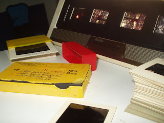
We also set-up the Crosley slide and negative scanner on their Mac as well. Above is the set-up using a Kodak Transparency Illuminator to view the slides. The slides here were processed October 27, 1965 and cost 10¢ for first class shipping.

More on Kodak’s Folmer & Schwing Division, their professional apparatus division, can be found here.  See a Kodak Folmer & Schwing No 8 Cirkut Outfit Cycle Graphic wooden tripod here.

Elsa Mora’s Papercuttings


The Ride

via a friend

Visit Elsa Mora’ blog dedicated to the magic art of papercutting here; more of her work here. Makes me smile.


Pillows and Maps


via The Bright Side Project

“Cath Young of My Bearded Pigeon creates organic throw pillows that are so beautiful you may not want anyone to touch them. The combination of vintage images and modern organic textiles are inspired . . . ”

Read the rest here, and visit My Bearded Pigeon here.

James Blake’s CMYK EP


via printeresting

“This release from James Blake was apparently issued in three transparent vinyl colorways . . .”

Business Cards: Page XIV

[Top Row] White on tan can be elegant, but never works in low light situations.

[Middle Row] The type stacking treatment almost works for The Dwelling Place -- it was a great store in Lewisburg none the less. Creative Lighting -- I was 99.9%% sure this design is from Art Nouveau design, and modified for the card. The type on the card is just a bit too crowed overall. A quick Google search for “light bulb ephemera + art nouveau” led me to this 1907 ad for AEG metallic filament lightbulbs. Thanks, Google!

[Bottom Row]  pictureline — I'm not usually a big fan of all lowercase type treatments, but this works.

Saturday, March 5, 2011

Rock-Paper-Scissors: You vs. the Computer


My results playing 13 rounds this morning
via nytimes

“Computers mimic human reasoning by building on simple rules and statistical averages. Test your strategy against the computer in this rock-paper-scissors game illustrating basic artificial intelligence. Choose from two different modes: novice, where the computer learns to play from scratch, and veteran, where the computer pits over 200,000 rounds of previous experience against you.”


Play it here.  Now I wonder how the computer would do playing Rock Paper Scissors Lizard Spock?


Contest for Pi Day


via green chair press

“The websites Serious Eats and Instructables have held a Pi Day Pie Contest the past couple of years. (Pi Day commemorates the mathematical constant π — 3.14159… — and is held on March 14.)”

Read the rest here, and find out how to enter the 2011 Pi Day Baking Contest here. Visit the official pi day site here,  and read more about the background and history here.

Ada Lovelace Day: 7 October 2011


“Ada Lovelace Day is an international day of celebration of the achievements of women in science, technology, engineering and maths. This year Ada Lovelace Day will be held on Friday 7 October. Ada Lovelace was one of the world’s first computer programmers, and one of the first people to see computers as more than just a machine for doing sums. She wrote programmes for Charles Babbage’s Analytical Engine, a general-purpose computing machine, despite the fact that it was never built. She also wrote the very first description of a computer and of software.”

Find out more about Ada Lovelace here, and here.

The 15 Most Important Women in Tech History


via make

No. 2: Grace Hopper
“In addition to inventing the first computer complier in 1952, Admiral Hopper developed COBOL (Common Business-Oriented Language), was credited with popularizing the term ‘bug’ and ‘debugging’ – reportedly when she had to remove a moth from the inside of a computer, was instrumental in the creation of FLOW-MATIC language for the UNIVAC I and UNIVAC II computers and was quoted as saying ‘It is easier to ask forgiveness than it is to get permission.’”

Read more about Admiral Grace Hopper, and the other 14 women, here.

Earworm: 56K Modem


Friday, March 4, 2011

Digital Detox


via utne reader

“The National Day of Unplugging (NDU) is observed from sundown Friday, March 4, until sundown on Saturday, March 5, NDU challenges us to turn off our smartphones, shut down our laptops, and unplug our televisions to observe a modern day of rest. Developed by Reboot, a nonprofit organization that aims to reinvent Jewish traditions, the NDU is for people of any faith or no faith. The 25-hour period is guided by Reboot’s Sabbath Manifesto, which encourages a weekly “time-out” following ten principles: 1) Avoid technology; 2) Connect with loved ones; 3) Nurture your health;     4) Get outside; 5) Avoid commerce; 6) Light candles; 7) Drink wine; 8) Eat bread; 9) Find silence; and 10) Give back.”

Read the rest here.

Making Faces: Metal Type in the 21st Century


Via creativepro
The documentary film, Making Faces: Metal Type in the 21st Century, is now ready for DVD release and select theatrical screenings.

Read the rest here, more on the documentary here, and preorder a copy here.

The Fading Sounds of Analog Technology


Via NYTIMES by David Pogue

“As digital technology takes over, we're losing the sounds of analog technologies. And sometimes that's a real loss. A dial tone can serve a useful purpose . . . ”

Read the rest here.

Letter Heads


via the daily heller

“You’ve heard of Dead Heads (followers of the Grateful Dead), well now there are Letter Heads (grateful followers of letterhead designs). I don’t think there are as many of the latter as there are of the former, but I heard a rumor that Jerry Garcia might have collected letterheads (but then again, it is just a rumor)...”

Read the rest, and see more great examples of 1940s letterheads here. I really like how the smoke curls up through the type on this letterhead. 

Finch Paper: 1930s-era Papermaking Film


via finch

“Newsprint was Finch Paper’s stock-in-trade when this film of the papermaking process was prepared in the early 1930s. The film traces the creation of Finch Paper from New York’s Adirondack forests to our mill in Glens Falls, where logs were mechanically ground up into pulp and then made into newsprint and, ultimately, newspapers. Although our basic approach to papermaking remains remarkably similar today, the technologies and our products are far different.

Watch it here, and contrast it with making premium printing papers here.

Green’s Dictionary of Slang


via cnn

“The publication of Green’s Dictionary of Slang—a product of 17 years of work that make it the largest slang dictionary ever published in English—is for anyone who loves words and likes to laugh.”

Read the rest of the post here.

“The three volumes of Green’s Dictionary of Slang demonstrate the sheer scope of a lifetime of research by Jonathon Green, the leading slang lexicographer of our time. A remarkable collection of this often reviled but endlessly fascinating area of the English language, it covers slang from the past five centuries right up to the present day, from all the different English-speaking countries and regions. Totaling 10.3 million words and over 53,000 entries, the collection provides the definitions of 100,000 words and over 413,000 citations.”

Priced at $450, you can order it here.

Business Cards: Page XIII

[Middle Row] Great color choices for the Newport Bay Restaurant card; it fits the rustic feel.

[Bottom Row] Middle card: A sample card again. The angled torn paper really helps to make this card stand out.

Thursday, March 3, 2011

Happy Birthday Ira Glass


Ira Glass (born March 3, 1959) is an American public radio personality, and host and producer of the radio and television show This American Life, one of our favorite podcasts to enjoy on road trips.

You can learn more about him here, he answers questions about himself here, and listen to him interview his first cousin once removed composer Philip Glass here,

Ira Glass/Philip Glass Join Forces At Soho Apple Store Jan 21, 2010


Fishs Eddy & Vintage Metal Stationer’s Engraving Blocks


via pomme designs

“ . . . Dave, one of the owners of Fishs Eddy, made a fortuitous find on a recent buying trip to the Midwest: Vintage metal stationer's engraving blocks from the 1940’s and 1950’s! He came back with hundreds of initials and full addresses, most in their original boxes with handwritten names and dates of when they were last used.”

I had the great pleasure of seeing these engraving blocks in person with two of my best  friends. Fishs Eddy is a fascinating place to wander through. I noticed what looked like letterpress blocks nestled on an old desk surrounded by glassware. The outer boxes were curious as well with handwritten labels from the ’40s. I realized what they were, and while looking through the various names, monograms, and address blocks from the Philadelphia region, it was thrilling to even find a few that were still wrapped and taped closed, never opened since they were created by Baily Banks & Biddle. Priced very reasonably, I just couldn’t figure out what I could use these for, so I just appreciated them for their beauty and craft and continued exploring and shopping with my companions.


Earworm: The Chain

A few years after this album was released, I picked it up [along with a dozens other albums being discarded] beside a dumpster behind the Mifflin County Library. This  was before I drove, so I balanced the stack on my skateboard, and pushed them home through the back alleys to Walnut Street.

Listen to The Chain here.

Shackleton’s Antarctica in Color, 1915


via retronaut

“These are Frank Hurley’s famous early colour photographs of Sir Ernest Shackleton’s ill-fated ‘Endurance’ voyage, as part of the British Imperial Trans-Antarctic Expedition, 1914-1917. Hurley was the official photographer on the expedition.”

Read the rest, and see more of Hurley’s color photographs here.

Wednesday, March 2, 2011

March 2, 1887: Birth of the Master Locksmith


via wired

1887: Harry Soref is born. The inventor will miniaturize the security of a bank vault into the everyday padlock.

Read about him here.

Oliver Sacks: Prosopagnosia

via world science festival
The Story of the Living, Breathing Mirror
Living with the perceptual disorder known as prosopagnosia—the inability to recognize even the faces of people you know—can be difficult. But it can also be awkwardly funny, as the legendary author and neurologist Oliver Sacks recounts from his life experiences of living face blind.


Can I Catch Face Blindness?


Coping with Face Blindness


More on Oliver Sacks’ most recent book, The Mind’s Eye, can be found here. Watch short videos featuring Chuck Close here. I remember first seeing a painting by Close at the Carnegie Museum of Art in the early ’80s. It was fascinating seeing a large painting of his from across a massive room, and being constantly amazed as I walked up to within inches of it.

Becky Blanton: Secrets of Black & White


via colourlovers

“There really is no such thing as color. Color is just the reflection of light, which is why at night things are shades of grey, or black — there is no light to reflect. During the day, or with a flashlight, different substances or objects absorb and reflect different wavelengths of light, making us believe we are seeing color when we’re not.

The power of color then is its ability to alter our consciousness, our thoughts, our emotions, our perceptions. White is the presence of ALL color and the absence of all color. Black is the absence of all color and the presence of all color. If you mix all the primary colors — you get black. Yet you cannot mix any pigments to get white, although through additive and subtractive mixing of light you can. Where does the color go? And where does it come from?”

Read the rest of the post here, go to TRiiiBES’ Color & Form PDF here.


Marko Costanzo: Foley Artist


via wired

“If you want a film to really have visceral impact, the sound maketh the movie—and the foley artist maketh the sound. During a shoot, mic placement is optimized for dialog, and the quality of background sounds can suffer. That’s where the foley artist steps in, re-creating and recording those other noises, from footsteps to crackling fires, as discrete layers that can be edited into the scene. The practice goes back to Jack Foley, part of the team that transformed the 1929 silent movie Show Boat into an ear-tickling musical hit. Some say great foley is the stuff that goes unnoticed: the soft swirl of a waltzing dress. . . ”

Read the rest here.

Wood Type: 5 line De Vinne


via letterpress daily

I love the slight nick in the Open Counter.


Tuesday, March 1, 2011

Tekhelet, Snails, and the Midnight Sky


via nytimes

“One of the mysteries that scholars have puzzled over for centuries is the exact shade of blue represented by ‘tekhelet,’ which the Bible mentions as the color of ceremonial robes donned by high priests and ritual prayer tassels worn by the common Israelite.

Though scientists and scholars are still debating the exact shade of the ritual blue, the dye used is modeled after a 2,000-year-old textile, above, and is produced from sea snails found in Israeli waters.

What was known about tekhelet (pronounced t-CHELL-et) was that the Talmud said it was produced from the secretion of the sea snail, which is still found on Israeli beaches. Traditional interpretations have characterized tekhelet as a pure blue, symbolic of the heavens so that Jews would remember God. Not so, according to an Israeli scholar who has a new analysis: tekhelet appears to have been closer to a bluish purple.

The scholar, Zvi C. Koren, a professor specializing in the analytical chemistry of ancient colorants, says he has identified the first known physical sample of tekhelet in a tiny, 2,000-year-old patch of dyed fabric recovered from Masada, King Herod’s Judean Desert fortress, later the site of a mass suicide by Jewish zealots after a long standoff against the Romans.

‘It really is majestic,’ Dr. Koren said of the shade, which he said remained close to its original hue and appeared to be indigo. . . ”

Read the rest here.
Virtual Letterpress for iPad


via Mark Simonson Studio 

“LetterMPress is a virtual letterpress app for the iPad—at least that’s the idea. The project is using Kickstarter to raise funds to complete the app and to acquire wood type fonts to include (virtually) in the app.

... Not only will you be able to make compositions on a virtual press bed with virtual wood type, mix and apply virtual ink, and make virtual prints, if all goes according to plan, you will be able to send them your design and have it all done for real, with real wood type, ink, and paper.”

Learn more about the project here.

Spring 2011 Migration of Ruby-throated Hummingbirds


For those that like to track Hummingbirds, a nice site to follow their migration.

Earworm: All the Gold in California


I remember hearing this song by Larry Gatlin & The Gatlin Brothers Band in 1979 on local radio stations WKVA and WMRF. Though not typically a fan of country songs, the vocal harmonies have always stuck with me.


Listen to it here.

Monday, February 28, 2011

Image of the Day: Tavern on the Green Man

This green man, and a matching twin, are on the northern entrance of the Central Park Visitor Center at Tavern on the Green.

Earworm of the Day: You’re The Storm

I originally heard this song by The Cardigans on Pandora.  I like the sound quality that they create, especially on the refrain.

. . . cause you’re the storm that I've been needing
and all this peace has been deceiving
I need some wind to get me sailing
so it's the storm that I believe in
you fill my heart, you keep me breathing
'cause you're the storm that I believe in


The rest of the lyrics can be found here. Not much into the video, but the music created.

Electric Sheep


via electricsheep

Electric Sheep is a collaborative abstract artwork founded by Scott Draves. It’s run by thousands of people all over the world, and can be installed on any ordinary PC or Mac. When these computers ‘sleep,’ the Electric Sheep comes on and the computers communicate with each other by the internet to share the work of creating morphing abstract animations known as ‘sheep.’ The result is a collective ‘android dream,’ an homage to Philip K. Dick’s novel Do Androids Dream of Electric Sheep.


Another post resurrected for my previous blog, I forgot about it until I saw it running on my son’s Mac. Explore, download, and create electric sheep for dreaming androids here.

Business Cards: Page XII


[Top Row] The first card in this row is a sample — the embossed paper with a page curl is a nice treatment. I really like the next two cards artwork -- big and bold. The color “pops” on the Janae Berry card, and I like how the leaves break out of the black box on Susan Alexander’s card, On both of these though, I feel the type below the art is just too close to the bottom edge of the card.

[Middle Row] First colum: I really like the muted colors of the periwinkle and tangerine inks on this sample card; but dislike the overall text placement.

Sunday, February 27, 2011

His Master’s Vice


via that’s right


Makes me smile.

Wood Type: 8 line Rugged


via letterpress daily

The abstract quality of the magenta dimples against the woodgrain is breathtaking. Find more great letters here.

Business Cards: Page XI

[Top Row] Middle card: The deeply embossed wool logo is the perfect solution for this card. Third column: Perfect two color card for Kites, etc. The typography and artwork gives the card a feel of a kite in flight.

[Middle Row] Middle card: Though this card is a sample, it shares the name of a former employer of mine. This card is so 1980s in type and art treatment. And Graphics II in State College will need to be covered in a future post.

[Bottom Row] Third column: Another sample card, clean, crisp, but ultimately a generic design treatment.

Earworm: The Wayouts

Season 6, Episode 11 Summary: 
For his costume for the Water Buffalos’ masquerade party, Fred Flintstone picks a spaceman's uniform. Unfortunately, he goes out on a night when a local radio station has launched a publicity stunt about an invasion by space aliens, a stunt that backfires and creates a panic in the city. This episode is a remake of The Honeymooners episode entitled 'The Man from Space' from Dec. 31, 1955.


Lyrics can be found here.

Saturday, February 26, 2011

Paul Octavious’ S6 Minutes: Indigo

via swissmiss
A beautiful experimental short by Paul Octavious


S6 Minutes: Indigo from Paul Octavious on Vimeo.


Earworm: O Fortuna


The original text of "O Fortuna", from the Carmina Burana

O Fortuna is a medieval Latin Goliardic poem written early in the thirteenth century, part of the collection known as the Carmina Burana. It is a complaint about fate, and Fortuna, a goddess in Roman mythology and personification of luck.

The misheard lyrics here make me smile. You can find out more about O Fortuna here, including the actual lyrics and translation.

Alas, Julia Child & Jacques Pepin


Queen Victoria’s Ten Ingredients

Queen Victoria favors ten ingredients: almond, lemon peel, liquorice, juniper berries, orris root, angelica, coriander, cassia, cubeb, and grains of paradise.

Friday, February 25, 2011

Chromatic: The Crossroads Between Color and Music


via COLOURlovers.com

“At nearly 400 pages of full-color artwork and editorial, Chromatic: The Crossroads of Color and Music, is a dynamic print presentation of independent musicians and artists who are using or exploring color in unorthodox ways. . . ”

Read the rest here, visit the Alarm Press page here.

Image of the Day: Desktop Amersands

I’m pleased that I captured the soft glow reflection of the small metal ampersand on my desk, and the barely-able-to-be-seen ghost of a French Curve.

Typography Deconstructed Letterpress Poster

via creativepro

“The Typography Deconstructed letterpress poster is the result of several months of research both on the subjects of the Anatomy of Type and Type Glossary. Inspired by the craft of letterpress printing and a love for typography, Typography Deconstructed aims at providing a resource for educating those interested in what makes type… well, type. Each poster has a comprehensive list of typographical terms with each term being represented by the anatomy of the letter that best describes it visually.”

Read the rest here, and visit the Type Deconstructed site here to learn more about the anatomy of type and their type glossary.


The Daft Punk / Coke Connection


via creativity

“Coke is taking its inspiration from French synthpop act Daft Punk with these new limited edition bottles designed to mimic the helmets worn by the duo. From next month, the gold and silver bottles will be released at clubs and will also be packaged in a collector's box as a set, made available exclusively through Colette in Paris. A website, at Daftcoke.com, will also go live.”

Business Cards: Page X

[Top row] Nice color choice and handlettering for VIPPS card on a grey stock. The embossed “One” is done well, Wow, the next card, is hard to sum up—the salmon glow is intriguing. The card is embossed, but not very deep, with Fickle Enterprises California. Fickle Enterprises? Fickle Enterprises? Characterized by erratic changeableness or instability? “[In my head I hear the printer saying, “Sir, are you SURE you really want your business named that?”] Finally, why is there such a large space bewteen the capital S and the rest of the letters in Sawyers? And why is the state that is embossed say California, but on the card the address is Oregon?

[Middle row] Michael Fedorko was fellow student from AIP; I really liked the serif lettering arrangement of the last name. Tie One On has a cute name, but I guess the printer wasn’t able to center Avis Johnson’s name on the card — things like that just drive me a little crazy.

[Bottom row] Penn’s Farms card— very nice utilization of two colors on a white stock.

Houdini’s letterhead, 1920


via John Foster’s Accidental Mysteries.
Learn more about the letterhead here.

Gabriel Dawe Thread Installations


via COLOURlovers.com

“Using over 50 miles of string, Gabriel creates dramatic, almost other-worldly installations. . . ” I had previously had this posted on my older version of my blog, and when I saw it pop-up again on ColourLovers, I wanted to post it again.

Read the rest of this post here, explore more of his work here.

Revisiting “The Lottery”


via utne reader

“The cautionary tale of conformity in Shirley Jackson’s controversial short story is as relevant today as it was in 1948 . . . ”

Read the rest of the post here, and the short story here.