Monday, August 8, 2011

The Gutter Pencil


via Pippa’s Cabinet
Bridget Watson Payne writes, “When I was in high school I carried my pens and pencils loose in the small front zipper compartment of my jansport backpack. The pencils were for math class, but at sixteen they still carried an embarrassing aura of childhood with them, and so I made it a point to pay them as little mind as possible. As a result what I had were half a dozen pencil stubs--each maybe two inches long, eraser worn down to nothing, heavily chewed on (because, yeah, no, gnawing on your pencil isn’t infantile at all). My best friend Fern always teased me about them, referring to them as my ‘gutter pencils’ (the implication being, I guess, that they looked like I found them in the gutter)...”
Read the rest here. I used to have several very short, very chewed, yellow #2 Ticonderoga pencils in school; now I know that they had a proper name!

Yoko Ono: Hiroshima Day


via boingboing
“Artist and peace activist Yoko Ono (78), wife of the late John Lennon, was recently honored with the 8th Hiroshima Art Prize. The award honors artists whose work has contributed to peace. To commemorate this, The Hiroshima Museum of Contemporary Art is hosting ‘The Road of Hope: Yoko Ono 2011,’ an exhibit honoring the ‘spirit of Hiroshima that yearns for permanent world peace and prosperity for all humanity.’ The show is on display through October 16, 2011. It features new works by Yoko Ono inspired by the survival of Hiroshima and Nagasaki, and by the disasters that struck Japan in March, 2011, ‘with hope for the future.’”
Read the rest here, which includes an interview with Yoko Ono; and her blog post “On Hiroshima Day August 6th 2011” here.

Alphabeasties and other Amazing Types


via a two-winged fairy
“This typographical trip will wow design fans... Innovations arrive several to a page, encouraging readers to muse on the power of type and all that letters and words can imply or insinuate.”
Discover more in this book here.  Another fun typography-inspired book by Sharon Werner is  “Bugs by the Numbers,” which can be found here.

Image of the Day: Passion Fruit Vines

In the backyard of my in-laws in Lewistown.

1971: Nike Swoosh


via imprint
“June 1971 is the date the Nike Swoosh was launched. Designed by Carolyn Davidson for $35. The origin of the mark goes like this: Phil Knight, the co-founder of Blue Ribbon Sports (BRS) that evolved into Nike, wanted to differentiate BRS’s custom product from the ones they were importing from Onituska in Japan: ‘…so Knight turned to a graphic design student he met at Portland State University two years earlier.’ One day in 1969, the student, Carolyn Davidson, was approached by Knight and offered $2 per hour ‘to make charts and graphics’ for his business. For the next two years Davidson managed the design work on BRS. ‘Then one day Phil asked me if I wanted to work on a shoe stripe,’ Davidson recalled. The only advice she received was to ‘Make the stripe supportive of the shoe.’ Davidson came up with half a dozen options. None of the options ‘captivated anyone" so it came down to "which was the least awful...’ ”
Read the rest here.

Sunday, August 7, 2011

Swastikas on a Square

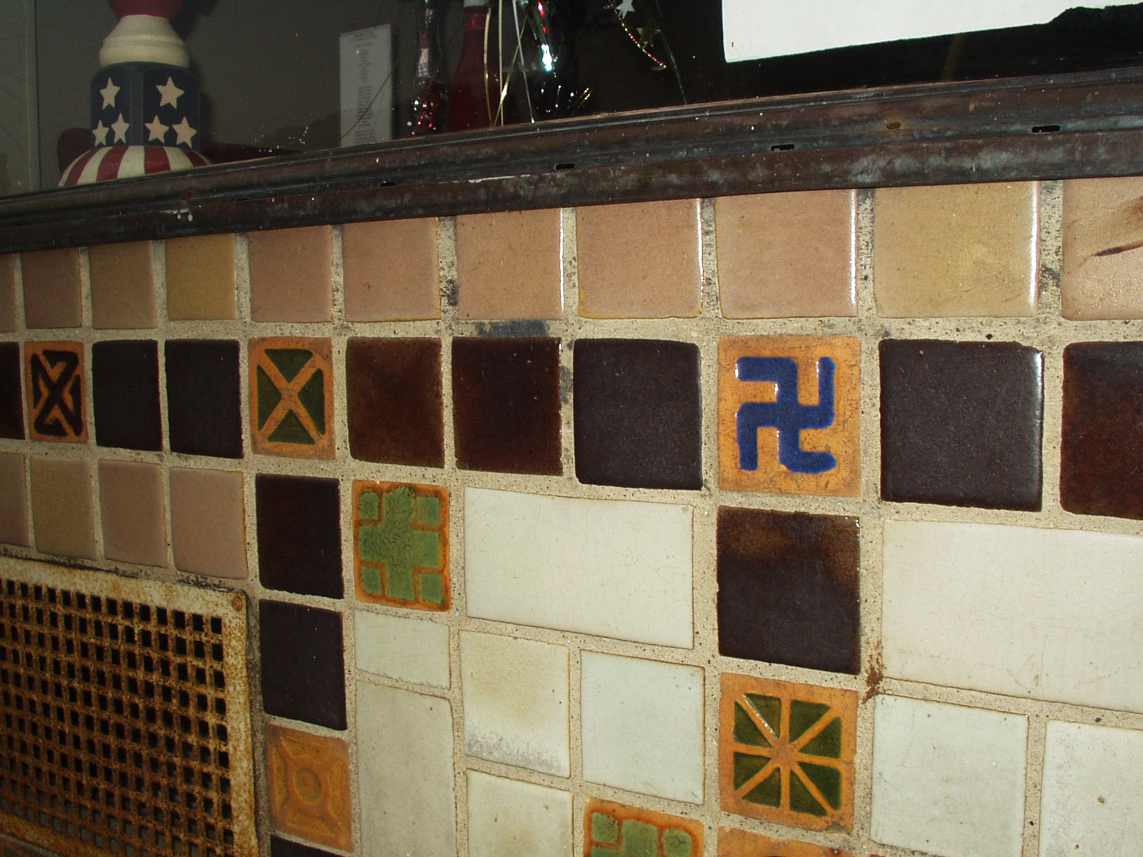
Back in the 1960s, on the south-west corner of the square in my little hometown of Lewistown, PA there was a restaurant called The Diana Shop, and to the right of it was a dark seedy-looking bar called The Hofbrau. Today, it is all one spot, Nettie’s Cafe.

As a young child shopping downtown with my mother, we would often walk by this building on our way from G.C. Murphy’s to Montgomery Wards or to the lobby of the taxi business to get a ride back home on North Walnut Street.

I remember seeing the tile work, and was fascinated by all of the symbols. It wasn’t until I was a bit older that I spent much time examining them. My best guess is that building probably dates sometime around the 1920s. [As a bit of trivia, in the mid 1980s my wife and I loved meeting for lunch at The Diana Shop. We even had our tiny 4-person wedding reception there, which consisted of flavored lemon and cherry Cokes. The older waitresses there were so very friendly to us, and later on, to our newborn son.]

I knew that with the age of the building that the swastika symbol, along with all of the other ornaments, were just decoration and did not carry the meaning of Nazi Germany and WWII. Yet, there they were, and immediately upon seeing the swastika, that is all I could think of. Our culture — from comic books, TV cartoons and drama shows, movies, and history books — has burned this association together forever in our collective minds.

Years later I read a great article by Steven Heller called “Symbol of the Century” in the January / February 1992 issue of Print Magazine. I still have that issue saved in my collection of graphic design resources.

Heller recently wrote “Swastika Guilt” in Imprint, and reading it reminded me of these tiles again. Slowly, time is eroding the past, and it wouldn’t surprise me if suddenly one day this building is torn down to be replaced with a vacant lot or mini-strip mall. I made a mental note that the next time we were in town visiting our parents, that I needed to take some photos of the tiles before they were gone forever, This past weekend I had that opportunity; below are some of the images I captured.


On the way into the main entrance to the cafe, someone has even
tried to scratch away the swastika; my guess is with their car keys.

The cafe was closed late on a Saturday afternoon;
the scratched swastika can be seen in the upper right.

Despite decades of pollution and grime, the rich indigo-blue glaze
is still vibrant.


Oliver Sacks: New Cover Designs


via howmagazine
These covers were designed in-house at Vintage by Cardon Webb and make me fall in love with the Oliver Sacks books anew.


Keep Our Secrets

via brain pickings
“Keep Our Secrets by Jordan Crane isn’t merely a charmingly illustrated treat, it’s also an admirable piece of publishing innovation — the book is printed with thermally-activated color-changing ink that lets you discover a wealth of delightful surprises and hidden illustrations as you rub the pages and the heat from your fingers causes some ink layers to become transparent. This kind of playful, tactile interactivity in what’s still a printed, physical book is challenges our assumptions about what it means to build truly “interactive” reading experiences, showing it doesn’t necessarily have to mean device-centricity…”
Read the rest here.

Saturday, August 6, 2011

Rudolf Brazda, 98, Dies; Survived Pink Triangle


via nytimes
“Rudolf Brazda, believed to be the last surviving man to wear the pink triangle — the emblem sewn onto the striped uniforms of the thousands of homosexuals sent to Nazi concentration camps, most of them to their deaths — died on Wednesday in Bantzenheim, in Alsace, France…”
Read the rest here.

QR Stenciler & Hobo Codes


Vegans Beware

via make
“The QR_STENCILER is a free, fully-automated utility which converts QR codes into vector-based stencil patterns suitable for laser-cutting. Additionally, we present QR_HOBO_CODES, a series of one hundred QR stencil designs which, covertly marked in urban spaces, may be used to warn people about danger or clue them into good situations...”
Read the rest here. The hobo codes make me smile!

Tuesday, August 2, 2011

Monday, August 1, 2011

Sunday, July 31, 2011

Upper/lowercase Living

Spotted on the trip back from Pittsburgh. I understand that they think the name “uppercase living” set in lower case letters is cute, but it it is jarring when trying to make sense of the phrase, and understanding the history behind what uppercase and lowercase means in typographic terms. This business is just one of the many other pyramid-type-schemes to make money off of others holding vinyl ‘decor’ parties.
trueindigo did a great job taking this photo in a moving vehicle, and nabbing Bondi Printing Center in the background to boot!

1942: Marg Printing & Engraving


via retronaut
At the Corner of Pearl St., NYC, from the Charles Cushman Collection
See more images here, and visit the Charles Cushman Collection here.

Thursday, July 28, 2011

Sea of Cephalopods Octopus Necktie


via thrilllist
“A writhing sea of cephalopods creates a striking pattern on this unique necktie…”
Visit the Thrill List site here. Makes me smile...

Monday, July 25, 2011

Reynolds Stone’s Press

via letterology
“Reynolds Stone (1909 - 1979) was a very distinguished British wood engraver, letter cutter and painter who lived in rural Dorset, England. His wife, Janet was a skilled photographer and took these two and a quarter square format photos of him and his presses in the mid-1960s. The negatives were found recently by his son-in-law and artist, Ian Beck who scanned and posted them here.”

Sunday, July 24, 2011

Suffragette Banners

via mary evens picture library
“The Women’s Library, part of London Metropolitan University, hold the most extensive collection of women’s history in the UK. The latest selection includes a large number of designs for suffrage banners by renowned stained-glass and poster artist Mary Lowndes. Deeply committed to the suffragette cause, in 1907 Lowndes formed the Artists’ Suffrage League which went on to create much of the promotional material for the National Union of Women’s Suffrage Societies. As chair, Lowndes contributed many designs for posters, banners and cards. Her watercolour banner sketches are notable for their use of luminous colour revealing the influence of Lowndes’s training in stained-glass. We also have images of a number of finished, sewn banners based on Lowndes’s designs.”
Please click here to view these images.