Tuesday, May 3, 2011

Image of the Day: Nestle® For Men


While recently touring in Russia, my son picked up these two chocolate bars — a dazed baby and the Nestle For Men bars. My wife and I tried both milk chocolate bars, but the name ”For Men” really is crazy; why only for men, does it have testosterone as an ingredient . . .?

After a brief search online, I found this translated write-up about the campaign: “...The idea of this product creation, intended only for men, is based on deep understanding of a modern man psychology. ‘The role of woman in a society is more and more increasing. A distinction between a woman and a man is gradually drawn. So much the men would like to have things, which will belong only to them. Considering this need, Nestle company developed a key idea of ‘untouchable man’s property,’ which was laid in the basis of Nestle Classic for Men strategic concept,’ Aleksandra Tarasinkevich, senior manager of trademarks of confectionery products department of Nestle company says... No tears, no sentiments... Men are not such as women, therefore they like everything big, weighty, and brutal that will not be lost [in the] palm [of their hand].”


The label open and flat.
The no-women symbol enlarged from the label.

Thank goodness this sexist campaign, with its poor attempt at humor, wouldn’t be shown in the United States. But this is a very much appreciated eye-opening world culture lesson in marketing in Russia!

The Royal Family Name, the House of Windsor, and Mountbatten-Windsor

via the British Monarchy Website
“People often ask whether members of the Royal Family have a surname, and, if so, what it is. Members of the Royal Family can be known both by the name of the Royal house, and by a surname, which are not always the same. And often they do not use a surname at all. Before 1917, members of the British Royal Family had no surname, but only the name of the house or dynasty to which they belonged…”

Read the rest here, and a bit more here. DaBraLady had the answer again!

Earth Confessions


via liquid treat
“Grist has been a proud provider of environmental news and commentary with a wry twist since 1999, and so the Seattle-based nonprofit greets each Earth Day with some eye rolling. This year, the organization is calling out the nonsense with Earth Confessions. The new site offers the opportunity to confess your sins against the Earth and swear off your evil ways forever. Those not comfortable airing their dirty laundry in public can peruse the Sin Gallery…”

Visit the site here, and view the prayer cards here.

World’s Last Typewriter Factory


via a friend
“As ubiquitous as iPads may be, the typewriter is ‘far from dead,’ says Ed Michael, General Manager of Sales at Moonachie, NJ-based Swintec… ”

Read the rest here.

Sunday, May 1, 2011

Bare Memorial Electric Fountain


I bought this hand-colored postcard a few ago at a flea market, intending to do a bit of research to see if the fountain still existed, and to visit it some day.

The reverse side of the postcard.


After a 4-mile run this morning, we decided to go on an adventure try to find the fountain. A bit of Google® searching turned up a good map, and a description of the fountain and park.

From Wikipedia:
“…The civic center of the borough is the borough park with its duck pond and fountain designed around the Big Spring. The present park, which [Daniel] Bare set aside for public use, is the result of successive improvement projects started in the 1870s and continuing through the early 20th century. A stone arch, counted as a contributing structure, was built in 1874 to channel the spring, and a breast dam was added in 1876 to impound the spring water into a pond; the first dam was replaced by the present steel and cement dam, a noncontributing structure, in 1958. Sometime in the 1920s to 1930s, the pond was further contained by a concrete basin. In 1937, the Bare Memorial Fountain, counted as a second contributing structure, with its oscillating streams [which rise to 25 feet] and colored lights was added.” 
Read the rest here.
It was raining lightly when we arrived. Notice, the curved supporting structures of the fountain have been removed.


We crossed the street to look in the windows of The Roaring Spring Blank Book Company.
Roaring Spring Paper Products History
“In 1887 Daniel M. Bare founded the Roaring Spring Blank Book Company to produce ledgers, journals, etc., hence the name 'Blank Book'. Today the company has grown from a 20 person operation in a small two story brick building to over 330 employees in a 400,000 square foot modern facility that manufactures a variety of school and office paper products.”

An etched logo on the front door. Inside were large book bindery machines.

Part of the park was under construction, and we were not able to walk around the entire perimeter, but it didn’t dampen our spirits.

Monday, April 25, 2011

Image of the Day: Blue Bunny & Fondue

During the 50th wedding anniversary celebration of my in-laws, a Peeps® marshmallow blue bunny gets dipped into one of the chocolate fondues. 

Sunday, April 24, 2011

The FD&C Color Palette


via idsn

“As designers, we know color is important. But when food is your medium, color can be powerful enough to influence taste—and affect health. Say hello to Blue No. 1, Yellow No. 5, and Red No. 40. These numbers make up part of an artificial color palette approved by the United States’ Food and Drug Administration. First introduced in 1906, the FDA’s Pure Food and Drug Act (and later the Food, Drug, and Cosmetic Act) was put in place to ensure the safety and wholesomeness of food products. Before this, more than eighty dyes were used to color food, without regulation—the same dye could be used to color both clothing and candy. Currently, the FD&C color palette features seven colors that can be used in the production of food, along with two additional colors for limited use. . . ”

Read the rest here.

Saturday, April 23, 2011

Mac vs. PC


via hunch blog
“Our latest data project was to analyze how self-described Mac and PC people are different. The infographic [here], designed by the talented folks at Column Five Media, breaks it down. Keep reading after the Infographic for more background and analysis, including some comparisons to findings from 18 months ago when we first looked at this issue.”


Friday, April 22, 2011

Image of the Day: Frear’s Detail

Architectural detail on Frear Building, Penn State University Park Campus. 
More on Frear Building can be found here.

Thursday, April 21, 2011

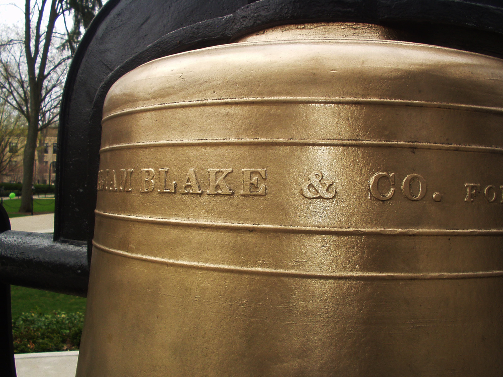
1871 Bronze Ampersand: Old Main Bell


During a recent photo shoot of historical plaques and markers on campus, my eye was drawn to this bronze ampersand [a professional hazard]. I knew I’d be back again sometime soon, and made a mental note to take the time to take photos of it properly. . .

Read the rest and see more images of the bell here.

Wednesday, April 20, 2011

The Interrobang, Part II


via shady characters
“The interrobang’s arrival on the keyboard of Remington Rand’s Model 25 typewriter brought with it a new wave of interest in the character. In common with its appearance in Richard Isbell’s Americana, the mark’s transition from hot metal type to the typewriter keyboard was the result of a happy coincidence: a Remington Rand graphic designer saw ATF’s sample brochure for the font and lobbied in turn for its provision on his company’s typewriters. The Model 25’s replaceable key and typehead allowed different characters to be installed as required, providing the perfect vehicle for promoting this as-yet unproven mark of punctuation. Remington Rand entertained ideas of effecting a revolution in punctuation with its new interrobang key. . . ”

Read the rest here; part one can be found here.


Tuesday, April 19, 2011

Numeric sorts


spotted on we love typography, these make me smile/ See the original image here.

Monday, April 18, 2011

Business Cards: Page XXIII

[Top Row] Well, at least Kelly McDermott can create ransom notes, which is what this card looks like. Middle card: this card has ALWAYS cracked me up with the statement, “Jesus Saved?” and the photo of the Evangelist. On a whim, I Googled his name, and it looks like he is 76, still resides in Plant City, FL and is also listed as a Bishop another place. Last card in the row— just  a unique card that probably was set in metal type.

[Middle Row] “Memories in Movies with Sound” (MIMS) — I guess talkies are getting popular with Mr. Mims. Middle card: A GARBOLOGIST; how cool is that! Last card in row: just lose the border, please and get some white space.

[Bottom Row] Randy's Beehive nephew art makes me smile for some reason; Subterranean Mango is just a cool name; and Gita-Nagari in Port Royal is from the Krishna farm located there. We would visit this farm at least once a month when they offered free vegetarian meals during one of their many festivals. It was like stepping into another reality seeing a life-size statue of Prabhupada wearing a real wristwatch. From what I understand, they never did become a self-sustaining farm, but they were surely making an effort in the early 1980s. Today, they even have a Facebook page!

Sunday, April 17, 2011

Business Cards: Page XXII

[Top Row] Why is this farmer smiling and holding a trident on a lead mining card? Middle card: Most likely their fully color outdoor sign reproduced pretty crappy in black and white.

[Middle Row] It cracks me up seeing the hand-written addition “Also Snake Dancing.” Middle casino card has really fine line embossing; it looks like something out of the Rat Pack era. Last card: is CAZAN from mixing up the letters in the owners’ last name ZANCA?

[Bottom Row] Middle card — something about the 1950s minty green ink on this card just draws me in.

Saturday, April 16, 2011

Image of the Day: Caslon and Goudy

Two of my favorite ampersands, Caslon and Goudy in PMS 659

Business Cards: Page XXI

All in all, the cards on this page all utilize pretty crappy artwork.

[Top Row] Can "White Dragon" be positioned any closer to the top of the card?  Trivia on the last card, we graduated from high school with Mona.

[Middle Row] First card, I think it is time to invest in a new card when you have to resort to whiteout and mailing labels to fix your present card. Last card in the row: Strike-a-Pose Computer Portraits — does the art in the upper right hand corner look extremely scary to you?

[Bottom Row] Crappy hand drawn type and horse just doesn't cut it. Middle card: What exactly does Jean E. Tayrien do by appointment only? Last card in the row: so stereotypical of early 1980s desktop publishing.

A Paper Record Player Wedding Invitation


via Paper Forest
“Check out designer Kelli Anderson's lovely wedding invitation design. Okay, so it is not made entirely of paper, but careful folding of the paper in this invite is used to amplify the sound of a sewing needle on a flexi-disc record.”
Click here and watch the video. Kudos to Mr. Wizard!

Friday, April 15, 2011

Image of the Day: Ampersand Cleaning

Interesting effect when cleaning the ink from the metal type on an old cotton rag.

Antarctica, 1911-1914


Wreck of the 'Gratitude', Macquarie Island,
1911 / Format: Silver gelatin photoprint

via Brain Pickings
“In the summer of 1911, a group of Australian scientists, adventurers and explorers set out to make history by undertaking the first Australian expedition to Antarctica, a three-year journey into the frozen unknown. Under the leadership of Dr. Douglas Mawson, they set sail for Macquarie Island and the virgin parts of Antarctica. . . ”

Read the rest, and see more images, here. More on Frank Hurley — who was also the photographer during Ernest Shackleton’s fabled Endurance expedition to Antarctica, 1914-1917 — can be found here.