Friday, April 22, 2011

Image of the Day: Frear’s Detail

Architectural detail on Frear Building, Penn State University Park Campus. 
More on Frear Building can be found here.

Thursday, April 21, 2011

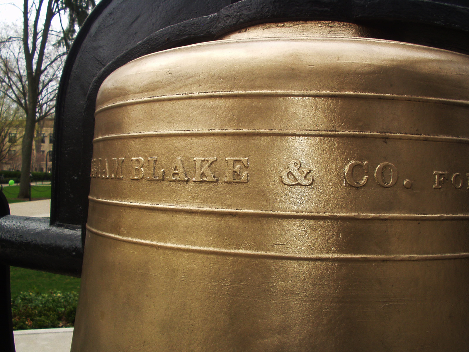
1871 Bronze Ampersand: Old Main Bell


During a recent photo shoot of historical plaques and markers on campus, my eye was drawn to this bronze ampersand [a professional hazard]. I knew I’d be back again sometime soon, and made a mental note to take the time to take photos of it properly. . .

Read the rest and see more images of the bell here.

Wednesday, April 20, 2011

The Interrobang, Part II


via shady characters
“The interrobang’s arrival on the keyboard of Remington Rand’s Model 25 typewriter brought with it a new wave of interest in the character. In common with its appearance in Richard Isbell’s Americana, the mark’s transition from hot metal type to the typewriter keyboard was the result of a happy coincidence: a Remington Rand graphic designer saw ATF’s sample brochure for the font and lobbied in turn for its provision on his company’s typewriters. The Model 25’s replaceable key and typehead allowed different characters to be installed as required, providing the perfect vehicle for promoting this as-yet unproven mark of punctuation. Remington Rand entertained ideas of effecting a revolution in punctuation with its new interrobang key. . . ”

Read the rest here; part one can be found here.


Tuesday, April 19, 2011

Numeric sorts


spotted on we love typography, these make me smile/ See the original image here.

Monday, April 18, 2011

Business Cards: Page XXIII

[Top Row] Well, at least Kelly McDermott can create ransom notes, which is what this card looks like. Middle card: this card has ALWAYS cracked me up with the statement, “Jesus Saved?” and the photo of the Evangelist. On a whim, I Googled his name, and it looks like he is 76, still resides in Plant City, FL and is also listed as a Bishop another place. Last card in the row— just  a unique card that probably was set in metal type.

[Middle Row] “Memories in Movies with Sound” (MIMS) — I guess talkies are getting popular with Mr. Mims. Middle card: A GARBOLOGIST; how cool is that! Last card in row: just lose the border, please and get some white space.

[Bottom Row] Randy's Beehive nephew art makes me smile for some reason; Subterranean Mango is just a cool name; and Gita-Nagari in Port Royal is from the Krishna farm located there. We would visit this farm at least once a month when they offered free vegetarian meals during one of their many festivals. It was like stepping into another reality seeing a life-size statue of Prabhupada wearing a real wristwatch. From what I understand, they never did become a self-sustaining farm, but they were surely making an effort in the early 1980s. Today, they even have a Facebook page!

Sunday, April 17, 2011

Business Cards: Page XXII

[Top Row] Why is this farmer smiling and holding a trident on a lead mining card? Middle card: Most likely their fully color outdoor sign reproduced pretty crappy in black and white.

[Middle Row] It cracks me up seeing the hand-written addition “Also Snake Dancing.” Middle casino card has really fine line embossing; it looks like something out of the Rat Pack era. Last card: is CAZAN from mixing up the letters in the owners’ last name ZANCA?

[Bottom Row] Middle card — something about the 1950s minty green ink on this card just draws me in.

Saturday, April 16, 2011

Image of the Day: Caslon and Goudy

Two of my favorite ampersands, Caslon and Goudy in PMS 659

Business Cards: Page XXI

All in all, the cards on this page all utilize pretty crappy artwork.

[Top Row] Can "White Dragon" be positioned any closer to the top of the card?  Trivia on the last card, we graduated from high school with Mona.

[Middle Row] First card, I think it is time to invest in a new card when you have to resort to whiteout and mailing labels to fix your present card. Last card in the row: Strike-a-Pose Computer Portraits — does the art in the upper right hand corner look extremely scary to you?

[Bottom Row] Crappy hand drawn type and horse just doesn't cut it. Middle card: What exactly does Jean E. Tayrien do by appointment only? Last card in the row: so stereotypical of early 1980s desktop publishing.

A Paper Record Player Wedding Invitation


via Paper Forest
“Check out designer Kelli Anderson's lovely wedding invitation design. Okay, so it is not made entirely of paper, but careful folding of the paper in this invite is used to amplify the sound of a sewing needle on a flexi-disc record.”
Click here and watch the video. Kudos to Mr. Wizard!

Friday, April 15, 2011

Image of the Day: Ampersand Cleaning

Interesting effect when cleaning the ink from the metal type on an old cotton rag.

Antarctica, 1911-1914


Wreck of the 'Gratitude', Macquarie Island,
1911 / Format: Silver gelatin photoprint

via Brain Pickings
“In the summer of 1911, a group of Australian scientists, adventurers and explorers set out to make history by undertaking the first Australian expedition to Antarctica, a three-year journey into the frozen unknown. Under the leadership of Dr. Douglas Mawson, they set sail for Macquarie Island and the virgin parts of Antarctica. . . ”

Read the rest, and see more images, here. More on Frank Hurley — who was also the photographer during Ernest Shackleton’s fabled Endurance expedition to Antarctica, 1914-1917 — can be found here.

Thursday, April 14, 2011

Image of the Day: Kern’s Ampersand


PRINtNG

1922 Flapper’s Dictionary


via boingboing

“Originally published in the July 1922 edition of FLAPPER magazine, this dictionary went into some detail, listing the group's slang and providing definitions. In the process, it also provided an insight: through the slang we can begin to discern attitudes and priorities and the mindset of the adherents. And the adherents, after all, were our grandmothers and great-grandmothers.”

Visit here to read the dictionary.

Business Cards: Page XX

[Top Row] Is the word “Naked” in red italics supposed imply a certain amount of naughtiness in their furniture? Next card for the Chief of Police—during the day you need an area code, but at night it isn't necessary. Last card in this row, what exactly is a billanjo dairy, and is there a jimanbarbara dairy as well?

[Middle Row] AMBUSH uses a crazy wooden looking font, but the extremely poor letterspacing on their subhead kills the card [A•C•R•U•I•S•E•B•A•R]. Middle card is just so poorly executed, and the "pun" of the manager's name just doesn't cut it. Nag Drywall — is it because they use horsehair in their plaster? The smug looking horse with a bow-back looks like it is out of a 1950s MAD magazine.

[Bottom Row] My mother-in-law’s business card back when she was still doing craft and art shows to sell prints of her scenes in central PA pen and ink drawings. I remember Stan Scanlon coming into Graphics II in the early 1980s; the photo sums him up. Last card in the row: is this a supply company for taking armadillo photos, or a photo supply store for armadillos?

Wednesday, April 13, 2011

Image of the Day: Angry Bunny Ornament

Measuring in at just .5" tall, this little printers ornament has a curious expression.

Camera Lingo Necklaces


via photojojo

“Masons have secret handshakes, conspiracy theorists have secret symbols. Photographers have their own secret code words; lingo that only serious snappers recognize. Show you're in the know by wearing the symbols of the craft! There are 4 symbols to choose from: JPEG, the no-flash icon, NEF, or CR2 (Nikon and Canon's respective RAW file format names).”

Find out more here.

Business Cards: Page XIX

[Top Row] Why is it “Tame -Ur-Bird” and not “Tame-Your-Bird”? The next card for mobile dog grooming is just so typical of desktop publishing with the two different styles of clip-art images. Equi-Knead—I never heard of equine sports massage—especially in Lewistown of all places—but I can see its value.

[Middle Row] Why would anyone name their company “S.N.A.T.C.H.”? The next card for “Rare Plant Research” is just an interesting field of study and makes me smile. Dog Waste Removal—a business that can only exist in the age of owners too busy and/or lazy to clean up after their pets.

[Bottom Row] Why would a computer consultant name their business “Medusa Systems”? I’d hate to see the screensaver they install on your PC — fears of turning to stone looking at it as it kicks in! The Curl Up Hotel, well the name is just simple and homey. The next card—what does it mean? Cheap nephew-art lips and a strawberry—Is it trying to be erotic? Why are the lips eating the strawberry stem first? This is for a fishing guide’s business card?

The Beauty of Maps: A Documentary


via swissmiss
The Beauty of Maps is a 4 part BBC series that was released almost a year ago. The documentary takes us through the staggering four million map collection of the British Library in London.


Discover more here.

Tuesday, April 12, 2011