 |
| Interesting effect when cleaning the ink from the metal type on an old cotton rag. |
Friday, April 15, 2011
Image of the Day: Ampersand Cleaning

Antarctica, 1911-1914
 |
| Wreck of the 'Gratitude', Macquarie Island, 1911 / Format: Silver gelatin photoprint |
via Brain Pickings
“In the summer of 1911, a group of Australian scientists, adventurers and explorers set out to make history by undertaking the first Australian expedition to Antarctica, a three-year journey into the frozen unknown. Under the leadership of Dr. Douglas Mawson, they set sail for Macquarie Island and the virgin parts of Antarctica. . . ”
Read the rest, and see more images, here. More on Frank Hurley — who was also the photographer during Ernest Shackleton’s fabled Endurance expedition to Antarctica, 1914-1917 — can be found here.
Thursday, April 14, 2011


1922 Flapper’s Dictionary
 via boingboing
“Originally published in the July 1922 edition of FLAPPER magazine, this dictionary went into some detail, listing the group's slang and providing definitions. In the process, it also provided an insight: through the slang we can begin to discern attitudes and priorities and the mindset of the adherents. And the adherents, after all, were our grandmothers and great-grandmothers.”
Visit here to read the dictionary.
Business Cards: Page XX

[Middle Row] AMBUSH uses a crazy wooden looking font, but the extremely poor letterspacing on their subhead kills the card [A•C•R•U•I•S•E•B•A•R]. Middle card is just so poorly executed, and the "pun" of the manager's name just doesn't cut it. Nag Drywall — is it because they use horsehair in their plaster? The smug looking horse with a bow-back looks like it is out of a 1950s MAD magazine.
[Bottom Row] My mother-in-law’s business card back when she was still doing craft and art shows to sell prints of her scenes in central PA pen and ink drawings. I remember Stan Scanlon coming into Graphics II in the early 1980s; the photo sums him up. Last card in the row: is this a supply company for taking armadillo photos, or a photo supply store for armadillos?
Wednesday, April 13, 2011
Image of the Day: Angry Bunny Ornament

Camera Lingo Necklaces
 via photojojo
“Masons have secret handshakes, conspiracy theorists have secret symbols. Photographers have their own secret code words; lingo that only serious snappers recognize. Show you're in the know by wearing the symbols of the craft! There are 4 symbols to choose from: JPEG, the no-flash icon, NEF, or CR2 (Nikon and Canon's respective RAW file format names).”
Find out more here.
Business Cards: Page XIX

[Middle Row] Why would anyone name their company “S.N.A.T.C.H.”? The next card for “Rare Plant Research” is just an interesting field of study and makes me smile. Dog Waste Removal—a business that can only exist in the age of owners too busy and/or lazy to clean up after their pets.
[Bottom Row] Why would a computer consultant name their business “Medusa Systems”? I’d hate to see the screensaver they install on your PC — fears of turning to stone looking at it as it kicks in! The Curl Up Hotel, well the name is just simple and homey. The next card—what does it mean? Cheap nephew-art lips and a strawberry—Is it trying to be erotic? Why are the lips eating the strawberry stem first? This is for a fishing guide’s business card?
The Beauty of Maps: A Documentary
 via swissmiss
The Beauty of Maps is a 4 part BBC series that was released almost a year ago. The documentary takes us through the staggering four million map collection of the British Library in London.
Discover more here.
Tuesday, April 12, 2011

Pi & Piem
 |
| Letterpress poster by Amanda White |
via green chair press
“For National Poetry Month I’ve been noticing where poetry showed up in every day life. Recently in the New Yorker, Calvin Trillin wrote about pi day and mentioned:
There is a form of poetry known as a piem, in which pi’s digits are represented by the number of letters in each word. The best-known piem renders the first fifteen digits of pi as “How I want a drink, alcoholic of course, after the heavy chapters involving quantum mechanics.”
Read the rest here.
Gender Stereotypes in the Language of Toy Ads
 via boingboing
Transcribed boys’ and girls’ toy commercials were made into word-clouds. The difference is stark and immediately visible.
Read more about the project here.
Newspaper Blackout Poems

“Austin Kleon has been creating newspaper blackout poems since 2005, shortly after finishing his undergraduate degree in Interdisciplinary Studies from Miami University in Ohio. He was facing writer’s block, when he got the idea to make a blank canvas out of a newspaper. In an interview with PBS News Hour, Kleon says ‘I looked over at the recycle bin next to my desk and thought, “I don’t have any words, and right over there are millions of them.’”
Asked what he does now when he faces writer’s block, he says, “When I’m blocked, I don’t try to force it. I go do something else. I go for walks. Do dishes. Play the guitar. Watch a movie. Read a book. Doodle. Browse Twitter. As long as you show up every day, you can lose a day and still get work done.”
Though the words in the newspaper may not be his originally, the poems are always a reflection of Kleon. He doesn’t just summarize the initial article in a poem. Rather, he focuses on one or two words that really call out to him, and then he creates new meanings from a few already-existing words or letters.”
See more of his work here.
Monday, April 11, 2011
Image of the Day: Goss Fine Candies
 |
| Goss’ Peanut Butter Easter Eggs were certainly a part of our lives in the 1960s. Now some of our colored pencils are stored in this box. |
 |
| The rabbit has some crazy ‘candy buzz’ reflections in its eyes! [Click on the image to see for yourself.] I also love that every phrase has its own font. |
Sunday, April 10, 2011


Inking Ampersands
 |
| For my birthday, my son and daughter-in-law gave me some metal and wood letterpress ampersands to add to my collection. A few weeks later the head pressman at work [Ron] was cleaning out the area where we store leftover ink used on past printings. I asked if I could have one of the containers in order to ink up my collection, and Ron’s eyes lit up when he saw the ampersands. |
 |
| A little ink goes a long way. You can see some of the test prints I made of each individual ampersand. |
 |
| I arranged the ampersands in a ‘cloud’ for printing, inked them up, then used a brayer to get smooth impression. |
 |
| Holding the group as I inked up. |
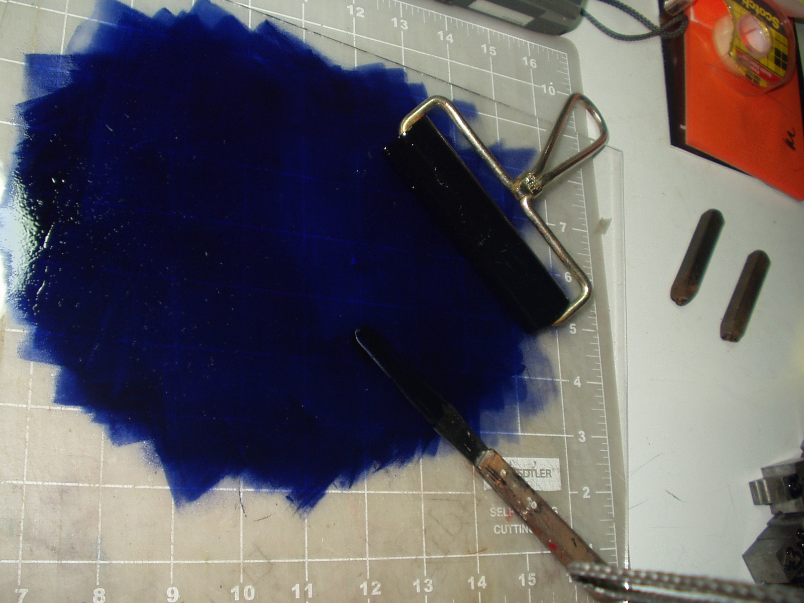 |
| Pantone 659; a pretty sweet color. |

Eric Whitacre's Virtual Choir 2.0, ‘Sleep’

Watch and listen the entire video here.
Wood Type of the Month: De Vinne
 via International Printing Museum
Read this month’s wood-type column to learn what typeface was named not for the designer but for the man who foresaw the need for this typeface style.
Mercator: An Italic Hand

A 1540 monograph of Gerardus Mercator on the lettering of maps in 16th C Netherlands and his treatise on the italic hand. One of only 3 known copies in existence. Mercator (1512-1594), a Flemish mapmaker is best known for the Mercator projection world map named after him.
See more images here.
Subscribe to:
Posts (Atom)