Sunday, July 31, 2011

Upper/lowercase Living

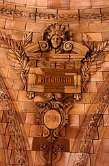
Spotted on the trip back from Pittsburgh. I understand that they think the name “uppercase living” set in lower case letters is cute, but it it is jarring when trying to make sense of the phrase, and understanding the history behind what uppercase and lowercase means in typographic terms. This business is just one of the many other pyramid-type-schemes to make money off of others holding vinyl ‘decor’ parties.
trueindigo did a great job taking this photo in a moving vehicle, and nabbing Bondi Printing Center in the background to boot!

1942: Marg Printing & Engraving


via retronaut
At the Corner of Pearl St., NYC, from the Charles Cushman Collection
See more images here, and visit the Charles Cushman Collection here.

Thursday, July 28, 2011

Sea of Cephalopods Octopus Necktie


via thrilllist
“A writhing sea of cephalopods creates a striking pattern on this unique necktie…”
Visit the Thrill List site here. Makes me smile...

Monday, July 25, 2011

Reynolds Stone’s Press

via letterology
“Reynolds Stone (1909 - 1979) was a very distinguished British wood engraver, letter cutter and painter who lived in rural Dorset, England. His wife, Janet was a skilled photographer and took these two and a quarter square format photos of him and his presses in the mid-1960s. The negatives were found recently by his son-in-law and artist, Ian Beck who scanned and posted them here.”

Sunday, July 24, 2011

Suffragette Banners

via mary evens picture library
“The Women’s Library, part of London Metropolitan University, hold the most extensive collection of women’s history in the UK. The latest selection includes a large number of designs for suffrage banners by renowned stained-glass and poster artist Mary Lowndes. Deeply committed to the suffragette cause, in 1907 Lowndes formed the Artists’ Suffrage League which went on to create much of the promotional material for the National Union of Women’s Suffrage Societies. As chair, Lowndes contributed many designs for posters, banners and cards. Her watercolour banner sketches are notable for their use of luminous colour revealing the influence of Lowndes’s training in stained-glass. We also have images of a number of finished, sewn banners based on Lowndes’s designs.”
Please click here to view these images.

Saturday, July 23, 2011

Caren Alpert’s Microscopic Photography


Life Saver, 17X Magnification
via a friend
Read Caren Alpert’s artistic statement here, and visit her gallery here.

Chicago Brewery Goes for Zero Waste


via utne reader
“A growing number of beer makers are incorporating green practices in their brewing operations, but a couple of brothers setting up a brewery in Chicago are setting their sights even higher, reports the Chicago Reader: They’re aiming for a zero-waste facility. The key is that the New Chicago Brewing Company is not a freestanding operation but part of The Plant, a former meatpacking facility that is being renovated to house a bunch of symbiotic businesses under one roof. One makes pickles, one makes kombucha tea, and one is an aquaponics operation that will produce tilapia, greens, mushrooms, and herbs…”
Read more here and here.

Our food varieties are dwindling. So why should you care?

via writesforfood
“…Most of us in the well-fed world give little thought to where our food comes from or how it’s grown. We steer our shopping carts down supermarket aisles without realizing that the apparent bounty is a shiny stage set held up by increasingly shaky scaffolding. We’ve been hearing for some time about the loss of flora and fauna in our rain forests. Very little, by contrast, is being said or done about the parallel erosion in the genetic diversity of the foods we eat. Food varieties extinction is happening all over the world—and it’s happening fast. In the United States an estimated 90 percent of our historic fruit and vegetable varieties have vanished. Of the 7,000 apple varieties that were grown in the 1800s, fewer than a hundred remain. In the Philippines thousands of varieties of rice once thrived; now only up to a hundred are grown there. In China 90 percent of the wheat varieties cultivated just a century ago have disappeared. Experts estimate that we have lost more than half of the world’s food varieties over the past century. As for the 8,000 known livestock breeds, 1,600 are endangered or already extinct…”
Read the rest here.

Graphic Nothing’s Mona Lisa Remix


via retronaut
“Leonardo da Vinci's The Mona Lisa reduced and remixed down into 140 exact circles of colour. Makes no sense close up. Makes every sense from the other side of the room.”
More about it here. Print from your own hi-res quality from files here. Be sure to look through the Galleries section for some interesting discoveries, like Abbey Road Remix.


Tinnitus: When The Ringing Won’t Stop, Clear Your Mind

via npr
Two recent stories on NPR, Rethinking Tinnitus: When The Ringing Won’t Stop, Clear Your Mind and Tinnitus: Why Won’t My Ears Stop Ringing?

Friday, July 22, 2011

Melted Crayon Art


via cmybacon
“Jessica Kerbawy, an artist and graphic designer from Michigan, has been making these unique works of art by lining up crayons on foam board and melting them with a heat gun.”
See more of her work here.


Dyslexie: Typeface for dyslectics

spotted via a friend
The University of Twente did research on the typeface Dyslexie. Watch a part of their conclusion here.

Bolder

via swissmiss
“Bolder is a site that helps people to trigger and discover experiences that make the world a little better, one action at a time. You can start a challenge yourself or browse through the challenge catalogue and do positive actions to earn rewards. Anyone can respond to a challenge and earn a reward. Every challenge is a unique creation started by businesses or people. Challenges pose a request for users to take action, have a little fun, and be part of something that drives positive change…”
Read the rest here, visit Bolder here.

Google Books includes new Penn State titles


via Penn State University Libraries Newswire 
“Each month new Penn State titles are added to Google Books. Sacred and legendary art, Applied motion study, Hopes and fears for art, The afterglow of European travel, The castle builders, Aliens or Americans and Memorials of prison life are a few of the books now available online...”
Read the full story on Live here. Among the books they have digitized is Instruction in photography (1905). You can find the updated listing of books here.

Thursday, July 21, 2011

Rene Siegfried’s The Serif Fairy


via green chair press
“The Serif Fairy has lost her wing, keeping her from performing magic. This book follows her through an airy, immaculately designed typographic landscape as she hunts for it. Along the way, she makes friends and has adventures as she wanders through the Garamond Forest, visits Futura Town and eventually ends her quest at Shelley Lake.”
Order your copy here.

Fibonaccis Numbers: The Man Behind The Math

via npr
“Though generations of schoolchildren have cursed arithmetic, the world was a much more inconvenient place without it. Before the advent of modern arithmetic in the 13th century, basic calculations required a physical abacus. But then came a young Italian mathematician named Leonardo da Pisa — no relation to da Vinci — who, in 1202, published a book titled Liber Abaci. That’s Latin for Book of Calculation. And though it doesn't necessarily sound like an overnight best-seller, it was a smash hit. Liber Abaci introduced practical uses for the Arabic numerals 0 through 9 to Western Europe. The book revolutionized commerce, banking, science and technology and established the basis of modern arithmetic, algebra and other disciplines…”
Read the rest, and listen to the story, here.

19th Century Trade Cards and Advertisements

via letterology
“With so few marketing options available for shopkeepers in the 19th C, the trade card was considered an essential form of advertising. Designers were just as compelled to create sharp examples of typography and printing then as they are today—much of it hand lettered and illustrated to promote their skills. American cards were intended to be more colorful than some of the European cards and they soon became quite collectable. These ornate trade cards eventually evolved into the business card as we know it today…”
See more examples here, and here at Sheaff: Ephemera listed under The Printing Trades tab.

Wooden Nautical Flags

via bestmade
“The A to Z of the high seas! These bright, bold and graphic wooden flags are as eye-catching as they are functional. Based on the International Code of Signals, each flag represents a letter in the alphabet: hang just one or the entire set, spell out a coded message, or conjure up the evocative regimen of naval life. Each flag is hand-painted in the same method as our axes, in our New York City workshop, and the entire set of 26 comes securely packed in a pine storage box.”
Visit Best Made here, or at 368 Broadway, NYC

Wednesday, July 20, 2011

Connecting the Dots

via savage chickens
This just makes me smile!

Sir Kensington’s Gourmet Spiced Scooping Ketchup

via notcot
“Some things were thought to be unachievable. Gourmet spiced ketchup may now be crossed off such lists…”
Be sure to go to the notcot site here to read about the beginning of their introduction to Sir Kensington’s, and visit the playful Sir Kensington’s site itself here.

How Pittsburgh lost its ‘H’ and then got it back

H-less Pittsburg appears
under the Penn Station
rotunda Downtown.

via nor and the post gazette
“Richardson Clover had a problem, and a pretty good idea how to fix it. As assistant hydrographer in the U.S. Navy’s Bureau of Navigation in 1889, Lt. Clover was in charge of producing its maps. He’d noticed that many place names were spelled several different ways, especially in Alaska, where there were 20 indigenous languages. He suggested to Thomas C. Mendenhall, superintendent of the U.S. Coast and Geodetic Survey, that the two offices work together on standardizing place names on government charts and other official publications. Thus was born, in 1890, the U.S. Board on Geographic Names. One of its first acts, on June 2, 1891, was to take away Pittsburgh’s “H.” On Dec. 23, President Benjamin Harrison made it official. Merry Christmas, Pittsburg! Nothing personal, mind you. The board ruled that all cities and towns with name endings pronounced ‘berg’ should be spelled ‘burg.’... ”
Read the rest here.

Inside Out: A Global Arts Project

via photojojo
“The Banksy of the photo world wants you to be in his next project! 2011′s TED Prize winner JR is known for combating social inequalities with photography. He’s plastered massive 20 foot tall portraits from Paris to Brazil, Nairobi, and Cambodia. Inside Out is a photo project that asks anyone to upload their portrait with their personal story. After uploading, your photo’s then mailed to you as a poster that you can post in public. The goal? To give individuals a voice and unveil the untold stories of people around the world. Awareness and mutual respect are the aim!”
Visit the Photojojo site here, and the Inside Out site here.

Karakuri, Japan’s Ancient Robots

via make
“Japan has always been on the forefront of cutting edge robotics. Its roots can be traced back 200-300 years during the Edo period when skilled craftsmen created automata (self-operating machines). Using nothing more than pulleys and weights they were able to make the Karakuri (Japanese automata) perform amazing tasks. Today Hideki Higashino is one of the few remaining craftsmen who is determined to keep the history and tradition of Japanese Karakuri alive…”
Watch the video here.

Pantone Metal Storage Boxes

via creativepro
“Each 4"×12"×9" box costs $19.99. In addition to Macaw Green 377 to the right, there’s Pastel Lavender 672, Royal Purple 268, Ruby Red 186, Mimosa 14-0848, Turquoise 15-5519, Vitamin C 165, Cool Gray 10, Surf 286, and Honeysuckle 18-2120.”
See more about them here.

Snail Mail My Email

via creativity
Fall back in love with letters. Ivan Cash created Snail Mail My Email, a a month-long art project aimed at inspiring people to rediscover the lost art of letter writing. You simply go to the site and send in an email of up to 200 words, which you can customize with one item (for example, a doodle, petal, lipstick kiss or your own graphic). The service will then transform your email into a handwritten letter physically mailed to your recipient, free of charge. The letters written will be showcased on the site, which is live until August 15th.”
Find out more here.

Tuesday, July 19, 2011

Union Square: 1910

via shorpy
New York circa 1910. “Union Square.” The Met Life tower presides over this panoramic view, a composite of four 8x10 glass negatives. Looking up Broadway, you can just see the block that where American Ballet Theatre’s home is today at 890.
View the full size here.

Monday, July 18, 2011

Bacon is NOT an Herb

Artichoke meal from
Bacon is NOT an Herb
Be sure to bookmark or subscribe to the blog Bacon is NOT an Herb — Exploring Vegetarianism in PA Dutch Country. It is filled with a growing list of well-written posts chocked with useful information for foodies, even if you are not a vegetarian. The recipes are spot-on, restaurant reviews are insightful and entertaining to read, and the rants expose the honesty of the writer’s soul. Join her as she shares, “what I am learning as I eat my way along the quest to find a personal balance, challenge the earth’s collective imagination & true indigo.”
Visit the blog here.

Sunday, July 17, 2011

Women’s World Cup Final

Watch Japan’s goalkeeper Ayumi Kaihori save
the ball during the final match, here.

I spent most of the afternoon at a local establishment watching the thrilling final game of the Women’s World Cup between the U.S. and Japan. How utterly heartbreaking it was to watch the reaction of some of the patrons there upon the loss by the U.S. team. With their “us versus them” outlook and middle finger retorts, they ultimately disgraced themselves while giving Americans — as well as all men — a bad name with their poor sportsmanship and misogynistic attitude.

. . .

Please take a few moments to read the expertly written post by Ray Curren; Women’s World Cup – Things We Learned: Final Edition As Japan Is Crowned on the women’s soccer fan site All White Kit (AWK):

“The rules of athletics (at least knockout style) dictate that there has to be a winner and there has to be a loser.

Expert commentary, I know.

But (and I realize not everyone reading this is a United States fan, and I love that about AWK, so keep visiting) if you can take yourself out of your rooting shoes (or jersey) for a second and take the game you watched on Sunday for what it was.

A brilliant advertisement for women’s soccer, which saw the best the game has to offer. An underdog that everyone could root for, coming off an unspeakable tragedy in their home country, playing an attractive style of soccer, and exuding pure class and sportsmanship at just about every turn.

Of course, the rub is that this great story of Japan comes at the expense of the U.S., who lost the game in heartbreaking fashion, leading both in normal time and extra time before losing in penalties. It’s hard to imagine losing in a more painful fashion, actually.

But, perhaps the biggest lesson I try to get across to both the players I coach and students I teach is the ‘put yourself in someone else’s shoes’ lesson.

Can you be happy for someone else even if it comes at your expense? Can you put aside your pride to congratulate an opponent or adversary on a job well done?…”
Read the rest of this well written post here.

Paper Passion Fragrance

via green chair press
“The book-aholic has found the cure for everyone who misses the smell of paper in these digital times: a perfume that smells of books, thanks to a ‘fatty’ olfactory mark.” Karl Lagerfeld took his inspiration from the smell of both printed and unprinted paper...”
Read the rest here and here.  Another paper-inspired fragrance is Demeter’s Paperback. I wonder if they will ever come out with a Printer’s Ink & Toner Fragrance, which I already smell of most weekdays after 5:00 p.m.

Saturday, July 16, 2011

Bike Type

via HOW
Scott Kirkwood creates T-shirts featuring bikes built of type.
Visit his Cranky Threads shop here.

Friday, July 15, 2011

Native American Language Fonts

via we love typography and Typophile
An interesting discussion on one of the boards over at Typohile. Scroll down to 25.August.2008 to see a “sample of the Cherokee syllabary, showing the handwritten forms followed by an early draft of the more familiar typeset forms. They are written in pairs, divided by a vertical zigzag bar.”
Thread can be found here.

The Color of: Oliver Sacks

via notcot
“Fung Kwok Pan has developed this slick little piece of code that allows you to enter a search query, then grabs 80 Flickr photos related to your query, then makes a composite of the photos, showing you the color of whatever you entered. It’s pretty neat to watch this thing work.”
Try it yourself here.

Harry Potter Graffiti


via death by kerning

See more images here.

Thursday, July 14, 2011

Graphic Novel With Thought Bubbles Visible Only Under UV

via make
“Printed with a third ink — invisible without a UV light source — the comic book ‘SVK’ has hidden layers which are only revealed with a UV light source…”
Read a bit more about it here. I haven’t seen this graphic novel, but I do like this interesting use of printing and viewing technology.

Wood Type of the Month: Antique Tuscan

via International Printing Museum
“Read this month’s wood-type of the month here to learn what 1800s wood-type font was used recently for the title poster for a movie about a country music singer...”

Images from Old Books

via Brain Pickings
Detail of the title page from
De Studio Literarum (1536)
The site ‘From Old Books’ features over 3,100 high-resolution free images scanned from more than 180 different old or rare books, with extracts, by Liam Quin.
Visit the site here.

Wednesday, July 13, 2011

Business Cards of the Day

I really like that the Digimarc card utilizes their our technology of using an embedded imperceptible digital watermark. Learn more about Digimarc here.

AA Taxi — “[From one side of a fictional phone conversation] We need to keep the name and web address ABOVE the bricks in the stadium photo... no, no, no, you cannot crop the taxi’s wheels. I do not care about the photo’s proportions! Absolutely not,, we cannot reshoot the image so that it works, no one cares about proportions. Look, I do this all the time in Word — just stretch the image so that it fits the card, it’s easy! No one will notice that now the Joe Paterno statue looks like he is barely 5 fee tall and weights over 250 pounds or that our cab looks like a flattened low-rider. Perfect! Print ’em. Wait, you are charging me for these changes? But it is MY card...” Ah, taxi stories. They generally last just about two weeks and then fade away.

Every time I look at The Enchanted Kitchen card, I think of Bewitched. Which led me to this site of Mischa Ho’s font Witched. Even though it isn’t Mischa’s font, it still reminds me of it.

Hotel Manor was a welcome break at the end of a 26 mile bike ride. If you are up near Slate Run, be sure to stop by— they have a nice menu and a perfect location overlooking Slate Run and the rail trail. Their paw-print HM logo is just a bit too forced for my liking though.

Tattly: Temporary tattoo store

This one makes me smile — 5K1 N !!!

via swissmiss
“Tattly, temporary tattoo store for design-minded kids and kids-at-heart, is the brainchild of swissmiss and all of the tattoo designs are created by all-star designers…”
Read more about the designs here and visit Tattly here.

Quoins

Image from Brad Cornelius’s photostream.

via lawsonarchive
“In the past four centuries, very little tight logical change has been seen in the quoin, a simple item of composing room furniture used in preparing type for the press. The word itself, a variant of coin, has been used by printers since the 16th century. It is been discussed by the writers of printing manuals since Moxon’s treatise, Mechanick Exercises, first appeared in England in 1683….”
Read the rest here. Quoins are expandable metal or wooden wedges used by printers to lock up a form within a chase. More images of quoins can be found here and here.

Tuesday, July 12, 2011

July 12, 1960: Etch a Sketch Goes on Sale

via wired
“The technology behind this children’s toy is both simple and complex. Simple, in that an internal stylus is used, manipulated by turning horizontal and vertical knobs to ‘etch a sketch’ onto a glass window coated with aluminum powder. Complex, because the Etch a Sketch employs a fairly sophisticated pulley system that operates the orthogonal rails that move the stylus around when the knobs are turned…”
Read the rest here, and view a gallery of images here. As a child, I was fascinated by the silver powder inside of Etch-a-Sketchs.

1930s London Zoo Sign Writer

Looks like he painted a mean ampersand!

via buzzfeed
See more photos of Pauline Locke’s grandfather working at the London Zoo in the 1930s, here. He is using a Mahl stick!

AntiMosquito Fumigator App

via swissmiss
“The app claims to keep mosquitos away as long as you keep it running in the background. It emits a high-pitched sound that humans don’t hear but mosquitos do and not appreciate…”
I wonder if this app works!?!

The Johnson Box

Frank Johnson

I didn’t realize that this technique of marketing had a name until I was working on a PowerPoint slide last week.

via wikipedia
“A Johnson Box is a box commonly found at the top of direct mail letters, containing the key message of the letter. The purpose of it is to draw the reader’s attention to this key message first, and hopefully grab their attention, enticing them to read the rest of the letter. The Johnson Box is named after direct marketer Frank Johnson, who is credited as having first used the Johnson Box to improve response to his offers for American Heritage magazine. He does not claim credit for creating the device, claiming to have only popularized it.” Johnson died at the age of 88 on March 6, 2001.
See an example of a letter, believed to be from 1959, that contains a Johnson Box at the top, here. More on Johnson can be found here.

Sunday, July 10, 2011

People for Bikes

via freezethawcycles
“...We’re all united by a shared passion: bikes. Bikes keep us healthy, carry us from point A to point B, save us from high gas prices, and make our air cleaner and our roads less congested. Bikes fill our lives with adventure and excitement, relaxing our minds and energizing our souls. Peopleforbikes.org is dedicated to channeling that passion to improve the future of bicycling. Our goal is to gather a million names of support, to speak with one, powerful voice—to make bicycling safer, more convenient and appealing for everyone. Simply put, we believe that life is far more enjoyable when it’s experienced on two wheels. We believe that by coming together, we can make our world a better place to ride.”
Find out more here

Saturday, July 9, 2011

2-Foot Hand-Cut Playing Cards

via cmybacon
“Paper artist Emmanuel Jose is working on a year-long project hand-cutting a 2 foot tall deck of transformation playing cards out of paper, 1 card each week for 52 weeks. When his deck is completed, Emmanuel hopes to get it printed as a regular deck of cards and have a show to display his papercut designs...”
Follow his progress on his Tumblr blog, Ncyclopedia.

Friday, July 8, 2011

Loving Day: Anniversary of Loving vs. Virginia

Mildred and Richard Loving

via the daily heller
“Loving Day is a global movement to create a holiday that celebrates the anniversary of Loving v. Virginia, the Supreme Court decision that legalized interracial marriage in the United States. Mr. and Mrs. Loving were a young couple who were arrested for their interracial marriage, which was illegal in Virginia (as well as in most states at some point). The celebration was founded by Ken Tanabe, a designer, animator, and art director that works in motion, identity, print, experience design, and interactive media...”

Read the rest here. Visit the Loving Day site here.