 |
| During the 50th wedding anniversary celebration of my in-laws, a Peeps® marshmallow blue bunny gets dipped into one of the chocolate fondues. |
Monday, April 25, 2011
Image of the Day: Blue Bunny & Fondue
Sunday, April 24, 2011
The FD&C Color Palette
 via idsn
“As designers, we know color is important. But when food is your medium, color can be powerful enough to influence taste—and affect health. Say hello to Blue No. 1, Yellow No. 5, and Red No. 40. These numbers make up part of an artificial color palette approved by the United States’ Food and Drug Administration. First introduced in 1906, the FDA’s Pure Food and Drug Act (and later the Food, Drug, and Cosmetic Act) was put in place to ensure the safety and wholesomeness of food products. Before this, more than eighty dyes were used to color food, without regulation—the same dye could be used to color both clothing and candy. Currently, the FD&C color palette features seven colors that can be used in the production of food, along with two additional colors for limited use. . . ”
Read the rest here.
Saturday, April 23, 2011
Mac vs. PC

“Our latest data project was to analyze how self-described Mac and PC people are different. The infographic [here], designed by the talented folks at Column Five Media, breaks it down. Keep reading after the Infographic for more background and analysis, including some comparisons to findings from 18 months ago when we first looked at this issue.”
Friday, April 22, 2011
Image of the Day: Frear’s Detail
 |
| Architectural detail on Frear Building, Penn State University Park Campus. |
More on Frear Building can be found here.
Thursday, April 21, 2011
1871 Bronze Ampersand: Old Main Bell
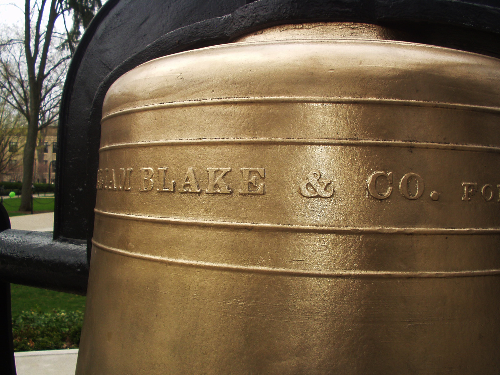
During a recent photo shoot of historical plaques and markers on campus, my eye was drawn to this bronze ampersand [a professional hazard]. I knew I’d be back again sometime soon, and made a mental note to take the time to take photos of it properly. . .
Read the rest and see more images of the bell here.
Wednesday, April 20, 2011
The Interrobang, Part II
 via shady characters
“The interrobang’s arrival on the keyboard of Remington Rand’s Model 25 typewriter brought with it a new wave of interest in the character. In common with its appearance in Richard Isbell’s Americana, the mark’s transition from hot metal type to the typewriter keyboard was the result of a happy coincidence: a Remington Rand graphic designer saw ATF’s sample brochure for the font and lobbied in turn for its provision on his company’s typewriters. The Model 25’s replaceable key and typehead allowed different characters to be installed as required, providing the perfect vehicle for promoting this as-yet unproven mark of punctuation. Remington Rand entertained ideas of effecting a revolution in punctuation with its new interrobang key. . . ”
Read the rest here; part one can be found here.
Tuesday, April 19, 2011

Monday, April 18, 2011
Business Cards: Page XXIII
 [Top Row] Well, at least Kelly McDermott can create ransom notes, which is what this card looks like. Middle card: this card has ALWAYS cracked me up with the statement, “Jesus Saved?” and the photo of the Evangelist. On a whim, I Googled his name, and it looks like he is 76, still resides in Plant City, FL and is also listed as a Bishop another place. Last card in the row— just a unique card that probably was set in metal type.
[Bottom Row] Randy's Beehive nephew art makes me smile for some reason; Subterranean Mango is just a cool name; and Gita-Nagari in Port Royal is from the Krishna farm located there. We would visit this farm at least once a month when they offered free vegetarian meals during one of their many festivals. It was like stepping into another reality seeing a life-size statue of Prabhupada wearing a real wristwatch. From what I understand, they never did become a self-sustaining farm, but they were surely making an effort in the early 1980s. Today, they even have a Facebook page!
Sunday, April 17, 2011
Business Cards: Page XXII

[Middle Row] It cracks me up seeing the hand-written addition “Also Snake Dancing.” Middle casino card has really fine line embossing; it looks like something out of the Rat Pack era. Last card: is CAZAN from mixing up the letters in the owners’ last name ZANCA?
[Bottom Row] Middle card — something about the 1950s minty green ink on this card just draws me in.
Saturday, April 16, 2011

Business Cards: Page XXI

[Top Row] Can "White Dragon" be positioned any closer to the top of the card? Trivia on the last card, we graduated from high school with Mona.
[Middle Row] First card, I think it is time to invest in a new card when you have to resort to whiteout and mailing labels to fix your present card. Last card in the row: Strike-a-Pose Computer Portraits — does the art in the upper right hand corner look extremely scary to you?
[Bottom Row] Crappy hand drawn type and horse just doesn't cut it. Middle card: What exactly does Jean E. Tayrien do by appointment only? Last card in the row: so stereotypical of early 1980s desktop publishing.
A Paper Record Player Wedding Invitation
 via Paper Forest
“Check out designer Kelli Anderson's lovely wedding invitation design. Okay, so it is not made entirely of paper, but careful folding of the paper in this invite is used to amplify the sound of a sewing needle on a flexi-disc record.”
Click here and watch the video. Kudos to Mr. Wizard!
Friday, April 15, 2011
Image of the Day: Ampersand Cleaning
 |
| Interesting effect when cleaning the ink from the metal type on an old cotton rag. |
Antarctica, 1911-1914
 |
| Wreck of the 'Gratitude', Macquarie Island, 1911 / Format: Silver gelatin photoprint |
via Brain Pickings
“In the summer of 1911, a group of Australian scientists, adventurers and explorers set out to make history by undertaking the first Australian expedition to Antarctica, a three-year journey into the frozen unknown. Under the leadership of Dr. Douglas Mawson, they set sail for Macquarie Island and the virgin parts of Antarctica. . . ”
Read the rest, and see more images, here. More on Frank Hurley — who was also the photographer during Ernest Shackleton’s fabled Endurance expedition to Antarctica, 1914-1917 — can be found here.
Thursday, April 14, 2011


1922 Flapper’s Dictionary
 via boingboing
“Originally published in the July 1922 edition of FLAPPER magazine, this dictionary went into some detail, listing the group's slang and providing definitions. In the process, it also provided an insight: through the slang we can begin to discern attitudes and priorities and the mindset of the adherents. And the adherents, after all, were our grandmothers and great-grandmothers.”
Visit here to read the dictionary.
Business Cards: Page XX

[Middle Row] AMBUSH uses a crazy wooden looking font, but the extremely poor letterspacing on their subhead kills the card [A•C•R•U•I•S•E•B•A•R]. Middle card is just so poorly executed, and the "pun" of the manager's name just doesn't cut it. Nag Drywall — is it because they use horsehair in their plaster? The smug looking horse with a bow-back looks like it is out of a 1950s MAD magazine.
[Bottom Row] My mother-in-law’s business card back when she was still doing craft and art shows to sell prints of her scenes in central PA pen and ink drawings. I remember Stan Scanlon coming into Graphics II in the early 1980s; the photo sums him up. Last card in the row: is this a supply company for taking armadillo photos, or a photo supply store for armadillos?
Wednesday, April 13, 2011
Image of the Day: Angry Bunny Ornament

Camera Lingo Necklaces
 via photojojo
“Masons have secret handshakes, conspiracy theorists have secret symbols. Photographers have their own secret code words; lingo that only serious snappers recognize. Show you're in the know by wearing the symbols of the craft! There are 4 symbols to choose from: JPEG, the no-flash icon, NEF, or CR2 (Nikon and Canon's respective RAW file format names).”
Find out more here.
Business Cards: Page XIX

[Middle Row] Why would anyone name their company “S.N.A.T.C.H.”? The next card for “Rare Plant Research” is just an interesting field of study and makes me smile. Dog Waste Removal—a business that can only exist in the age of owners too busy and/or lazy to clean up after their pets.
[Bottom Row] Why would a computer consultant name their business “Medusa Systems”? I’d hate to see the screensaver they install on your PC — fears of turning to stone looking at it as it kicks in! The Curl Up Hotel, well the name is just simple and homey. The next card—what does it mean? Cheap nephew-art lips and a strawberry—Is it trying to be erotic? Why are the lips eating the strawberry stem first? This is for a fishing guide’s business card?
The Beauty of Maps: A Documentary
 via swissmiss
The Beauty of Maps is a 4 part BBC series that was released almost a year ago. The documentary takes us through the staggering four million map collection of the British Library in London.
Discover more here.
Tuesday, April 12, 2011

Pi & Piem
 |
| Letterpress poster by Amanda White |
via green chair press
“For National Poetry Month I’ve been noticing where poetry showed up in every day life. Recently in the New Yorker, Calvin Trillin wrote about pi day and mentioned:
There is a form of poetry known as a piem, in which pi’s digits are represented by the number of letters in each word. The best-known piem renders the first fifteen digits of pi as “How I want a drink, alcoholic of course, after the heavy chapters involving quantum mechanics.”
Read the rest here.
Gender Stereotypes in the Language of Toy Ads
 via boingboing
Transcribed boys’ and girls’ toy commercials were made into word-clouds. The difference is stark and immediately visible.
Read more about the project here.
Newspaper Blackout Poems

“Austin Kleon has been creating newspaper blackout poems since 2005, shortly after finishing his undergraduate degree in Interdisciplinary Studies from Miami University in Ohio. He was facing writer’s block, when he got the idea to make a blank canvas out of a newspaper. In an interview with PBS News Hour, Kleon says ‘I looked over at the recycle bin next to my desk and thought, “I don’t have any words, and right over there are millions of them.’”
Asked what he does now when he faces writer’s block, he says, “When I’m blocked, I don’t try to force it. I go do something else. I go for walks. Do dishes. Play the guitar. Watch a movie. Read a book. Doodle. Browse Twitter. As long as you show up every day, you can lose a day and still get work done.”
Though the words in the newspaper may not be his originally, the poems are always a reflection of Kleon. He doesn’t just summarize the initial article in a poem. Rather, he focuses on one or two words that really call out to him, and then he creates new meanings from a few already-existing words or letters.”
See more of his work here.
Monday, April 11, 2011
Image of the Day: Goss Fine Candies
 |
| Goss’ Peanut Butter Easter Eggs were certainly a part of our lives in the 1960s. Now some of our colored pencils are stored in this box. |
 |
| The rabbit has some crazy ‘candy buzz’ reflections in its eyes! [Click on the image to see for yourself.] I also love that every phrase has its own font. |
Sunday, April 10, 2011

Inking Ampersands
 |
| For my birthday, my son and daughter-in-law gave me some metal and wood letterpress ampersands to add to my collection. A few weeks later the head pressman at work [Ron] was cleaning out the area where we store leftover ink used on past printings. I asked if I could have one of the containers in order to ink up my collection, and Ron’s eyes lit up when he saw the ampersands. |
 |
| A little ink goes a long way. You can see some of the test prints I made of each individual ampersand. |
 |
| I arranged the ampersands in a ‘cloud’ for printing, inked them up, then used a brayer to get smooth impression. |
 |
| Holding the group as I inked up. |
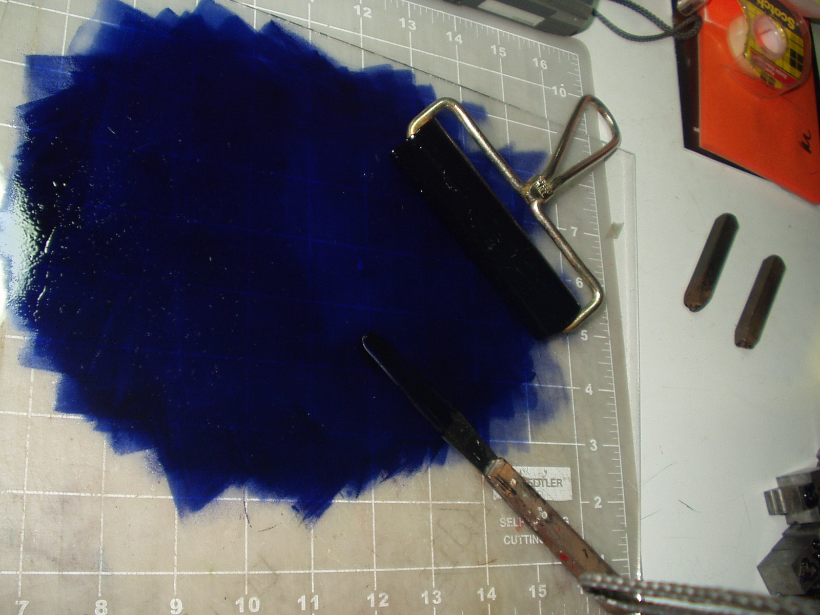 |
| Pantone 659; a pretty sweet color. |

Eric Whitacre's Virtual Choir 2.0, ‘Sleep’

Watch and listen the entire video here.
Wood Type of the Month: De Vinne
 via International Printing Museum
Read this month’s wood-type column to learn what typeface was named not for the designer but for the man who foresaw the need for this typeface style.
Mercator: An Italic Hand

A 1540 monograph of Gerardus Mercator on the lettering of maps in 16th C Netherlands and his treatise on the italic hand. One of only 3 known copies in existence. Mercator (1512-1594), a Flemish mapmaker is best known for the Mercator projection world map named after him.
See more images here.
Saturday, April 9, 2011
Ampersand Punch
 |
| I have a couple of metal ampersand punches. They are identical to each other, but I received them years apart. Terri got inspired and used one on her belt. |
 |

Word of the Day: Bumf
 via A.Word.A.Day with Anu Garg
MEANING: Noun: Unwanted or uninteresting printed matter such as governmental forms, legal documents, junk mail, promotional pamphlets, etc.
ETYMOLOGY: Short for bum fodder, slang for toilet paper. Earliest documented use: 1889.
“A mortgage loan can generate 200 pages of bumf, most of it so boring and repetitious that no one has the energy or the time to read it all.”—John Gilmour; Lenders Use The Hoover Principle; The Sydney Morning Herald (Australia); Jan 20, 2001.
Friday, April 8, 2011
Image of the Day: Periodic Table of Typefaces

4CP | Four Color Process adventures deep inside the comic book
 via letterology
[From the 4CP blog] “. . . Lately, I've been trying to master the relationship between dot patterns and the finite color value options of vintage four-color process. Typically there were only three basic values for cyan, magenta, and yellow: 100%, 50%, and 25%, which were combined to create the optical illusion of 45-65 colors. (70% was also used sometimes.) These values account for the way a constituent color may appear as large or small dots or as what looks like a solid color with dots knocked out of it.
When you blow up process printing, you eliminate nearly all of the intended colors. There is no illusion of anything anymore, and no human intention behind what you’re seeing. It’s just the rudimentary building blocks of an inexpensive mechanical printing process, thrown into accidental relationships at the microscopic level.”
Discover more images here.
Earworm of the Day: The Only Living Boy in New York

Listen to it here.
Thursday, April 7, 2011
The Dun Emer Press
 |
| Elizabeth Yeats standing at the iron handpress, with Beatrice Cassidy rolling out ink and Esther Ryan correcting proofs at the table at Dun Emer Press in 1903. |
via letterology
“Elizabeth ‘Lolly’ Corbett Yeats (1868-1940) was the first commercial printer in Ireland to work exclusively on iron handpresses. She was also an art teacher and member of William Morris’s circle in London and studied with the Women’s Printing Society there. In 1902 she established a private press at the large home of Evelyn Gleeson in Dundrum near Dublin and was placed in charge of managing the new Dun Emer Press. With her sister Lily, a skilled needleworker, and Evelyn Gleeson they also began the Dun Emer Guild to train young women in bookbinding, printing and other craft trades so they might earn a living. In 1908, Elizabeth and her poet brother, William Butler Yeats started the Cuala Press, publishing over 70 fine edition books of Irish writers including 48 works by her brother William. . .”
More can be found here.
Eric Whitacre: A virtual choir 2,052 voices strong
 via TED
“In a moving and madly viral video last year, composer Eric Whitacre led a virtual choir of singers from around the world. He talks through the creative challenges of making music powered by YouTube, and unveils the first 2 minutes of his new work, Sleep, with a video choir of 2,052.
Watch the TED talk here, and Eric Whitacre's Virtual Choir - Lux Aurumque here.
Planet eBook

Planet eBook hosts a growing number of iconic works of classic literature — free to download without needing a log-in or membership. 82 books are currently hosted in the library as PDF files, which can be opened and read on any computer or smartphone. The books served up on Planet eBook are all public domain material; meaning they can be downloaded, copied, printed, and shared without requiring authorization from the author or publisher — as long as you do not modify the content or sell them for a profit.
To read the novels on Planet eBook you will need a PDF reader. Visit Plant eBook here.
Subscribe to:
Posts (Atom)