Showing posts with label maps. Show all posts

Friday, September 30, 2011

Vintage Maps Trace the Meandering Mississippi


via a raven
“For anyone obsessed with beautiful maps, these colorful and informative examples tracking the many paths of the lower Mississippi are a dream come true. The monumental collection was produced in 1944 by Harold N. Fisk, who drew in a rainbow of colors the path of past and current flows as the mighty river changed course and flooded over time...”
More can be found here.

Thursday, September 15, 2011

Mapping Terms for American Streams


via Strange Maps Blog
“A body of running water may be called any of many different names, the most generic being stream, the most common being river.  A river can be defined as ‘a natural stream of water of usually considerable volume’. General terms for smaller streams include creek (smaller than a river) and brook (smaller than a creek). Very specific types of water currents  include anabranches (river branches that rejoin the main body of water) and distributaries (branches that don’t).

This map charts the rich variety of waterflow toponyms in the US, which reflects the climatological and geographical diversity of the country, but also its linguistic and historical heritage. River names seem extremely resistant to change, and indeed often are echoes of earlier dominant cultures.

The colors on the map, which is based on the place names in the USGS National Hydrography Dataset, correspond to the generic toponyms for waterflows, excluding the two commonest ones (river and creek, rendered in gray).

The term brook (light blue) is massively prevalent throughout New England, and into northern New Jersey and Pennsylvania. It is interspersed with stream (light green) in Maine, the only place in the country where that term is used with any frequency; and with kill (dark blue) in New York state’s Hudson valley - the occurrence of that Dutch-derived term coinciding somewhat with the former Dutch colony of New Netherland. Pennsylvania, Maryland, northern Virginia, West Virginia and Ohio are dominated by the run (pink)…”

Read the rest here, see the map large here, and visit Derek Watkins site here.


Friday, August 26, 2011

Typographic Transit Maps


via a two winged fairy
“TRNSPRTNATION” is a series of typographic transit maps by Fadeout Design. The transit lines are made up of strings of text that list the stations of the transit system. Prints are available for sale on the website of Boston, Chicago, London, NYC, San Francisco, and Washington, D.C.
Visit the site here.

Wednesday, July 20, 2011

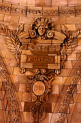
How Pittsburgh lost its ‘H’ and then got it back

H-less Pittsburg appears
under the Penn Station
rotunda Downtown.

via nor and the post gazette
“Richardson Clover had a problem, and a pretty good idea how to fix it. As assistant hydrographer in the U.S. Navy’s Bureau of Navigation in 1889, Lt. Clover was in charge of producing its maps. He’d noticed that many place names were spelled several different ways, especially in Alaska, where there were 20 indigenous languages. He suggested to Thomas C. Mendenhall, superintendent of the U.S. Coast and Geodetic Survey, that the two offices work together on standardizing place names on government charts and other official publications. Thus was born, in 1890, the U.S. Board on Geographic Names. One of its first acts, on June 2, 1891, was to take away Pittsburgh’s “H.” On Dec. 23, President Benjamin Harrison made it official. Merry Christmas, Pittsburg! Nothing personal, mind you. The board ruled that all cities and towns with name endings pronounced ‘berg’ should be spelled ‘burg.’... ”
Read the rest here.

Friday, June 17, 2011

Arem Bartholl’s Google Map Installations


Map at ‘Gateways,’ KUMU, Tallinn, Estonia, May 2011

via designobserver
“…Bartholl’s Map installations involved setting up a large physical version of the pin in several locales, at the exact spot where Google Maps assumes to be the center of the city.”
Find out more about the installations here.


Sunday, May 22, 2011

Mapping the Human Condition


via brainpickings
“…There’s something about cartography that lends itself to visualizing much more than land and geography. [Presented] are seven cartographic interpretations of the human condition, using the visual vocabulary of classical maps to interpret various facets of the human psyche — a genre that came of age during the late Renaissance, when it became known as “sentimental cartography.”
Read the rest here.

Monday, May 16, 2011

Cartography and Photography


London, 2011 and 1572

via imprint
“My, how our perception of the world has changed in a few short centuries—a heartbeat in the universe’s chronology. The Atlantic has an intriguing slideshow comparing differences between cartographic representations of major cities in the 16th century, and modern Google Maps views. In many cases, the difference in underlying geography are striking…”
See the slideshow here.

Wednesday, April 13, 2011

The Beauty of Maps: A Documentary


via swissmiss
The Beauty of Maps is a 4 part BBC series that was released almost a year ago. The documentary takes us through the staggering four million map collection of the British Library in London.


Discover more here.

Sunday, April 10, 2011

Mercator: An Italic Hand


via letterology

A 1540 monograph of Gerardus Mercator on the lettering of maps in 16th C Netherlands and his treatise on the italic hand. One of only 3 known copies in existence. Mercator (1512-1594), a Flemish mapmaker is best known for the Mercator projection world map named after him.

See more images here.

Monday, March 7, 2011

Edinburgh Civic Survey (1949)


via Ace Jet 170

“This huge book (280 x 360mm & 111 pages) is full of the incredible post-war maps of Edinburgh. Prepared by Patrick Abercrombie and Derek Plumstead for the Town Council, the book contains detailed data for traffic, health, education, recreation, population density and so on, beautifully depicted in a series of maps, charts and diagrams.”

More about the book can be found here. I especially love the compasses that sit at the foot of each map under the key.

Sunday, March 6, 2011

Pillows and Maps


via The Bright Side Project

“Cath Young of My Bearded Pigeon creates organic throw pillows that are so beautiful you may not want anyone to touch them. The combination of vintage images and modern organic textiles are inspired . . . ”

Read the rest here, and visit My Bearded Pigeon here.

Tuesday, March 1, 2011

Saturday, January 29, 2011

BBC’s Dimensions


via veryshortlist

“According to its creators at the London-based BERG firm, Dimensions is a Google Map–based ‘experimental prototype’ designed for the BBC’s always-expanding, ever-impressive website. ‘We want to bring home the human scale of events and places in history,’ the designers write. ‘How far would the Titanic stretch down your street?’ You can pick dozens of structures, or other space-based things or phenomena, which are split into nine categories—Space, Ancient Worlds, Cities in History, WWII, and so forth—and lay them over your own address, or any other. Some, like the area affected by the Chernobyl cloud, are unfathomably large—much bigger than we imagined them to be before plugging our hometowns into BERG’s prototype.”

Visit the Very Short List here; the BBC’s Dimensions site here.