
As a young child shopping downtown with my mother, we would often walk by this building on our way from G.C. Murphy’s to Montgomery Wards or to the lobby of the taxi business to get a ride back home on North Walnut Street.
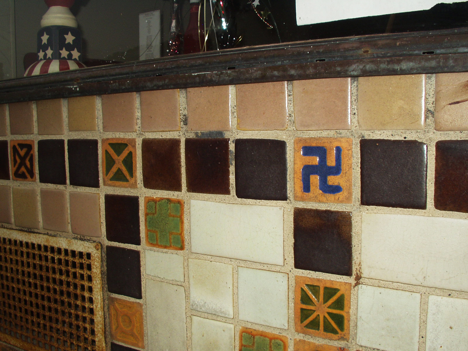
I remember seeing the tile work, and was fascinated by all of the symbols. It wasn’t until I was a bit older that I spent much time examining them. My best guess is that building probably dates sometime around the 1920s. [As a bit of trivia, in the mid 1980s my wife and I loved meeting for lunch at The Diana Shop. We even had our tiny 4-person wedding reception there, which consisted of flavored lemon and cherry Cokes. The older waitresses there were so very friendly to us, and later on, to our newborn son.]
I knew that with the age of the building that the swastika symbol, along with all of the other ornaments, were just decoration and did not carry the meaning of Nazi Germany and WWII. Yet, there they were, and immediately upon seeing the swastika, that is all I could think of. Our culture — from comic books, TV cartoons and drama shows, movies, and history books — has burned this association together forever in our collective minds.
Years later I read a great article by Steven Heller called “Symbol of the Century” in the January / February 1992 issue of Print Magazine. I still have that issue saved in my collection of graphic design resources.
Heller recently wrote “Swastika Guilt” in Imprint, and reading it reminded me of these tiles again. Slowly, time is eroding the past, and it wouldn’t surprise me if suddenly one day this building is torn down to be replaced with a vacant lot or mini-strip mall. I made a mental note that the next time we were in town visiting our parents, that I needed to take some photos of the tiles before they were gone forever, This past weekend I had that opportunity; below are some of the images I captured.


 |
| On the way into the main entrance to the cafe, someone has even tried to scratch away the swastika; my guess is with their car keys. |
 |
| The cafe was closed late on a Saturday afternoon; the scratched swastika can be seen in the upper right. |
 |
| Despite decades of pollution and grime, the rich indigo-blue glaze is still vibrant. |

