Wednesday, August 31, 2011

Vegan Ipsum


Both Vegan Ipsum and Veggie Ipsum are simple placeholder text generators.

A bit of history of Lorem Ipsum found on the Straight Dope:
“... Lorem ipsum was part of a passage from Cicero, specifically De finibus bonorum et malorum, a treatise on the theory of ethics written in 45 BC. The original reads, “Neque porro quisquam est qui dolorem ipsum quia dolor sit amet, consectetur, adipisci velit . . .” (“There is no one who loves pain itself, who seeks after it and wants to have it, simply because it is pain …”).

McClintock recalled having seen lorem ipsum in a book of early metal type samples, which commonly used extracts from the classics. “What I find remarkable,” he told Before & After, “is that this text has been the industry’s standard dummy text ever since some printer in the 1500s took a galley of type and scrambled it to make a type specimen book; it has survived not only four centuries of letter-by-letter resetting but even the leap into electronic typesetting, essentially unchanged...”


Lewis Hine: Photographer, Activist, Character


An expert linotyper in a
Southern publishing house.

via nytimes
Read this post by James Esztrin on the role of the photograph in affecting social change.

Saturday, August 27, 2011

Wayzgoose


via wikipedia
“A wayzgoose was at one time an entertainment given by a master printer to his workmen each year on or about St Bartholomew’s Day (24 August). It marked the traditional end of summer and the start of the season of working by candlelight. Later, the word came to refer to an annual outing and dinner for the staff of a printing works or the printers on a newspaper...”

I seem to forget about this holiday every year, but will try to get an early start for 2012.

Wayzgoose for Coventry printers at Stonebridge, c. 1907.

Images of the Day: Poe Valley Moss


With my camera nestled in some great moss behind the concession stand 
at Poe Valley State Park, I’m not sure which of these I like better.

Friday, August 26, 2011

Typographic Transit Maps


via a two winged fairy
“TRNSPRTNATION” is a series of typographic transit maps by Fadeout Design. The transit lines are made up of strings of text that list the stations of the transit system. Prints are available for sale on the website of Boston, Chicago, London, NYC, San Francisco, and Washington, D.C.
Visit the site here.

Bookbinding: Everything you ever needed to know


via felt and wire
Craft Stew has more than 115 bookbinding projects, tips and tutorials that include stitching methods, glue methods, “unusual” methods, big books, little journals, and even how to bind a book by recycling an old book.
Visit Craft Stew here.

Thursday, August 25, 2011

Seneca Lodge Postcard


I love this hand-tinted image of the main building and surrounding cottages.

Wednesday, August 24, 2011

Erasable e-papers


via printeresting
“Geek.com profiles a new erasable e-paper, which costs about two bucks for a single A4 sheet, but is good for 260 uses.”
Read more here.

Tuesday, August 23, 2011

Edison’s Mimeograph


via letterology
“Thomas Edison’s Mimeograph machine was licensed by A.B. Dick who invented the Mimeograph stencil in 1884. With Edison’s support the two of them began advertising in 1888 and sold the machines for $12 to $30 depending upon the size…”
Read more here.

Sunday, August 21, 2011

Image of the Day: The Printers Sink

Sink in our offset area splattered with Gojo cleaner
used to wash off the offset inks 

Saturday, August 20, 2011

Image of the Day: Mouseover Hand


via a two-winged fairy and a raven who were searching for sparkly objects
When a cursor hovers over a hyperlink, a mouseover event changes the cursor into a hand with an outstretched index finger. This hand icon now graces my keychain. An online search revealed links to artist Susan Kare’s original Mac icons limited edition prints.


Raven & Crow


From Raven & Crow’s blog: “Since they started scavenging from all those dead people during the Black Plague, crows and ravens have gotten some pretty harsh associations slapped on them. Harbingers of death, bringers of doom, jerky black birds, etc. Which is why, to this day, groups of crows are known as murders. Likewise, a group of ravens is called an unkindness. At our design company, raven + crow studio, we're proud to say that we make a point to work with companies and non-profits who are out to make the world a better place.”
Their blog is dedicated to all things kind in the realms that fascinate them: Design, music, culture, fashion, and, of course, vegan food. Visit Raven and Crow’s blog here, and their design studio here.

Friday, August 19, 2011

Image of the Day: Rooftop Sunset 2


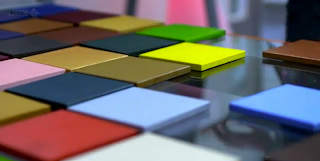
Color Swatch Door


via a two-winged fairy, Design Sponge, and Gizmodo
Architects are designers, too, and Armin Blasbichler’s home in South Tyrol is a great example. The floor-to-ceiling stained glass windows are designed as Pantone-like swatches that reflect the colors of the landscape outside.
See more here.

Thursday, August 18, 2011

The Subjectivity of Color Perception


via brain pickings
“How do ‘normal’ people see ‘normal’ color? Turns out, the answer isn’t as black and white. From the fine folks behind BBC’s excellent Horizon series — who have also pondered the nature of reality, the age-old tension between science and religion, how music works, what time is, and how money came to dominate the world — comes Do You See What I See, a fascinating look at the subjectivity and divergence of how we each see the world and the surprising power colors can have on our mood, cognition, emotion, and entire lives…”
Read the rest here.

Image of the Day: Rooftop Sunset


Emerald Green or Paris Green, the Deadly Regency Pigment


via jane austin's world
“Once upon a time green paint literally killed people. In 1814 in Schweinfurt, Germany, two men named Russ and Sattler tried to improve on Scheele’s green, a paint made with copper arsenite. The result was a highly toxic pigment called emerald green. Made with arsenic and verdigris, the bright green color became an instant favorite with painters, cloth makers, wall paper designers, and dyers…”
Read the rest here.

Deconstructing the Color Wheel


via neatorama
The colors we use today have fascinating origins based in treachery, lust, and mythology. Find out more as Mental Floss (via Neatorama) deconstructs the color wheel. Next time you use green, remember that pigment maker Carl Wilhem Scheele died of arsenic poisoning.
Read the rest here.

Wednesday, August 17, 2011

Images of the Day: Trompe l'oeil

A& A showed us this mural at the corner of 83rd and York


Note the sewing machine  in “the window”

Stairs flanked by friendly creatures.

You’ve Got a Friend T-Shirt


via jamestaylor
I love the retro-feel design of the “You’ve Got a Friend T-Shirt” supporting James Taylor’s recent tour.

Tuesday, August 16, 2011

Images of the Day: Green Man


Thsnks to trueindigo for capturing these images!

Wallpapered Dumpsters


via Pippa's Cabinet
Take a look at artist Christine Finley's wallpapered dumpsters. “Wallpapered Dumpsters transform environmental activism into unexpected beauty. This project is an inquiry into urban waste, free art, and notions of femininity, beauty and domesticity. Inspired by free and accessible art the artist states, ‘If we see dumpsters as works of art, we have raised consciousness...’
Read the rest here. Visit the Wallpapered Dumpster site here.


Monday, August 15, 2011

Image of the Day: Clothing Tag

The three-legged crow on a clothing tag.
Note the repeating background pattern is also the crow.

Pantone 100 Postcards


via Pippa's Cabinet
“Legendary color authority PANTONE and Bridget Watson Payne have teamed up to create this box of 100 postcards. Every card is a different brilliant PANTONE color. And the postcard box is also being published in Spanish, French, and German…”
Read the rest here.

Sunday, August 14, 2011

Business Cards of the Day

South Side Tattoo and Body Piercing: Sometime, no matter how much you like a script font, you just shouldn’t use it.

Apple: Clean, classy, and a silver foil Apple logo. It just works. I have an older card from the early 80s at work that I’ll have to post again [lost when I deleted my old blog] as a comparison.

Houck & Gingrich: Simple, clean, Lewistown typesetting. At least it is all in the same font, though the letter spacing is a bit tight for all caps.

Pantone VISA®

Bodega Cats


via internets celebrities
For a smile, watch Bodega Cats by Internets Celebrities.

And while you have a few minutes to spare, also watch A Fare Slice? “In 1980, New Yorker Eric Bram noticed that for twenty years the price of a subway token had tended to match the price of a slice of pizza. Thirty years later, his hypothesis still holds true.”
Bodega Cats can be seen here; A Fare Slice? can be seen here.


Saturday, August 13, 2011

Business Cards of the Day

Espresso Yourself Cafe: Simple two color design, the typography choices are hard to read, but they do have excellent vegetarian food options!

Going Local: A lot of information packed onto this card, in fact too much information and too tiny. A better solution would have been to go to a two sided card.

Hotel State College & Company: Great ampersand, though it is a bit forced and crowded intertwining with the “S” and “C” and the gradient, well. . . it just doesn’t stand up to the test of time forcing the balance. Using thin display type for small text isn’t a good idea either, no matter how nice the font.

Rocket Science: Overall, a nice card. I like the tagline they use as well, especially since I am not mechanically inclined. Easy to read font choice too

Otto’s: Swoosh! Double swoosh! Not a fan of flush right text, and the flipping back to flush left. I miss the cat design. Perhaps just  one swoosh and a different type treatment...

Ochre Mills


via Juniata’s River Valleys By Jeffrey Adams
My in-laws loaned us a copy of the book this past weekend. Lots of interesting photos and snippets of tales. I love the name “Ochre Mills” which is near Juniata [note the typo on the old photo]. I wonder if remnants of the area still around, or if it is now silently resting under a development.
You can see more of Adams’ book here.

Fluid type font


via designboom
“Designed by Hussain Almossawi of Bahraini studio Skyrill Design, ‘fluid type’ is conceptualized as a dynamic typeface, in which each character in addition to being usable as a static letter has its own exploding animation…”
Read the rest here. I was so wishing that this included an ampersand...

Friday, August 12, 2011

30 Years of the IBM PC


via what's new now
“The IBM PC was launched 30 years ago today…”
Read the rest here.

The Old Man of the Lake


pointed out by my son
“About 7,000 to 8,000 years ago, a volcano named Mount Mazama, located in present-day Oregon, erupted, leaving behind a big crater.  Over time, water from rain and snowfall filled the hole, and Crater Lake was born.  And Crater Lake is not like most other lakes.  As seen here from above, it is a deep, undisturbed blue, having no natural rivers leading in or out of it, no fish indigenous to it (although it has since been artificially stocked), etc.  Over the course of 250 years, its water -- cold, due to the elevation (at 6,148 feet, Crater Lake is over a mile above sea level) -- is replaced via an ongoing cycle of evaporation and precipitation. But what makes Crater Lake truly unique is a solitary piece of wood, pictured right, nicknamed the Old Man of the Lake…’
Read the rest here.

The @-symbol


via shady characters
“Like the ampersand, the ‘@’ symbol is not strictly a mark of punctuation; rather, it is a logogram or grammalogue, a shorthand for the word ‘at’. Even so, it is as much a staple of modern communication as the semicolon or exclamation mark, punctuating email addresses and announcing Twitter usernames. Unlike the ampersand, though, whose journey to the top took two millennia of steady perseverance, the at symbol’s current fame is quite accidental. It can, in fact, be traced to the single stroke of a key made almost exactly four decades ago…”
Read the rest here, and a bit more here. Part 2 of the series can be found here.

Thursday, August 11, 2011

Image of the Day: Pantone Flash Drive

A gift from X-Rite after filling out an online survey.
Squee!

Gertrude Stein: The Daily Miracle


via pippa’s cabinet

“One of the pleasant things those of us who write or paint do is to have the daily miracle. It does come.”
—Gertrude Stein

“… Stein is saying—not just that you should be on the lookout for the daily miracle (and perhaps, as I like to think, that miracle is something very basic and simple and normal from the day that suddenly elevates itself into something astonishing, or perhaps for her it was something else entirely—no way of knowing for sure, but in truth it hardly matters), but that ‘it does come.’ It does. Not it can, or it might, or even it will come. And when it comes, what it is? Is it dramatic? Is it earth shattering? No, it’s pleasant…”
Read the rest here.

Nail polish + alcohol + newspaper


via cmybacon
I’m not really into nail polish, but this is a pretty neat idea. 1. Put on nail polish and let dry. 2. Dip fingernail in alcohol-basically any will do, vodka is suggested. 3. Press a strip of newspaper big enough to cover the whole nail on to your alcohol soaked nail. 4. Pull off slowly and be really impressed with yourself. 5. Paint top coat if desired.

Wednesday, August 10, 2011

Be Optimistic Felt Badge


via bestmade
“An emblem of hope in times of despair. Sew this sturdy felt backed patch onto a rucksack, jacket, or favorite cap and let it be a spark to buoy you up in the tiresome trenches of work, or on the inclement trails of adventure. Proceeds from the sale of this badge to the It Gets Better Project.”
Visit “Best Made” here, the “It Gets Better Project” here.


Image of the Day: Three-Legged Crow

My son created these origami creations of The Three-Legged Crow.

Amanda Lucinda Schucker and Children Captured by Native Americans


via delanceyplace
“…many children such as Jeff Smith were captured by the Native Americans in the mid-1800s, and though heartbroken, most were treated well. Most were returned as adults, where they faced the struggle of adjusting to a way of life they had forgotten, and the second heartbreak of having lost their Native American friends and a way of life they loved:

‘Eventually, most of the captured children were sent back to their families, often against their will. Usually, a federal Indian agent, working together with a friendly Indian chief, arranged their release. But the redeemed captives found it much harder to readjust to their own people's ways than it had been to adapt to Indian society. Jeff Smith put it best: 'Everything seemed mighty tame after I got back home.’

‘As adults, many of the former child captives lived in limbo between their original and adoptive cultures. A number of common characteristics set them apart. They were often reserved and did not talk much...”
Read the rest here.
. . . 
Amanda Lucinda Schucker
My paternal great-grandmother was one of the children that were captured by Native Americans and later returned. Recollections by my grandmother and great-aunts were that she never talked much about her time living with them, that she was quite reserved and stern, and while off tending the family’s flock of sheep she would carve small stones into decorative shapes. Dozens of her stones were dispersed through several family members over the years, and I am fortunate to have some photographs and photocopies of the stones.

Amanda Lucinda Schucker was born May 27, 1871, and married Henry Elmer Gable January 19, 1891. They had six children together. She died November 23, 1942 and is buried at the Church of God Cemetery in Valley View, PA.


Just a few of the stones that she had carved over the years.
These were in possession of a distant niece. 
My great-great-grandfather and Amanda’s father, Paul.
How did he feel about his daughter being taken, and how she had changed years later upon her return?

Tombstone in Valley View where she is buried with her husband and one of her sons. Elmer committed suicide at the age of 21 after years of battling epileptic seizures.