“If you heard the words “Tempest,’ ‘Turbulence’ and ‘Tornado Watch,’ you might head for the basement — fast. Paint manufacturers want you to head for the living room. In a redoubled effort to capture consumers’ attention in this sputtering economic recovery, some paint companies are hoping to distinguish their brands with names that tell a story, summon a memory or evoke an emotion — even a dark one — as long as they result in a sale. What they do not do is reveal the color…”
An ghost image continuing to appear in one’s vision after the exposure to the original has ceased.
Thursday, June 30, 2011
Alessandro Novelli’s The Alphabet
via felt and wire“In just over a minute, Alessandro Novelli captures his (and our) love for typography and animation in The Alphabet, a spelling video inspired by children’s hornbooks..”
Read the rest, and watch the video, here. P.S. Can you spot the typo?
Business Cards of the Day
Four cards I discovered on a recent trip. Freeze Frame Reality has used a nice spot gloss varnish. The Art Out of the Box card reminded me so much of the local equivalent to it [Artbox Studios] and I just had to laugh at the similarity. The next card, well, is self-explanitory: I buy. ’nuff said. Dog Gone Walking is my favorite in this series of finds [both sides of this card are shown, along with a close-up]. Clean design, nice muted color choices, sophisticated typography along with a touch of humor on a topic that can make me go on a rant.Click on the images for a larger view.
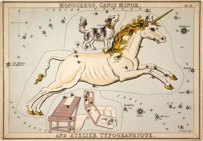
Heavenly Typography
![]() |
| From Urania’s Mirror: Monoceros, Canis Minor and Atelier Typographique, 1825 |
“Some people see faint outlines of unicorns in the heavenly constellations and others see dogs, or the canis minor. Yet Mr. Jehoshaphat Aspin looked up and saw a celestial type studio in the stars with a unicorn (monoceros) jumping over it…”
Read the rest here.
Wednesday, June 29, 2011
The Art of Sleeping in a Box
pointed out by a fairy“Start from simple sleeping on your back…or on your side…”
Read the rest here. Makes me smile.
Paige Bradley’s Expansion
via notcotPaige Bradley’s artist statement on her sculpture Expansion, “From the moment we are born, the world tends to have a container already built for us to fit inside: A social security number, a gender, a race, a profession or an I.Q. I ponder if we are more defined by the container we are in, rather than what we are inside. Would we recognize ourselves if we could expand beyond our bodies? Would we still be able to exist if we were authentically ‘un-contained’?”
More images of Expansion can be found here.
Don’t Fear the Internet
via imprint“…Jessica Hische and Russ Maschmeyer have started a wonderful little site explaining to beginners what production for the web is all about. Young designers, take heed: this is not optional information. It’s rare that a web shop would be willing to hire a designer who has no idea how HTML/CSS and JavaScript work together. Friendly and easy to understand, these guides are a good place to start.”
Be sure to visit here.
Tuesday, June 28, 2011
Typeface Software
![]() |
| This is my face as interpreted by the software. |
“The design of typefaces is founded upon principles from the days of metal type, when creating individual fonts was a laborious process and constrained by physical requirements. Most digital type design follows those same conventions, but technology gives us opportunities to make type design more spontaneous and personal. The Typeface software translates facial dimensions into generative type design.”
Learn more about it here, and download the software to generate your own typeface.
The Ampersand, part 2 of 2
via shadycharacters
“From its ignoble beginnings a century after Tiro’s scholarly et, the ampersand assumed its now-familiar ‘&’ form with remarkable speed even as the Tironian et stayed rigidly immutable. The symbol’s visual development is perhaps best documented in a formidable piece of typographical detective work carried out by one Jan Tschichold, a graphic designer born in Leipzig in 1902…”
Read the rest here.
Image to the Right: Collected ampersands in Jan Tschichold’s The Ampersand: its origin and development (1957). Notable here are (1) Pompeiian graffiti; (8) an insular majuscule ampersand from the 7th century Book of Kells, and (13) an 8th century Merovigian ampersand, already recognisable as the modern ampersand form.
Paper Peaucellier Linkage
via robives.com Newsletter“Invented by Monsier Peaucellier in 1864, the Peaucellier linkage is a simple mechanism created to convert rotary motion into straight line motion. Now, almost 150 years later, you can download and make your own working paper model. A fascinating paper model to download and make.”
Find out more here.
Monday, June 27, 2011
Vintage Office & Art Supplies
via letterology
See more examples here; and even more, including pocketwatches and locks, can be found at at Vintage Collective's Flickr site.
DART St. Louis
via designobserver“…Last April, as a part of STL Design Week, the St. Louis creative community was invited to FK Photo, a well-known commercial photography studio. Inside their sleek 12,000 square foot rehabbed warehouse in the city's midsection, more than 250 designers, art directors, photographers and illustrators took turns throwing real darts at a large projected map of the city. The intersection where the dart landed became their destination. The dart-thrower had a month to find his or her assigned corner of the city and return with a photograph that made that spot come to vivid life.
Each dart throw brought a donation of $5, with the proceeds going to Rebuild Together St. Louis, a local affiliate of the national not-for-profit dedicated to revitalizing local neighborhoods. The Throw Party raised over $2,500 for the organization. A month later, the community came together again for the Presentation Party, where all of the photographs were revealed to the public... ”
Read the rest here, and learn more about DART St. Louis here.
Subscribe to:
Posts (Atom)