
Friday, June 10, 2011
Business Cards: Page XXXIX

Thursday, June 9, 2011
Section 2 of The Highline Opens
 via designboom
“Featuring a number of new design features, section 2 of the one mile long urban park is open to the public. The one mile long urban park is recycled from the former elevated freight railroad spur and runs from Gansevvort Street in the Meatpacking District to west 34th street, between 10th and 11th avenues.”
See more images here.

Wednesday, June 8, 2011
Pantone desktop wallpapers
 via how about orange
Download PANTONE iPhone, iPad, and desktop wallpapers in your choice of six hues, here.

Tuesday, June 7, 2011
Image of the Day: Mathematics League Patch


Monday, June 6, 2011

Sleep May Restore Color Perception
 via colourlovers
“Color perception drifts away from neutrality during wakefulness and is restored during sleep, suggests a research abstract presented in at SLEEP 2010, the 24th annual meeting of the Associated Professional Sleep Societies LLC. Results indicate that prior wakefulness caused the color gray to be classified as having a slightly but significantly greenish tint. Overnight sleep restored perception to achromatic equilibrium so that gray was perceived as gray...”
Read the rest here.

Sunday, June 5, 2011

Indigo: The Colour that Seduced the World
 |
| Indigo by Catherine E McKinley will be published in August 2011 |
via delancyplace
“Until the most recent times, color dyes were rare and precious commodities upon which power and fortunes were built. Indigo, the brilliant blue dye made from plants, was one of America's slavery-based cash crops. But long before it was exported by America, indigo dye had been one of the world's great treasures for thousands of years. Referred to by some as blue gold, it caught the imagination of connoisseurs, and merchants and colonialists with its power to bewitch and its transcendent beauty — and the value and demand for indigo became ungovernable. It sparked bitter trade wars, and touched off impassioned European and North American legislation and political debate and became known as The Devil’s Dye.”
Read the rest here.
Making Faces: Metal Type in the 21st Century
 via nytimes
“Making Faces: Metal Type in the 21st Century is a new documentary by Richard Kegler. It is a video document of the late Jim Rimmer, the Canadian designer of almost 200 typefaces. In the film, Rimmer, who died in 2010, painstakingly demonstrates the lost art of pantographic type making. The pantograph is a mechanical device, based on parallelograms, which allows the movement of one pen, in tracing an image, to replicate that movement with a second pen. A craftsperson can draw on one side at a particular size, and on the other the type is “reproduced” at a chosen point size…”
“Is producing this display of vintage technology simply hanging on to the old for dear life, or is there a good reason for designers to know these processes? Kegler responds: “In any field of expertise there is a history and a cumulative reason that things are the way they are. How many Adobe Illustrator users know that kerning, leading, picas and points are terms that should have absolutely no relevance on the computer, but do, since they are direct analogies to the terms and processes of hundreds of years ago? The more time that designers spend on the screen, the more valuable the hand processes become. There is great subtlety and unique flavor in heirloom typefaces.”
Read more about the making of the documentary here, the DVD is available for order here, and the blog of Making Faces is here.
It’s hard to throw away a race number...
 via the mehallo blog
Turn your Tivek racing numbers into custom clothing; a cap or windbreaker. By Rick at ElevenGear.
Info/order here.
99 Bottles; Their Caps on the Wall
 via things neatly organized
“Arizona-based artist, William LeGoullon collected 99 bottle caps from one of his state’s remaining drive-in movie theaters as part of his Intermission series.”
See more of his work here.

Saturday, June 4, 2011

Friday, June 3, 2011
Jim Cosgrove: No Mother Could Give More
 via NPR
“This is egg laying season, if you're a bird. If you're an octopus, particularly a giant Pacific octopus, you've been there, done that. In fact, you died doing it, in what is the saddest mommy story I've heard in a long while. It comes from biologist Jim Cosgrove who describes it all in a lecture he calls, “No Mother Could Give More.’ ”
Read the rest here.
The Art Of Reproduction: 17 Ladies with Ermines
 |
| Lady With Ermine by Leonardo Da Vinci |
via Visual Hint: Color of Data
“The web can seem like the perfect museum, holding all the world’s art. Type ‘Danae Klimt’ into your favorite search engine, and you conjure up a high-resolution image of Gustav Klimt’s Danaë: tan limbs, a shower of gold, red hair. Or did you find pink limbs? Or were they gray or even green? There’s the rub: the seemingly perfect museum holds dozens of Danaës—with dozens of different palettes. Even the shape changes as reproductions are subtly cropped.
Curious just how far reproductions stray from each other, we began an investigation. For a set of famous artworks, we downloaded all the plausible copies we could find. Then we wrote software to reconstruct each artwork as a mosaic, a patchwork quilt where each patch comes from an individual copy.
The discontinuities of color, texture and frame tell the story of the inaccuracies in reproduction, forming a tapestry of beautiful half-truths...”
Read the rest here, and visit the site here.
Thursday, June 2, 2011

Celebrating Linotype, 125 Years Since Its Debut
 via the atlantic
“Around for a century, Linotype machines were made obsolete in the 1970s by changing technologies -- but they have not been forgotten…”
Read the rest here.

SLR Camera Simulator

“Want to play around with SLR Camera settings and see how it affects your photo, but without actually using an SLR? Well, you can do just that with the Online SLR Camera Simulator. This simple application allows you to choose the lighting, ISO, shutter speed and aperture. A great tool to teach someone the basics of photography.”
Wednesday, June 1, 2011
Should You Work for Free?

“It's a question that creative types encounter frequently, and the answer? Well, it depends. New York-based designer and illustrator Jessica Hische helps you reach an informed decision with her handy online flowchart, "Should I Work for Free?" Using only css and html (for speedy loading and Google-powered translation into 52 languages), she assists site visitors in analyzing their particular situation, whether the potential payment-free project is for a legitimate business, a charity or non-profit, your friend, or your mom. (That last one is an automatic yes.) Start from the middle of the chart and work outwards by answering yes or no questions -- Will they give you creative freedom? Are you masochistic? -- until you reach a clear answer, delivered with a morsel of parting advice from Hische.’
Works best with Firefox, here.
Who Did That?
 |
| Albrecht Durer’s monogram |
via imprint
“Anon, short for anonymous, is as common in art history as Smith is in American telephone directories. Yet for a specific work to have its maker buried in an unmarked grave in history’s Potters Field is a sad epitaph indeed.
Credit implies ownership and accountability. Around the eighteenth century art became more commonly a function of individual creators who received credit. The term Anon is less commonly found in art histories of this era. In fact, the signature became an important component of a work, even for lesser artists.
While not on the lowest rung of the art hierarchy, illustrators and cartoonists of the nineteenth century started signing their wares as much for their personal satisfaction as for the recognition it afforded them in an increasingly competitive marketplace. And not only did the illustrator’s signature appear, so did the engraver’s and printmaker’s — akin to the lengthy acknowledgments found in contemporary graphic design annuals...”
Read the rest here.
Practical Principles
 via letterology
“From an alphabet of tongue twisters originally published in 1836 and revised 100 years later by the Mergenthaler Linotype Corporation. This 1936 edition of Peter Piper’s Practical Principles of Plain and Perfect Pronunciation was designed and illustrated by some of the most celebrated typographers and designers of the day…”
See more examples here, and see the entire book on view at Dr. Chris Mullen's amazing site, The Visual Telling of Stories, here.


Hobo Type

“This written language for hobos was a system of symbols developed as a code to help them cope with a difficult lifestyle. Hobo signage was often written with chalk or coal and might include directions, information and warnings such as a dangerous dog or the homeowner has a gun. Three diagonal lines signified it was not a safe place, the cross indicated angel food, which was food served to hobos after a sermon, two shovels indicated work available and a cross with a smiley face with one corner meant the doctor was willing to treat hobos for free.
In 1889 at the National Hobo Convention, the Tourist Union #63 adopted a concrete set of sixteen ethical by-laws to govern the Nation-wide Hobo Body. Oh what a wonderful world it would be if we all lived by this Hobo Code…”
Read the rest here.
Tuesday, May 31, 2011


Chronophotography

“French scientist Étienne-Jules Marey (1830-1904) made significant contributions to the development of cardiology and physical instrumentation in medicine, but he is best-known as a pioneer of chronophotography — an antique Victorian-era photographic technique that captures several sequential frames of movement, which can then be combined into a single image. In 1882, Marey invented a chronophotographic gun that was capable of taking 12 consecutive frames per second, recorded on the same picture. He used these pictures to study the gallop of horses, the flight of birds, the gait of elephants, the swim of fish, and the organic motion of many more creatures, and his work served as the foundation for Eadweard Muybridge‘s iconic animal locomotion studies and directly influenced the development of early cinema. Yet the background of his landmark images remains obscure…”
Learn more here.
Geometry of Circles: Philip Glass + Sesame Street
 via brain pickings
“…In 1979, the makers of Sesame Street commissioned Philip Glass to compose music for a series of four unnumbered animation pieces titled Geometry of Circles, designed as a primer for visual thinking — something at the core of both Sesame Street itself and Jim Henson’s original vision that predated his creation of The Muppets. The combination, beautiful and eloquent in a multisensory way, feeds into my obsession with synesthesia and various visualizations of music.”
Read the rest, and watch one of the videos here.
Monday, May 30, 2011


Peter Pan in Kensington Gardens
via bibliodyssey

Read the rest here, and see the fifty Rackham illustrations for ‘Peter Pan in Kensington Gardens’ from Harvard University Library here.
1940s NYC Destination Subway Scrolls
 via accidental mysteries
“These incredibly graphic New York City destination subway scrolls were used to direct subway commuters in the early 1940s. I love the way the fonts are condensed and expanded to fill the space— from the school of ‘make it fit!’
Read more here.
Seeing, Hearing, and Smelling Color: Synesthesia Pt. 2
 via imprint
“[Part II digs] into a hot-topic among scientists in recent years: is synesthesia useful to those who have it? What can studying it yield?
Read part two here.
Sunday, May 29, 2011
Images of the Day: Glassfest
 |
| We loved the bright little spray painted runner on the course signs. |
 |
| Close-up of the spray runner wearing a double-brimmed hat. |
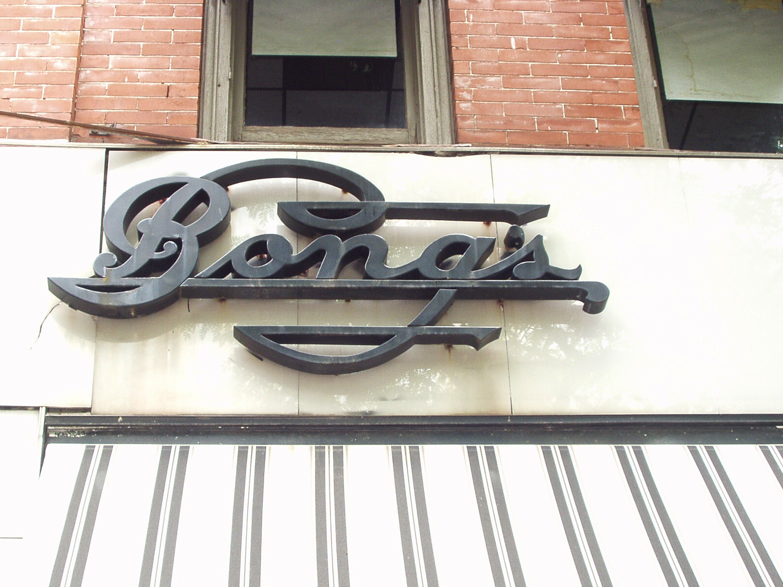 |
| Interesting typography treatment for this jeweler’s sign. |
 |
| A restored Whizzer bike |
 |
| Mail slot in a darkened corner along Main Street in Corning, NY |

Andrea Stark Poster Series
 via FPO
“The things we place value on; the things we hold most beautiful, are of our own accord. This project reminds people to step back and consider every object or mark as an opportunity to create something new or improve upon the existing. This poster series was part of a wider research project exploring the value of decoration. The designs were created using everyday objects, residues and ephemera. Each A1 print is double-sided, with the original objects printed on the reverse of the decorative design that was created from them…”
Read the rest here.
Graphically Evoking Vivaldi’s “Four Seasons”

“Our musical notation system follows a convention that dates back centuries. By reading it, musicians can get an aural sense of melody, tempo and all the other instructions on how the score should be played. But what if the notations were shown in graphically different colors and dot sizes? This is a study done by graphic designer Laia Clos of Mot Studio in Barcelona. Clos explains that the self-initiated project started with a woman in her studio who has a knowledge of music. From there, they created a new graphic musical notation system called “SisTeMu,” which translates a musical score into simple geometric forms and basic printing colors, exploring the rhythmic and melodic harmonies found in the musical composition. The system somewhat simplifies the complexity and mathematical structure, making it accessible to the viewer through a visual narrative. For their first translation, they used the musical data for the lead violin part of Antonio Vivaldi’s baroque concerto, The Four Seasons (or Lesquartrestacions)…”
Read more here and here.
Saturday, May 28, 2011

Seeing Color (and Hearing, and Smelling It)
 via imprint
“The number 1, for example, is a brilliant and bright white, like someone shining a flashlight into my eyes. Five is a clap of thunder or the sound of waves crashing against rocks. Thirty-seven is lumpy like porridge, while 89 reminds me of falling snow…”
Read the rest here.

Subscribe to:
Posts (Atom)