Sunday, May 29, 2011

Images of the Day: Glassfest

We loved the bright little spray painted runner on the course signs.

Close-up of the spray runner wearing a double-brimmed hat.


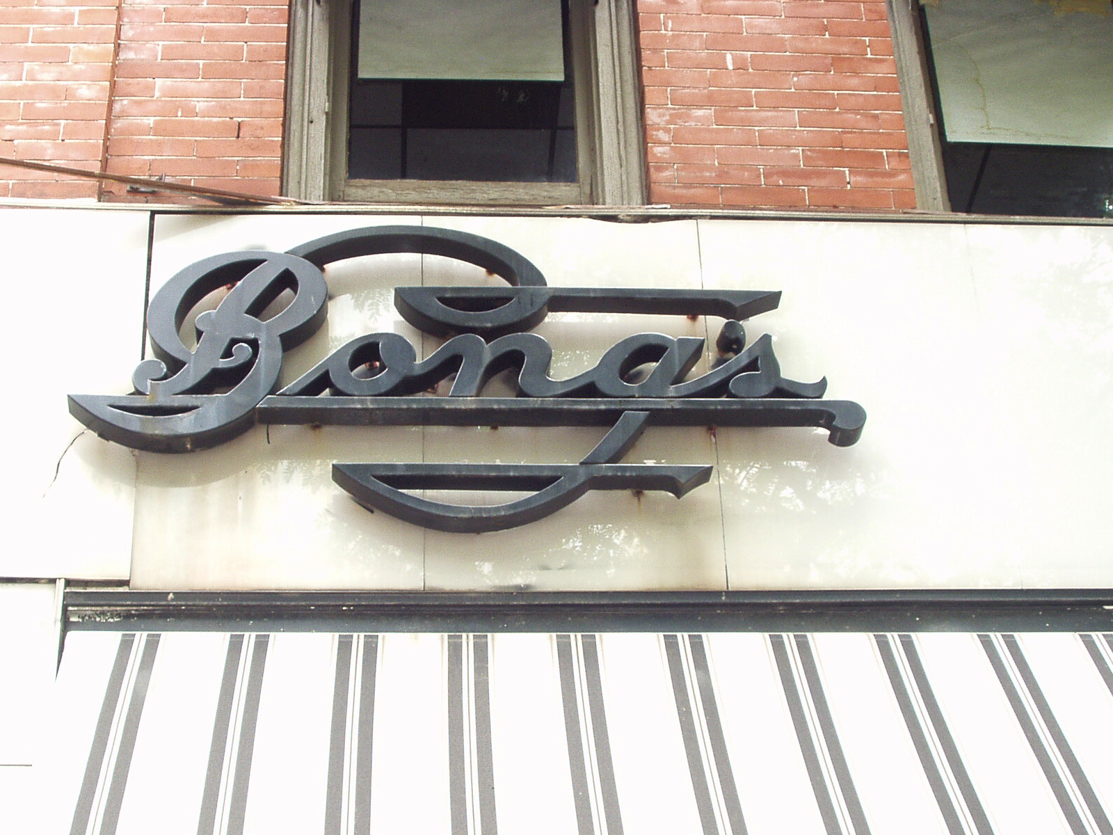
Interesting typography treatment for this jeweler’s sign.

A restored Whizzer bike


Mail slot in a darkened corner along Main Street in Corning, NY

There was even a old ampersand spotted along the way; you can see it here.


Business Cards: Page XXVIII


Andrea Stark Poster Series


via FPO
“The things we place value on; the things we hold most beautiful, are of our own accord. This project reminds people to step back and consider every object or mark as an opportunity to create something new or improve upon the existing. This poster series was part of a wider research project exploring the value of decoration. The designs were created using everyday objects, residues and ephemera. Each A1 print is double-sided, with the original objects printed on the reverse of the decorative design that was created from them…”
Read the rest here.

Graphically Evoking Vivaldi’s “Four Seasons”


via @Issue Journal of Business & Design
“Our musical notation system follows a convention that dates back centuries. By reading it, musicians can get an aural sense of melody, tempo and all the other instructions on how the score should be played. But what if the notations were shown in graphically different colors and dot sizes? This is a study done by graphic designer Laia Clos of Mot Studio in Barcelona. Clos explains that the self-initiated project started with a woman in her studio who has a knowledge of music. From there, they created a new graphic musical notation system called “SisTeMu,” which translates a musical score into simple geometric forms and basic printing colors, exploring the rhythmic and melodic harmonies found in the musical composition. The system somewhat simplifies the complexity and mathematical structure, making it accessible to the viewer through a visual narrative. For their first translation, they used the musical data for the lead violin part of Antonio Vivaldi’s baroque concerto, The Four Seasons (or Lesquartrestacions)…”
Read more here and here.


Saturday, May 28, 2011

Business Cards: Page XXVII


Seeing Color (and Hearing, and Smelling It)


via imprint
“The number 1, for example, is a brilliant and bright white, like someone shining a flashlight into my eyes. Five is a clap of thunder or the sound of waves crashing against rocks. Thirty-seven is lumpy like porridge, while 89 reminds me of falling snow…”
Read the rest here.

Letterpress


via swissmiss
Letterpress from Naomie Ross on Vimeo makes me smile. Watch it here.

Friday, May 27, 2011

Image of the Day: Rainbow Cats


Business Cards: Page XXVI


The Octothorpe, part 2 of 2


via shady characters
“Bell Telephone Laboratories, one-time research subsidiary of American telecoms giant AT&T, has produced some of the 20th century’s most influential developments in the worlds of science and technology. It boasts seven Nobel Prizes in Physics awarded for, among other things, a demonstration of the wave nature of matter, the invention of the transistor and the discovery of background cosmic radiation. Other notable products of this storied research centre include the laser, radio astronomy, the first communications satellite and the UNIX operating system, which forms a key component of the internet and of modern computing in general.

Most relevant in terms of punctuation, though, is a small linguistic innovation which emerged in the wake of a much larger technological one. Engaged in the 1960s in reinventing the world’s aging telephone dialing system, one of the many Bell Labs engineers working on this mammoth task was almost certainly responsible for coining the term ‘octothorpe’. And though the octothorpe’s birthplace is well recorded, the question of exactly who created it is somewhat more contentious…”
Read the rest here.

Close-Up

Thursday, May 26, 2011

Cinderella Stamps


via letterology
“A Cinderella stamp is any non-postage stamp. The oft-neglected stepchild of the postage stamp, a Cinderella may look like a stamp, but it won't carry the mail. The category includes locals, labels, tax stamps, fiscals, poster stamps, charity seals, forgeries, fantasies, phantoms, revenues, etc. Some are more elaborately designed than the postage stamps they imitate. The hard-core philatelist scorns any stamp that didn't carry the mail, but others find these philatelic by-ways fascinating and rewarding. Philatelic Exhibition Seals are a popular sideline among stamp collectors. The heyday for Cinderellas in the U.S. was the 1920's and 1930's, when many beautifully designed engraved examples were produced…”
Read more on Cinderella stamps here and here.

Business Cards: Page XXV


Image of the Day: Footprints in Cement


Crow Thought

Wednesday, May 25, 2011

Business Cards: Page XXIV

[Middle Row] The middle card in this row uses the maximum numbers of typefaces and point styles; it is so bad you can't stop looking at it. The card next to it, The Bird Net, harkens back to the early days of the internet and modems.

New York Public Library’s ‘Find The Future’


via the morning news
“As some Christians prepared for the Apocalypse, Elizabeth Kiem and 499 questers spent Friday night locked inside the New York Public Library with game designer Jane McGonigal…”
Read the rest here.

Textify


Ampersand Rapture Looting

via imprint
“A lovely little experimental web application, Textify, re-renders any image you feed it as a text version of itself. The app uses the typeface, colors, and scale that you specify to generate the image. Your result: a gorgeous little piece of generative art with historical ties to old ASCII art of the Usenet period.”
Works with Firefox, visit the site here to play.

Image of the Day: Rite Way Demolition


A Visual History of Famous Mac Icons


via maclife
“Mac OS 10 has given Mac users a slick GUI full of fancy visual goodies, and with the release of Lion right around the corner, it's only going to get slicker. However, we must not forget that Apple's attention to detail hasn't just been limited to their most recent releases -- they've always been pioneers on the interface front. This gallery features Apple's most humble beginnings -- their most famous icons you're sure to remember with fondness, and a few current updates as well...”
See them here.

TypeFacebook


via creativepro and make
“TypeFacebook was a booth at the 2011 Bay Area Maker Faire that was organized by the People's Republic of Paper, a loose collective of designers, type casters, paper makers, printers, and book binders. The TypeFacebook concept was simple: Using moveable lead type, people were asked to respond to the prompt Facebook uses: "What's on your mind?" Each character of your answer was a piece of metal type, which you carefully picked from a job case. You set the characters in a job stick (also called a composing stick), making sure they faced the right way. The press owner and operator, Pam DeLuco, set three people's answers into one forme and mounted the forme on a small platen press. Each participant then laid paper that would become the book cover on the press, pulled and released the press's handle, and the printing process was done. If you made typos (as I did), you either had to live with them or go through the entire process again…”
Read the rest here, and see some wonderful photos there as well.

The golden age of comics color palette


via wizzywigcomics
“Once upon a time before Adobe Photoshop, the color palette of comic books was very limited. Instead of the millions of colors that you can blend and gradiate and add filters to, there was a time where you were limited to 64 colors on average (that number is liquid if you’re a nerd about the printing process. Ed Piskor located an ‘antique’ chart of the exact mixtures for the 64 colors which were used in comics and newspaper strips for decades and then created a PSD file to share so that people can use these hues digitally."
Find out more here; there is even a link to download a ZIP file of the old comics 64 color guide PSD.

Cheryl Sorg’s Thumbprint Portraits


via liquidtreat
“Meet Cheryl Sorg. The Cincinnati-born, San Diego-based artist specializes in work inspired by and made from books. In addition to elaborate sculptures and breathtaking text collages, she has carved out an artistic niche in thumbprint portraits. Sorg enlarges her subject's thumbprint and then recreates its unique pattern. The whorls, loops, and archs are made from text and imagery that have special meaning for the subject, such as snippets of favorite books, songs, films, or, say, weekly e-mail newsletters…”
Learn more about these, here.

The Octothorpe, Pt. 1


‘lb’ as an abbreviation for libra, or ‘pound in weight’. On the left, a handwritten ‘lb’ from the pen of Isaac Newton, and on the right, a printed ‘lb’ crossed by a bar denoting its status as an abbreviation.

via Shady Characters: The secret life of punctuation
“The ‘#’ symbol is something of a problem child. It seems at first to be quite innocuous, a jack-of-all-trades whose names and uses correspond in a pleasingly systematic manner: ‘#5’ is read ‘number five’, leading to the name ‘number sign’; in North America, ‘5#’ means ‘five pounds in weight’, giving ‘pound sign’, while the cross-hatching suggested by its shape leads to the commonly used British name of ‘hash sign’. Dig a little deeper, though, and this glyph reveals itself to be a frustratingly multifaceted beast…”
Read the rest here.

Tuesday, May 24, 2011

Mimi and Eunice: “Nina” Font now Free


“Several people have asked if they can use ‘the Mimi & Eunice font’ for translations. It happens I don’t use a font – I actually hand-letter these suckers, trying to be messy. Apparently I haven’t succeeded, because even my messy hand-lettering looks a lot like my cleaner lettering from the late 1990′s, which I do have a font of. It’s called ‘Nina,’ and I made it with Fontographer on my very first Mac – in fact it was my first Mac project ever. At long last I’m sharing it freely with everyone...”
Read the rest, and download the font here.

Monday, May 23, 2011

Nina Paley’s 4 Elements Quilt Series: Air/Nude


via ninfa paley's blog
“My latest quilt is Capital-A Art. Know why?
1. It’s white on white
2. It depicts a nude
3. It is on canvas stretchers
Ladies and gentlemen, I unveil the fourth and final installment of my 4 Elements quilt series: Air/Nude!”
Read the rest, and see more images of this and the other quilts in the series, here.

Sunday, May 22, 2011

Mapping the Human Condition


via brainpickings
“…There’s something about cartography that lends itself to visualizing much more than land and geography. [Presented] are seven cartographic interpretations of the human condition, using the visual vocabulary of classical maps to interpret various facets of the human psyche — a genre that came of age during the late Renaissance, when it became known as “sentimental cartography.”
Read the rest here.

Saturday, May 21, 2011

God is a concept by which we measure our pain


via quotes

The Music of Philip Glass, Visualized in Fractals


via brain pickings
“What fractals have to do with classical music and the secret of Einstein’s genius: I’m obsessed with synesthesia and the visual language of music, and love the work of Philip Glass, often considered the greatest living composer. Naturally, I’m head over heels with these spellbinding fractal visualizations by Russian artist Tatiana Plakhova, abstracting Glass’s music graphically….”
Read the rest here.

Friday, May 20, 2011

Wood Type of the Month: Balloon


via international printing museum
Read this month’s wood-type column to learn what typeface was created for use in comic strips…

Glagolitic script


via typonine
“The Glagolitic script didn’t evolve from any older orthographic system, it was created as a completely new and original script. At first the Glagolitic script was rounded in shape and in that form came to Croatian ground in 9th century. From 12th century Glagolic script exists only in Croatian area and it evolves to a new angular style which is called Croatian Glagolitic.

The basic shapes of Croatian Glagolitic are determined by a few basic strokes mostly horizontal and vertical. The architecture of characters is very symmetrical which enabled the creation of numerous two-, three-, even four letter ligatures. Croatian Glagolitic is consisted of 32 alphanumeric characters. The script got its name in the 19th century from a verb glagoljati — to talk. This script was used in holy books, poems, legends, novels and legal documents…”

Read the rest here. The Typonine Glagolitic font is free for download.

Llama Font


“Avery Oldfield created Llamafont.com, a site that allows you to type a message in a font made of llamas and share it with your friends. Why? Because llamas make everything better...”
Makes me smile.

First Solar-Powered Engine


‘Eventually industry will no longer find in Europe the resources to satisfy its prodigious expansion. Coal will undoubtedly be used up. What will industry do then?’
— Augustin Bernard Mouchot (1825-1912), French inventor of the earliest solar-powered engine, converting solar energy into mechanical steam power

I love that the industry used in the image is a letterpress, which looks very much like the one we have at work.

Thursday, May 19, 2011

Final Encore: Pick Your Song For The End Of The World


via npr’s All Songs Considered
“Let’s just say, for the sake of discussion, that Saturday marks the occasion when the righteous ascend to heaven and the wicked are sent to writhe miserably in the eternal damnation of hellfire. What single song do you plan to play when the end arrives?”
Join the discussion here. My song would be the Beatle’s “A Day in the Life”

Stand Up For Girls Big and Small


via moomah
“...My five-year-old daughter came home from school last month and said she no longer wanted to wear pink because a girl in her class had told her that she hated pink and that it was too girly. My first instinct was to have my daughter tell this budding fashionista what she could do with her critique… but luckily I’ve learned to ignore my first instincts. I told my daughter it was a shame that her classmate couldn’t enjoy all the wonderful colors out there in the world. Then we made a list of some wonderful pink things: puppy bellies, cotton candy, strawberry ice cream, piglets, roses, bubble gum…

Let’s teach our daughters to celebrate other women’s strength, success and happiness. Let’s not limit their options. Let’s teach them that when they make decisions in their lives, to make them based on what’s right for them. Our dreams should never be hampered by fear of what others may think.”
Read the entire post by Tracey Stewart here.

How to create a ligature


via thisiscolossal
“David Schwen demonstrates how typographic ligatures are created. It’s all about the details…”
Find out more here. This really makes me smile.

Create an ambigram-style logo


via ComputerArts
John Langdon reveals how to bring rotational symmetry to your work, here.

Douglas Coffin, Lettercarver


via typeculture
“While this film may not be about type, it abounds with beautiful letters. Douglas Coffin is one of a handful of people in the United States who carve letters in stone with the same methods that were used in the Roman Empire. Two thousand years later, the most compelling results are still achieved through the design and carving skills of a passionate artist-craftsman…”
Watch this, and other short videos, here.

QR Code Portrait


via cmybacon
“Scott Blake has been creating large scale “pixel portraits” using barcodes, and one of his most recent projects is a portrait of Amy Goodman using 2,304 QR Codes that link to 9 years of Democracy Now videos….”
See the image and read more about it here.

Memento Mori


via make
Cory Doctorow writes, “I’m often puzzled by how satisfying older technology is. What a treat it is to muscle around an ancient teletype, feeding it new-old paper-tape or rolls of industrial paper with the weight of a bygone era. What pleasure I take from the length of piano roll I’ve hung like a banner from a high place in every office I’ve had since 2000.

How much satisfaction I derive from the racing works of the 1965 mechanical watch I received as a Father’s Day present this year, audible in rare moments of ambient silence or when my hand strays near my ear, going tick-tick-tick-tick like the pattering heart of a pet mouse held loosely in my hand.

The standard explanation for the attractiveness of this old stuff is simply that They Made It Better In The Old Days. But this isn’t necessarily or even usually true. Some of my favorite old technologies are as poorly made as today’s throwaway products from China’s Pearl River Delta sweatshops.”
Read the rest here.

Tuesday, May 17, 2011

The Rapture: May 21, 2011 6:00 p.m.


via The Bennington Vale Evening Transcript
“By now, everyone in Bennington Vale has seen the signs promising the end of days on May 21, 2011. The prophecy is being spread by Family Stations, a 53-year-old Christian radio network with over 60 outlets. Family Stations is so convinced that God is ready to receive His devoted flock this year that they have posted over 3,200 billboards worldwide with the message: ‘The Bible guarantees it!’ According to their prediction, the world will be progressively shaken apart by earthquakes, beginning at 6:00 p.m. EDT on May 21 and continuing through October 21. During this period of cataclysm, the Rapture will call all true believers back to Heaven. As a result, and with heavy heart, The Bennington Vale Evening Transcript is issuing final paychecks to some staff members and preparing to temporarily cease publication at the end of next week -- which is also the end of the world…”
Read the rest here.

via wikipedia
“Harold Egbert Camping has gained recent notoriety due to his prediction that the Christian Rapture will take place on May 21, 2011 and that the end of the world will take place five months later on October 21, 2011. Followers of Camping claim that around 200 million people (approximately 3% of the world's population) will be raptured. As for the remainder of the human population, Camping himself believes in annihilationism, which is the view that those who are not saved will simply cease to be conscious rather than spend eternity in Hell. Those who were "unsaved" and died prior to May 21 will not be affected by or experience the Rapture or the end of the world…”
Read the rest here.Or you can slog through his site here to learn more behind his prediction, or here and here or more links.

The Post Rapture Looting Facebook page [here] just makes me smile, as does the Post Rapture Pet Care Facebook page [here].

Classroom-Sized Camera Obscura


via neatorama
Cuban-born photographer Abelardo Morell demonstrated the concept of camera obscura to college students in 1988 by turning the entire classroom into a camera.
Read the rest here.